Animated Area Chart Generator
Show momentum with a filled trend line. Export as PNG, SVG, GIF or MP4.
Free to try · No design skills · Ready in about two minutes
Trusted by 1,198 users, including people at
 ByteDance
 Arizona State
 Fox
Fox UT Austin
 Roche
Roche Tulane
 United Airlines
 Clemson
 NHS
NHS Ayming
 Marquette
 Kent State
 Ray White
 UC Riverside
 CBA
CBA Illinois Tech
 Venngage
 Hofstra
 House of Communication
 IIT Madras
 Sotherly Hotels
 Zenus.ai
Overview
What is a area chart?
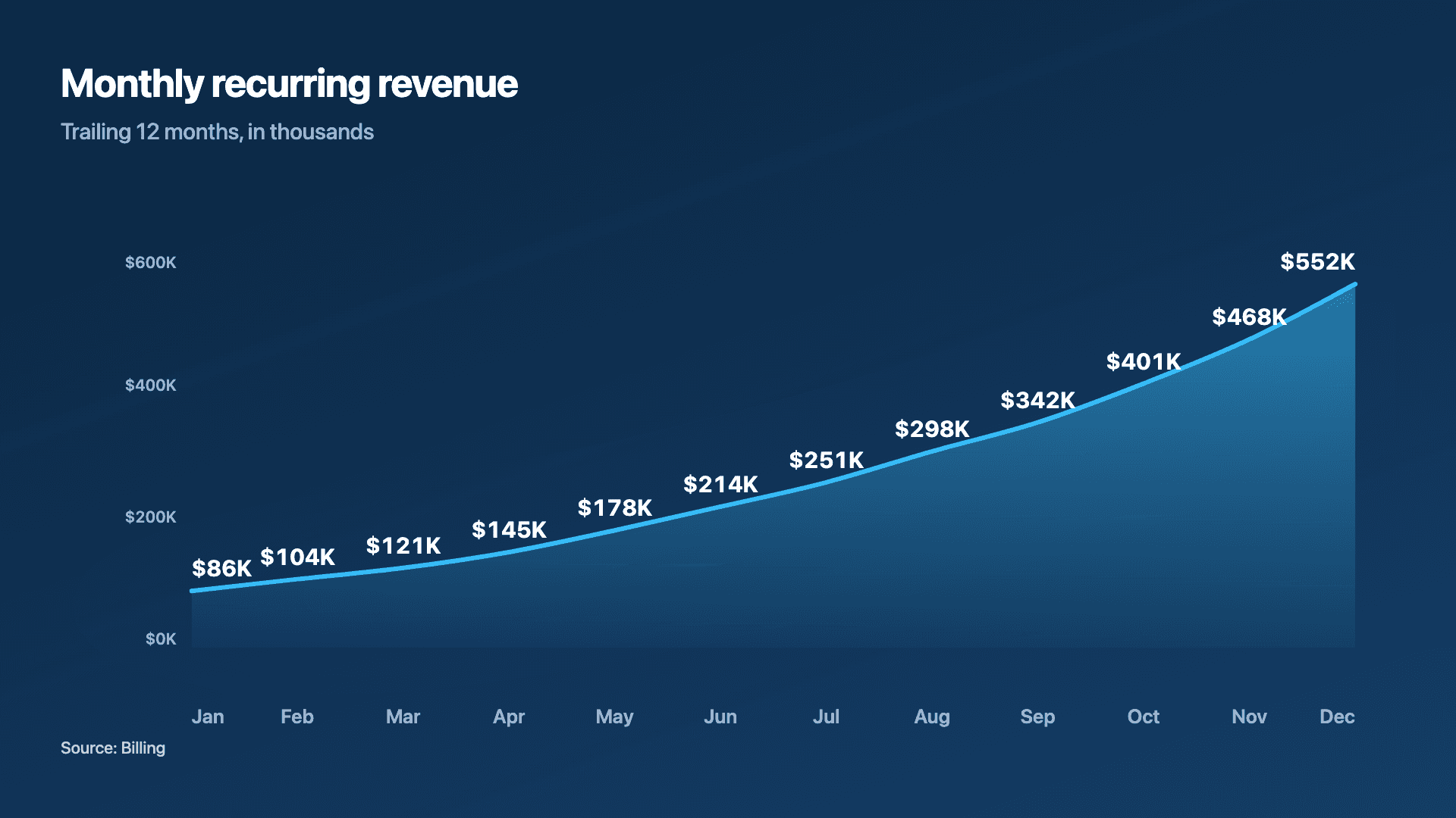
An area chart is a line chart with the region under the line shaded. That fill does one job exceptionally well: it makes the magnitude of a trend feel substantial. Where a thin line says 'this went up', a filled area says 'look how much this grew'. It is why area charts are the default for revenue, MRR and cumulative totals, the numbers that founders most want to feel big.
The shaded volume is the whole point, and also the constraint. An area chart works best for a single rising series where you want momentum to land emotionally. The moment you stack several opaque areas on top of each other, the ones behind get hidden and the chart becomes hard to read, that is when a line chart or a stacked bar is the better call.
Reochart draws the line on from left to right and fills the area underneath as it goes, so growth literally builds in front of the viewer, which is exactly what stops the scroll on LinkedIn or X. Steadily rising numbers tell the strongest story here. Export as MP4, GIF, PNG or SVG, with your own brand colours on Pro.
How it works
How an area chart works
Each point is plotted by its time period (x) and value (y), the points are joined into a line, and the region between that line and the baseline is filled. The eye reads both the line's slope (rate of change) and the filled volume (overall magnitude), which is what gives growth its weight.
Because the fill draws the eye to volume, area charts are happiest with one series. Start the y-axis at zero so the shaded area is proportional to the real numbers, a truncated axis exaggerates the fill and misleads.
Examples
Example area charts
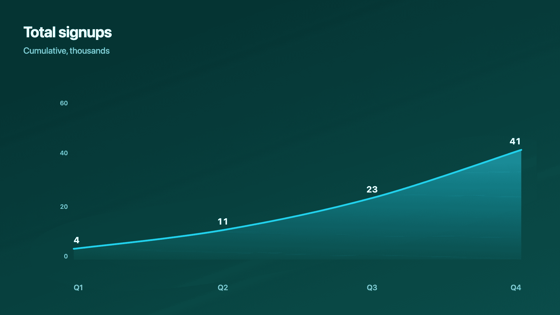
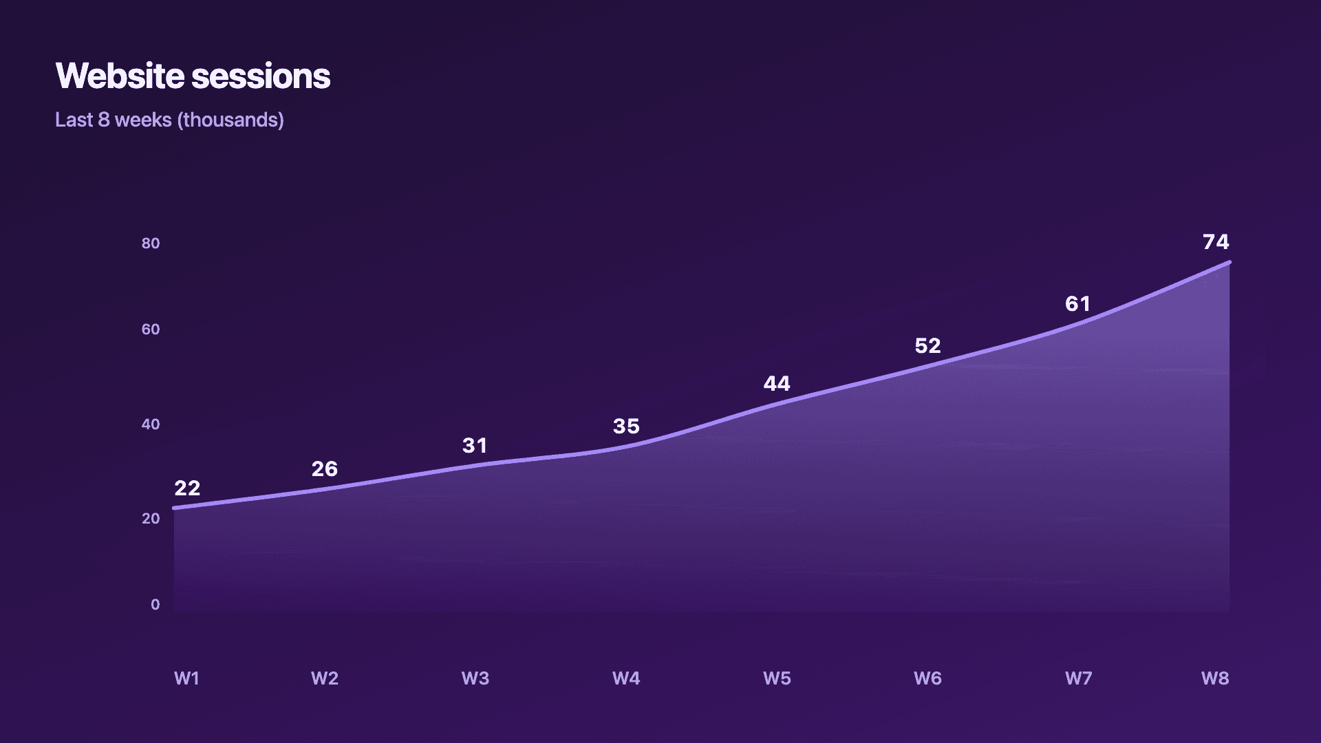
Real charts made in Reochart, each with its own data and theme. They animate automatically as you scroll.
Good fit
When to use a area chart
- ✓MRR and revenue growth
- ✓Cumulative signups or totals
- ✓Momentum over time
- ✓Any single rising trend you want to feel bigger
- ✓A hero metric in an investor update
Reach for something else
When not to use a area chart
- ✕You are comparing several series precisely, stacked opaque areas hide each other; use a line chart.
- ✕Your x-axis is separate categories, not time, use a bar chart.
- ✕The trend is flat or noisy, the fill adds weight to a story that is not there.
- ✕You need exact part-to-whole values, a stacked bar or donut is clearer.
Compare
Area chart vs other charts
Area chart vs the alternatives.
| Chart type | Best for | Avoid when |
|---|---|---|
| Area | A single trend you want to feel bigger | Comparing several precise series |
| Line | Comparing 2-5 series over time | You want growth to feel substantial |
| Stacked bar | Part-to-whole across periods | A smooth continuous trend |
| Bar / column | Distinct categories | A continuous time trend |
Your data
What data you need
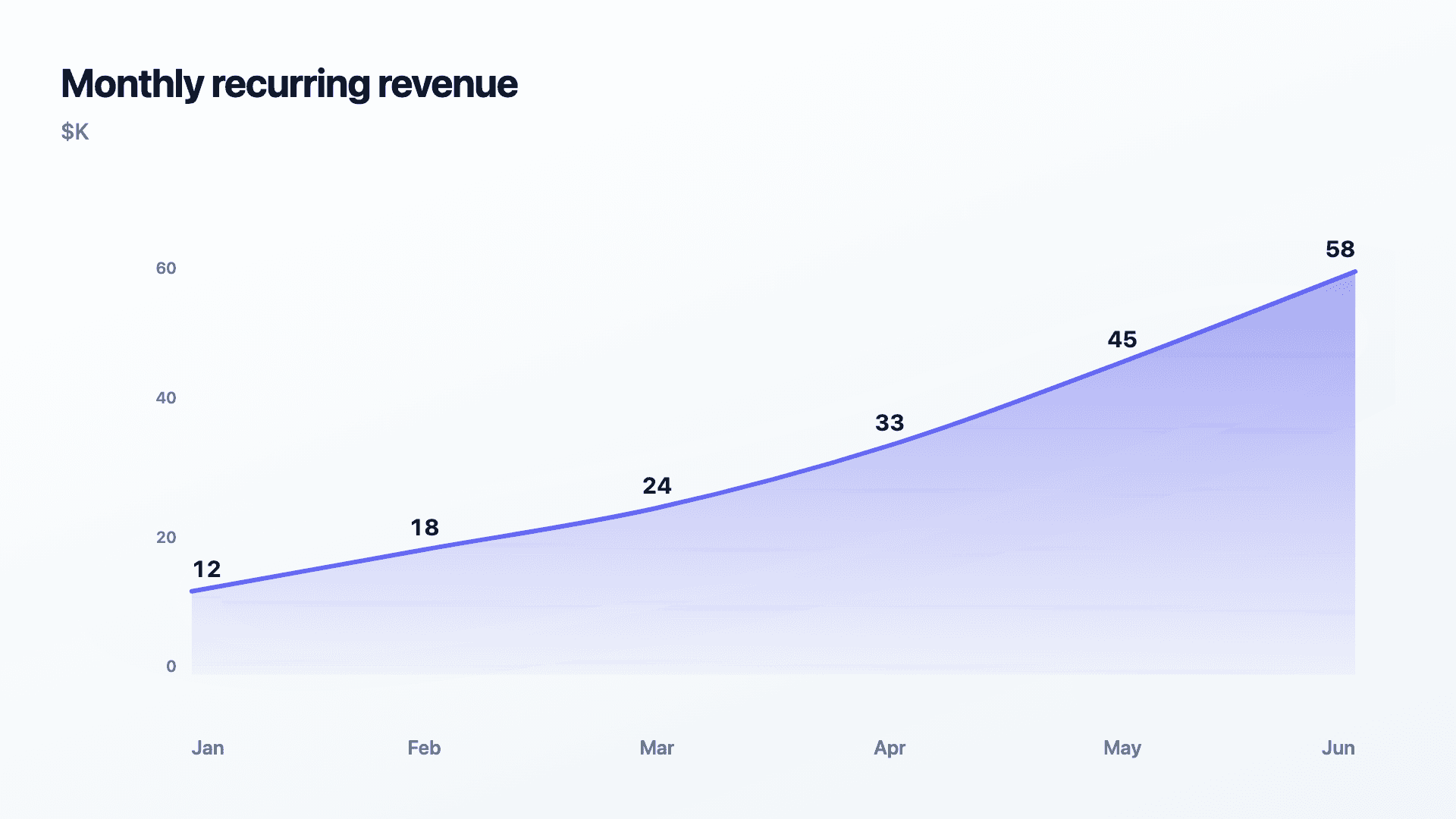
One row per time period: a label and a value. Paste from a sheet or import a CSV. 6 to 12 points reads best, and rising numbers tell the strongest story.
| Period | Value |
|---|---|
| Jan | 12 |
| Feb | 18 |
| Mar | 24 |
| Apr | 33 |
Step by step
How to make a area chart
Drop your numbers in, or import a CSV.
Choose the chart, theme and animation speed.
Tune colours, labels and add your brand.
Download MP4, GIF, PNG or SVG.
Best practices
Get it right
- ✓Start the y-axis at zero so the fill is proportional.
- ✓Use it for a single, clearly rising series.
- ✓Label the latest value, it is usually the headline.
- ✓Keep equal time intervals so the slope is honest.
- ✕Stack several opaque areas that hide one another.
- ✕Truncate the axis to exaggerate the fill.
- ✕Use it for unrelated categories instead of time.
- ✕Add an area fill to a flat trend to fake momentum.
Watch out
Common mistakes to avoid
An area chart that does not start at zero exaggerates the shaded volume and overstates growth. Keep the baseline at zero.
Layering several filled areas hides the ones behind. For multi-series, use a line chart or a stacked bar instead.
The fill implies continuity. Use area only for ordered time, not for separate categories.
A bold fill on a flat or noisy series dresses up a non-story. Let the data earn the emphasis.
Why Reochart
Built for sharing, not just charting
- ✓No design skills required
- ✓Animated MP4 and GIF exports
- ✓PNG and scalable SVG too
- ✓Your brand colours and logo (Pro)
- ✓Paste from a sheet or import a CSV
- ✓Presentation and feed ready in minutes
FAQ
Frequently asked questions
What is an area chart?
An area chart is a line chart with the region between the line and the baseline filled in, so the trend carries visual weight as well as direction. The line still does the precise work of showing where the value sat at each point, but the shaded area adds a sense of accumulated magnitude, which is why a climbing area chart reads as more substantial than the same data drawn as a bare line. That makes it the natural choice for revenue, MRR, active users and any cumulative total where the size of the thing matters as much as its direction. The trade-off is that fills stack up badly. One series works cleanly, two can work if the upper one is translucent, but beyond that the overlapping shapes hide each other and a plain multi-line chart communicates more clearly.
When should I use area instead of line?
Use area when you want a single growing metric (revenue, MRR, cumulative totals) to feel substantial. Use a line when you are comparing several series precisely.
Should the axis start at zero?
Yes. Because an area chart fills the region under the line, a truncated axis exaggerates the shaded volume and overstates the trend.
Can I stack multiple areas?
It is possible but usually a mistake, opaque areas hide each other. For multi-series comparisons, a line chart or stacked bar reads far better.
Can I make it animated?
Yes. Charts animate by default, and you can export the animation as an MP4 or GIF, or grab a static PNG or SVG if you prefer.
Can I export as SVG?
Yes. Pro exports a crisp, scalable SVG vector, alongside MP4, GIF and PNG. Every export renders at 1080p.
Is Reochart free?
Yes. The free plan lets you make every chart type except the animated bar chart race, and export an animated MP4 with a small watermark, no card needed. Pro adds the bar chart race, removes the watermark, and adds GIF and SVG, your brand colours and logo, longer videos and CSV import.
From the blog
Learn more about charts and data storytelling

11 min read
How to Create an Animated Number Counter
A step-by-step guide to building a number counter that actually lands: picking the number worth this treatment, setting an honest start point, adding the context that makes it mean something, and exporting an animated version for a launch post, a deck, or a milestone update.
Read article →

11 min read
How to Build a QBR Dashboard
A practical guide to building the handful of charts a quarterly business review actually needs: the growth number, the bridge that explains it, the pipeline read, the KPI scorecard, and the roadmap for what's next.
Read article →