Quarterly Business Review (QBR) Chart Generator
Build clean QBR charts your stakeholders actually read. Export as PNG, SVG, GIF or MP4.
Free to try · No design skills · Ready in about two minutes
Trusted by 1,198 users, including people at
 ByteDance
 Arizona State
 Fox
Fox UT Austin
 Roche
Roche Tulane
 United Airlines
 Clemson
 NHS
NHS Ayming
 Marquette
 Kent State
 Ray White
 UC Riverside
 CBA
CBA Illinois Tech
 Venngage
 Hofstra
 House of Communication
 IIT Madras
 Sotherly Hotels
 Zenus.ai
Overview
What this tool is for
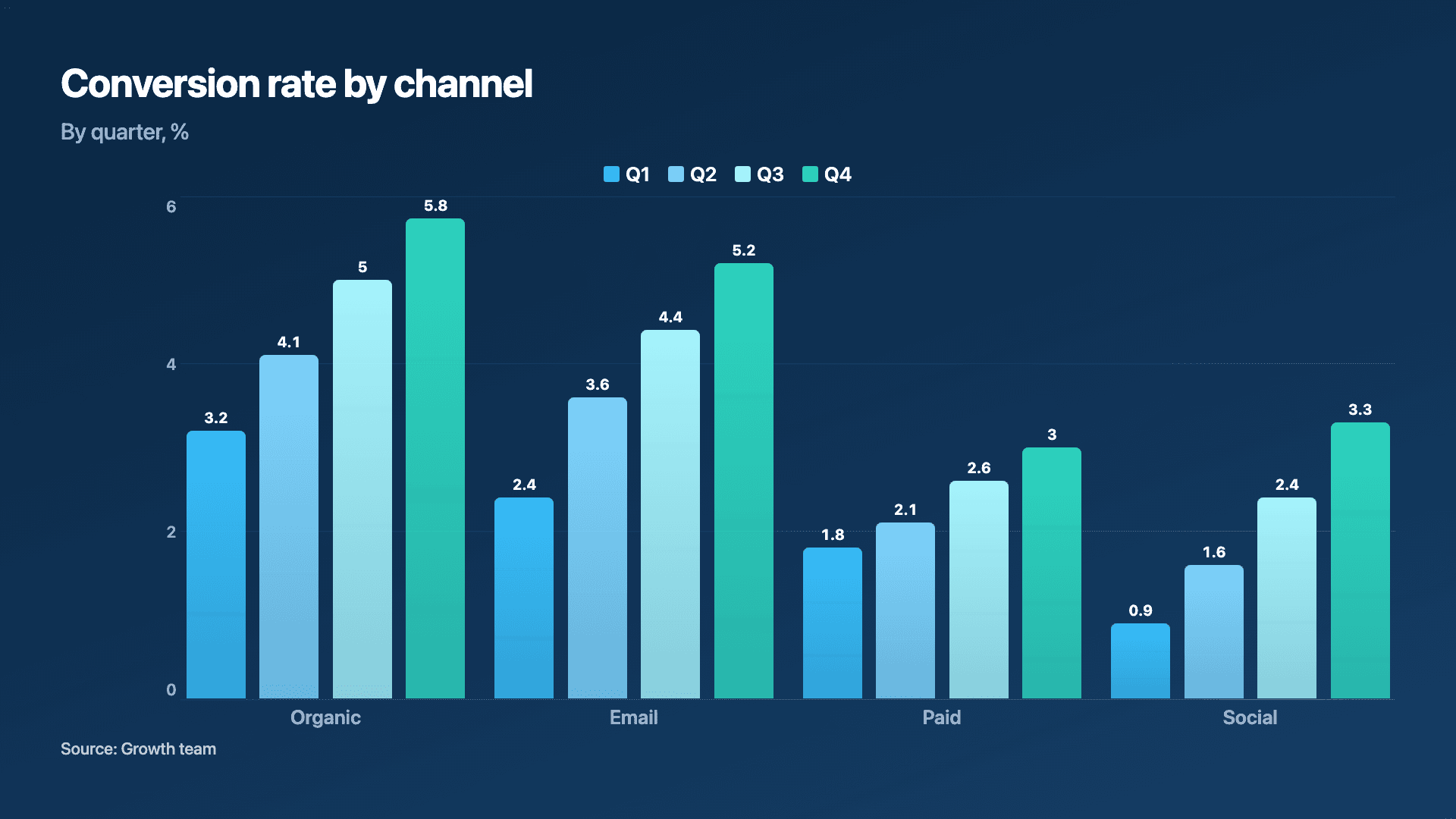
A quarterly business review lives or dies on its charts. The whole point of a QBR is to step back and answer how did the quarter go against plan, and for a room of stakeholders that answer has to be readable in seconds. Comparisons across quarters, target versus actual, and KPI trends are the backbone, and each has a chart that fits it.
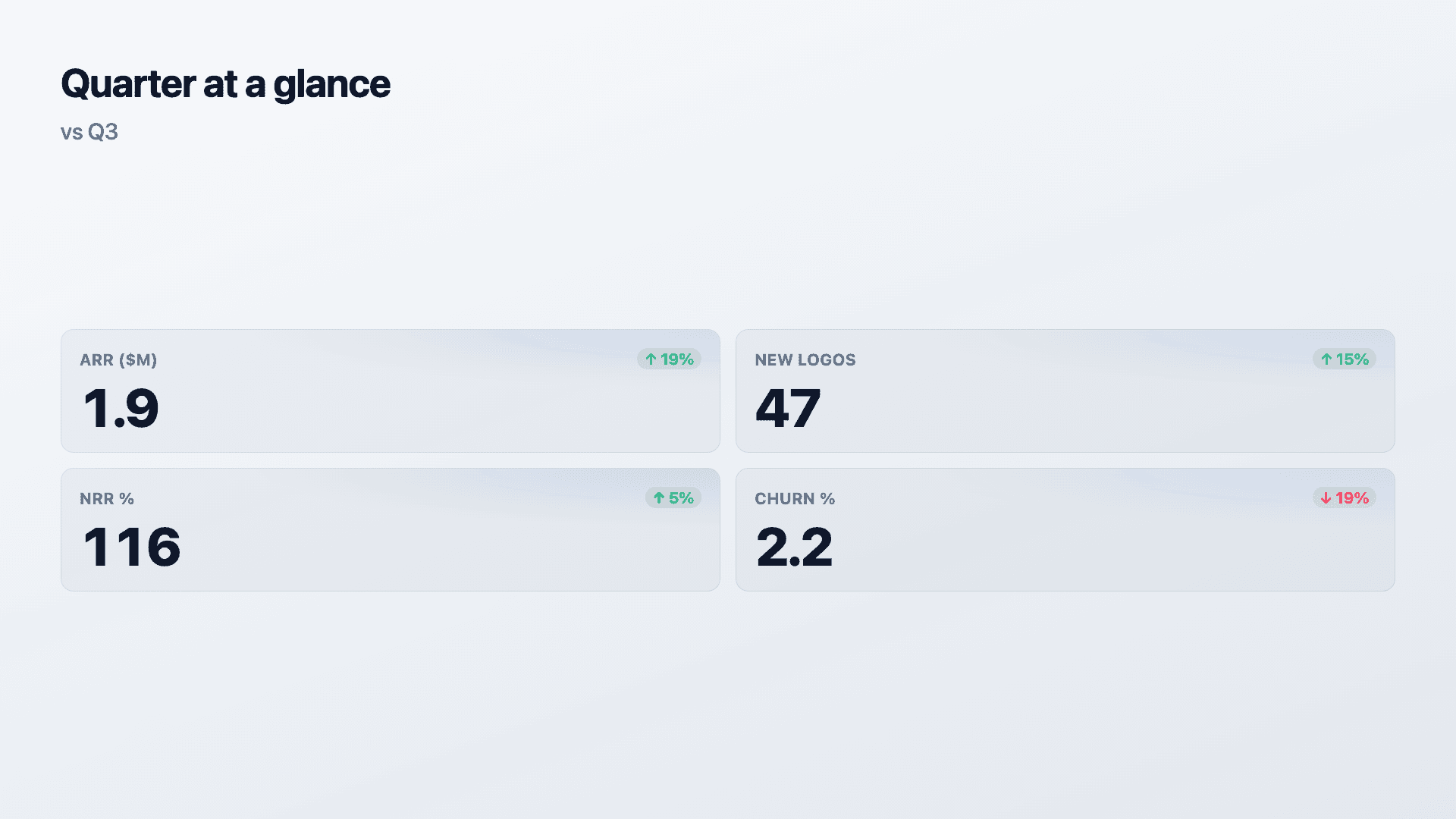
Grouped bars are the workhorse of the QBR: this quarter against last, or actual against target, side by side per metric. A KPI scorecard opens or closes the review with the headline numbers and their direction. A line or area chart carries the trend for the metric that defined the quarter, and a waterfall explains variance when the number missed or beat plan.
Reochart turns your QBR data into polished, on-brand animated charts in minutes, so the review looks as considered as the work behind it. Build them once, export to slides as PNG or to a recap video as MP4, and reuse the format every quarter.
How it works
How to build QBR charts
Map each section to a chart: grouped bars for quarter-over-quarter or target-vs-actual, a scorecard for the KPI summary, a line or area for the headline trend, a waterfall for variance. Enter the data, name the series clearly (the names become the legend), and set your brand palette.
Keep one idea per chart and use the same structure every quarter so stakeholders can compare at a glance. Order quarters left to right and start axes at zero so comparisons are honest.
Examples
Example charts
Real charts made in Reochart, each with its own data and theme. They animate automatically as you scroll.
Good fit
When to use it
- ✓Quarter-over-quarter comparisons
- ✓Target vs actual
- ✓KPI reviews
- ✓Stakeholder and exec decks
- ✓Customer success QBRs
Reach for something else
When not to use it
- ✕You need exact tabular figures, pair the chart with a table.
- ✕A single metric is the whole review, a counter or one chart is enough.
- ✕The data is still moving, wait until the quarter is closed.
- ✕It is a live operational review, a dashboard suits better.
Compare
Which chart to use
Which chart for which QBR section.
| Section | Best chart | Why |
|---|---|---|
| Quarter vs quarter | Grouped bars | Side-by-side per metric |
| Target vs actual | Grouped bars | Two series, one comparison |
| KPI summary | Scorecard | Headline numbers with trends |
| A trend / variance | Line or waterfall | Momentum or what moved it |
Your data
What data you need
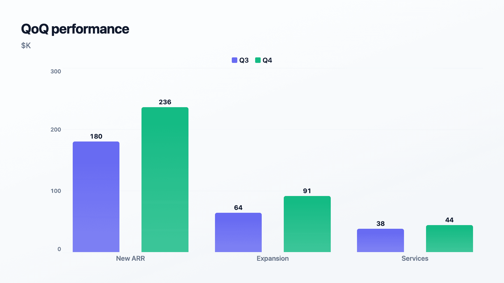
Grouped charts use one row per metric with a column per series (e.g. Q3/Q4 or Target/Actual). Scorecards use current and previous values. Paste or import a CSV.
| Metric | Series A | Series B |
|---|---|---|
| New ARR | 180 | 236 |
| Expansion | 64 | 91 |
| Services | 38 | 44 |
Step by step
How to make one
Drop your numbers in, or import a CSV.
Choose the chart, theme and animation speed.
Tune colours, labels and add your brand.
Download MP4, GIF, PNG or SVG.
Best practices
Get it right
- ✓Use the same chart structure every quarter.
- ✓Name series clearly (Q3/Q4, Target/Actual).
- ✓Order quarters left to right.
- ✓Start axes at zero for honest comparison.
- ✕Change chart styles each quarter so trends are hard to follow.
- ✕Pack several comparisons into one busy chart.
- ✕Truncate axes to flatter a result.
- ✕Omit the target when the review is about hitting plan.
Watch out
Common mistakes to avoid
If every QBR looks different, stakeholders cannot compare quarters. Lock a structure and reuse it.
Cramming three comparisons into one chart makes none of them land. One idea per chart.
A QBR is about performance against plan. Show target alongside actual, or the review loses its anchor.
A truncated axis to make a miss look smaller is quickly spotted in an exec room and costs credibility.
Why Reochart
Built for sharing, not just charting
- ✓No design skills required
- ✓Animated MP4 and GIF exports
- ✓PNG and scalable SVG too
- ✓Your brand colours and logo (Pro)
- ✓Paste from a sheet or import a CSV
- ✓Presentation and feed ready in minutes
FAQ
Frequently asked questions
What is a quarterly business review?
A quarterly business review, or QBR, is a recurring meeting where a team presents the last quarter's performance against what it committed to and sets expectations for the next one. The charts carry most of the weight, because the format's purpose is a shared read on reality rather than a narrative. That means three questions have to be answerable at a glance: what did we say we would do, what actually happened, and what changed compared with last quarter. Grouped bars handle target against actual and quarter over quarter, a line or area chart handles trends across several quarters, and a KPI scorecard handles the summary. Keeping the same charts in the same order each quarter is what makes a QBR deck useful, since stakeholders learn where to look and can compare across quarters.
What charts work best in a QBR?
Grouped bars for quarter-over-quarter and target-vs-actual, a line or area for trends, a scorecard for the KPI summary, and a waterfall for variance.
How do I show target vs actual?
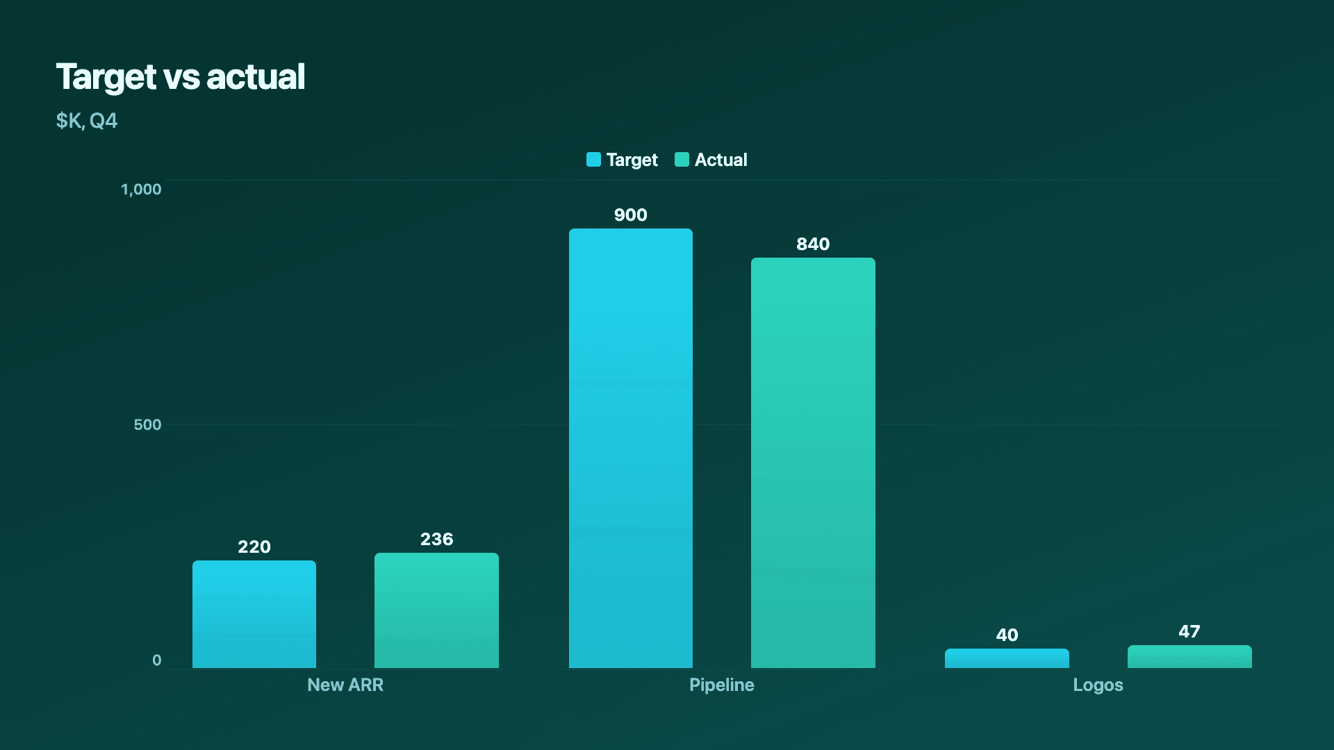
Use grouped bars with two named series, Target and Actual, one cluster per metric, so the gap is obvious at a glance.
How do I keep QBRs comparable?
Use the same chart structure and the same metrics every quarter. Consistency lets stakeholders track progress across reviews.
Can I export to slides?
Yes. Export PNG or SVG for decks, or MP4 and GIF for a recap video, all on your brand on Pro.
Can I make it animated?
Yes. Charts animate by default, and you can export the animation as an MP4 or GIF, or grab a static PNG or SVG if you prefer.
Is Reochart free?
Yes. The free plan lets you make every chart type except the animated bar chart race, and export an animated MP4 with a small watermark, no card needed. Pro adds the bar chart race, removes the watermark, and adds GIF and SVG, your brand colours and logo, longer videos and CSV import.
Keep exploring
Related generators
From the blog
Learn more about charts and data storytelling

11 min read
How to Create an Animated Number Counter
A step-by-step guide to building a number counter that actually lands: picking the number worth this treatment, setting an honest start point, adding the context that makes it mean something, and exporting an animated version for a launch post, a deck, or a milestone update.
Read article →

11 min read
How to Build a QBR Dashboard
A practical guide to building the handful of charts a quarterly business review actually needs: the growth number, the bridge that explains it, the pipeline read, the KPI scorecard, and the roadmap for what's next.
Read article →