Revenue Growth Chart Generator
Show revenue climbing in a chart people actually stop for. Export as PNG, SVG, GIF or MP4.
Free to try · No design skills · Ready in about two minutes
Trusted by 1,198 users, including people at
 ByteDance
 Arizona State
 Fox
Fox UT Austin
 Roche
Roche Tulane
 United Airlines
 Clemson
 NHS
NHS Ayming
 Marquette
 Kent State
 Ray White
 UC Riverside
 CBA
CBA Illinois Tech
 Venngage
 Hofstra
 House of Communication
 IIT Madras
 Sotherly Hotels
 Zenus.ai
Overview
What this tool is for
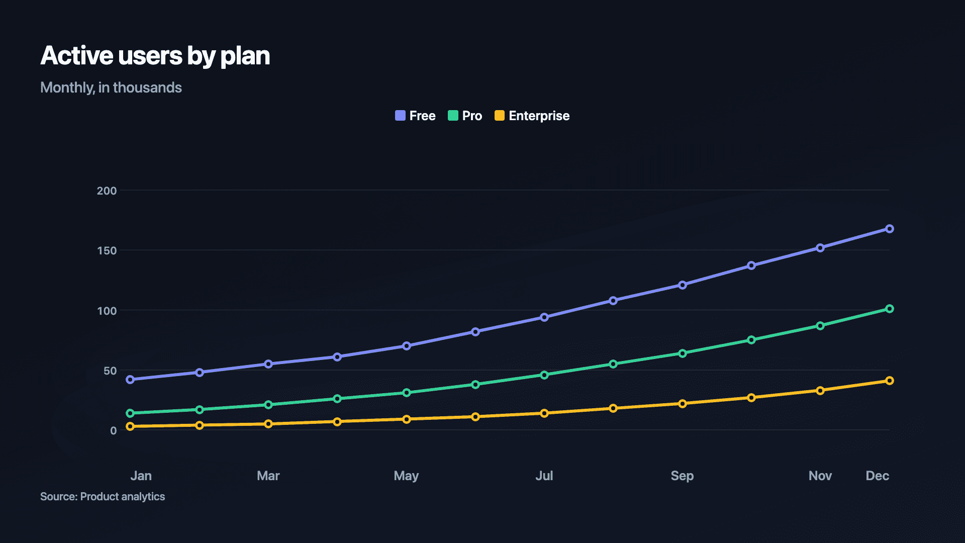
Revenue growth is the headline of almost every update, pitch and recap, and a chart that draws itself on communicates it far better than a row of numbers. The rising line is the proof; the animation is what makes someone stop long enough to read it.
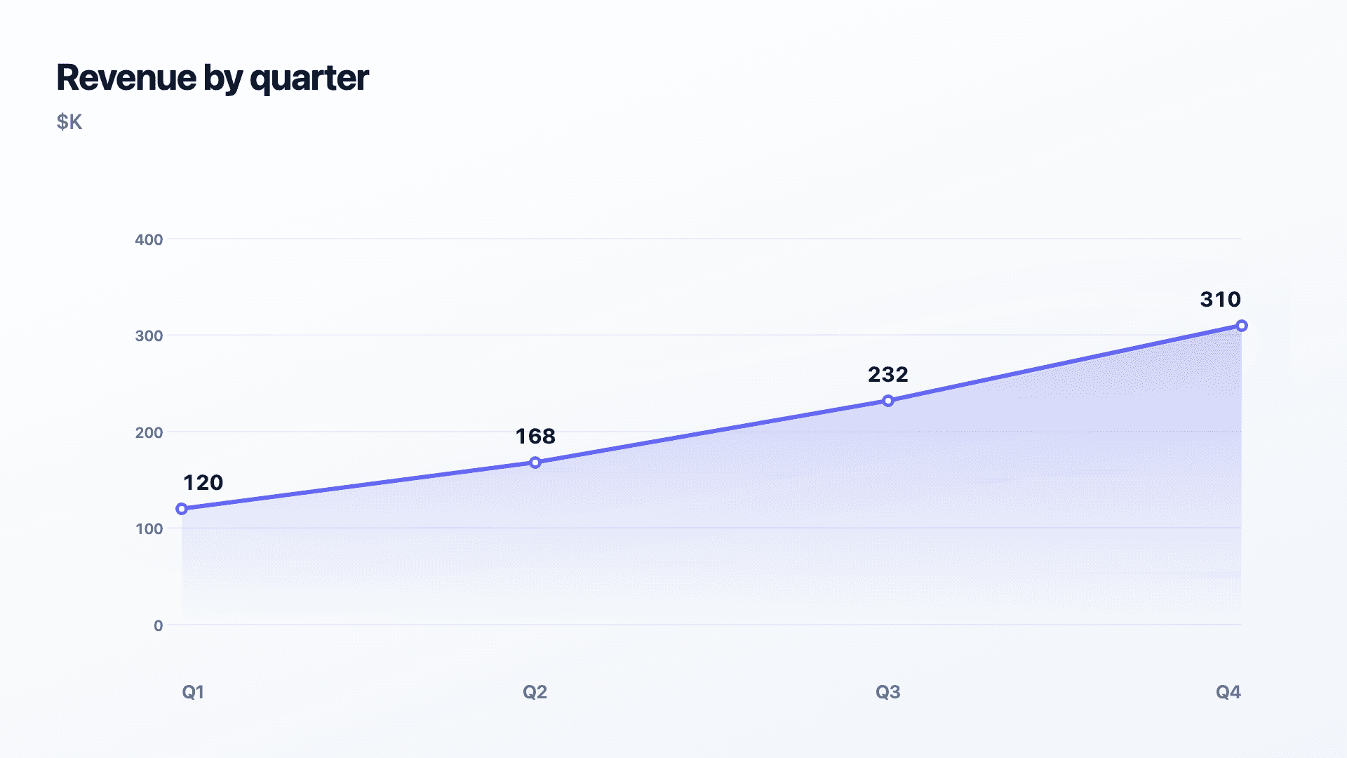
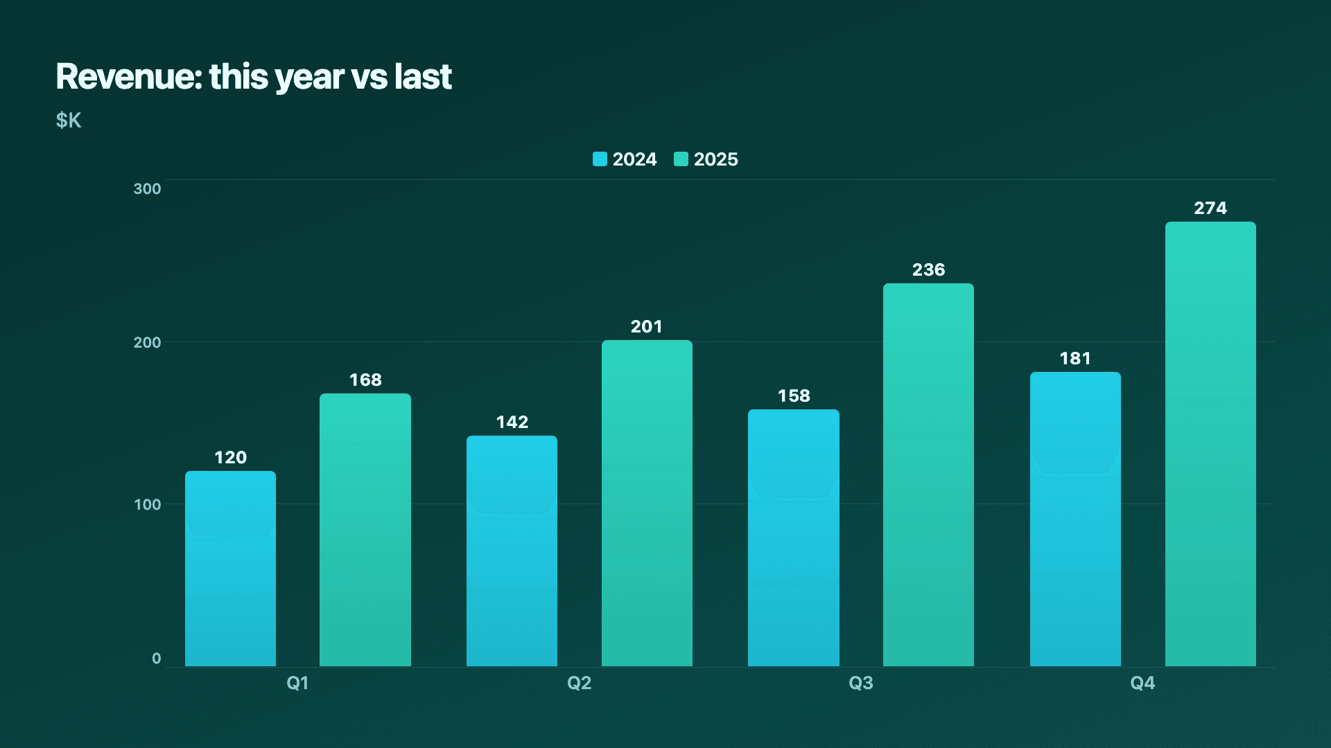
The format follows the message. A line chart is the clean default for revenue by period and for comparing this year to last. An area chart fills under a single line to make the growth feel weightier, ideal for a hero slide. Grouped bars work when you want crisp period-by-period comparison rather than a continuous trend.
Reochart turns your revenue figures into a polished animated chart in minutes, on your brand, ready for a LinkedIn post, an investor update or a board slide. Paste the numbers, pick the style, export the format you need.
How it works
How to make a revenue growth chart
Enter revenue by period, one row per month, quarter or year. Pick a line or area chart for a single trend, or a grouped bar / multi-line to compare this year against last. Reochart animates the chart on and holds the final frame for screenshots.
Keep periods evenly spaced so the slope is honest, start the axis at zero, and label the latest figure. For year-over-year, two clearly named series make the comparison instant.
Examples
Example charts
Real charts made in Reochart, each with its own data and theme. They animate automatically as you scroll.
Good fit
When to use it
- ✓Quarterly or annual revenue updates
- ✓LinkedIn and X growth posts
- ✓Investor and board decks
- ✓Year-over-year comparisons
- ✓Year-in-review recaps
Reach for something else
When not to use it
- ✕You want to show what drove the change, use a waterfall bridge.
- ✕Revenue is flat or down, an area fill overstates it.
- ✕You are showing a single milestone, a counter is punchier.
- ✕Periods are unevenly spaced, the slope will mislead.
Compare
Which chart to use
Which chart for which revenue story.
| Story | Best chart | Why |
|---|---|---|
| A growth trend | Line or area | Continuous climb over time |
| This year vs last | Grouped bars | Crisp period comparison |
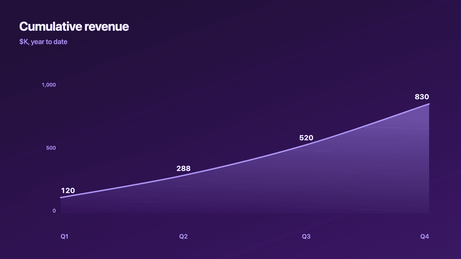
| Total accumulated | Area (cumulative) | Weight of the running total |
| What moved it | Waterfall | New, expansion, churn as steps |
Your data
What data you need
One row per period: a label and revenue. Add a column for a comparison year. Paste from a sheet or import a CSV (Pro).
| Period | Revenue |
|---|---|
| Q1 | 120 |
| Q2 | 168 |
| Q3 | 232 |
| Q4 | 310 |
Step by step
How to make one
Drop your numbers in, or import a CSV.
Choose the chart, theme and animation speed.
Tune colours, labels and add your brand.
Download MP4, GIF, PNG or SVG.
Best practices
Get it right
- ✓Use equal time intervals so the slope is honest.
- ✓Start the axis at zero.
- ✓Name both series clearly for a year-over-year view.
- ✓Label the latest revenue figure.
- ✕Truncate the axis to steepen the line.
- ✕Use an area fill on flat or falling revenue.
- ✕Mix months and quarters on one axis.
- ✕Bury the headline number in the chart.
Watch out
Common mistakes to avoid
Starting the chart at a convenient low point flatters the trend. Show a fair, representative range.
A non-zero baseline exaggerates growth and erodes trust with investors who notice.
If the question is why revenue moved, a line cannot answer it. Use a waterfall to show new, expansion and churn.
Mixing month and quarter spacing distorts the slope. Keep one consistent interval.
Why Reochart
Built for sharing, not just charting
- ✓No design skills required
- ✓Animated MP4 and GIF exports
- ✓PNG and scalable SVG too
- ✓Your brand colours and logo (Pro)
- ✓Paste from a sheet or import a CSV
- ✓Presentation and feed ready in minutes
FAQ
Frequently asked questions
What is a revenue growth chart?
A revenue growth chart plots revenue over successive periods so the trajectory, rather than any single figure, is the message. What matters in reading one is the shape: a steepening curve indicates accelerating growth, a straight line means steady absolute gains but a falling growth rate, and a flattening curve is the pattern investors look hardest for because it signals a ceiling. The format choice follows the story. A line or area chart suits one continuous trend and makes momentum feel substantial; grouped bars suit year-over-year or quarter-over-quarter comparison where the discrete jumps are the point; a counter suits a single milestone. Because the axis baseline determines how dramatic any growth appears, starting it at zero is what keeps the chart honest rather than flattering.
What chart is best for revenue growth?
A line or area chart over time for a single trend, grouped bars for this-year-vs-last, and a waterfall when you want to show what drove the change.
Line or area for revenue?
Area makes a single growth story feel bigger; line is cleaner for comparing periods or several series precisely.
How do I show year-over-year revenue?
Use grouped bars or a multi-line chart with two named series, this year and last, so the comparison reads at a glance.
What can I export?
MP4 and GIF for social feeds, PNG for slides, and SVG for the web, all on your brand on Pro.
Can I make it animated?
Yes. Charts animate by default, and you can export the animation as an MP4 or GIF, or grab a static PNG or SVG if you prefer.
Can I export as SVG?
Yes. Pro exports a crisp, scalable SVG vector, alongside MP4, GIF and PNG. Every export renders at 1080p.
Is Reochart free?
Yes. The free plan lets you make every chart type except the animated bar chart race, and export an animated MP4 with a small watermark, no card needed. Pro adds the bar chart race, removes the watermark, and adds GIF and SVG, your brand colours and logo, longer videos and CSV import.
Keep exploring
Related generators
From the blog
Learn more about charts and data storytelling

11 min read
How to Create an Animated Number Counter
A step-by-step guide to building a number counter that actually lands: picking the number worth this treatment, setting an honest start point, adding the context that makes it mean something, and exporting an animated version for a launch post, a deck, or a milestone update.
Read article →

11 min read
How to Build a QBR Dashboard
A practical guide to building the handful of charts a quarterly business review actually needs: the growth number, the bridge that explains it, the pipeline read, the KPI scorecard, and the roadmap for what's next.
Read article →