Animated Timeline Generator
Watch your milestones animate onto the line one by one, built for a video, a deck, or a social post, not a static poster. Export as MP4, GIF, PNG, or SVG.
Free to try · No design skills · Ready in about two minutes
Trusted by 1,198 users, including people at
 ByteDance
 Arizona State
 Fox
Fox UT Austin
 Roche
Roche Tulane
 United Airlines
 Clemson
 NHS
NHS Ayming
 Marquette
 Kent State
 Ray White
 UC Riverside
 CBA
CBA Illinois Tech
 Venngage
 Hofstra
 House of Communication
 IIT Madras
 Sotherly Hotels
 Zenus.ai
Overview
An animated timeline, not a static one
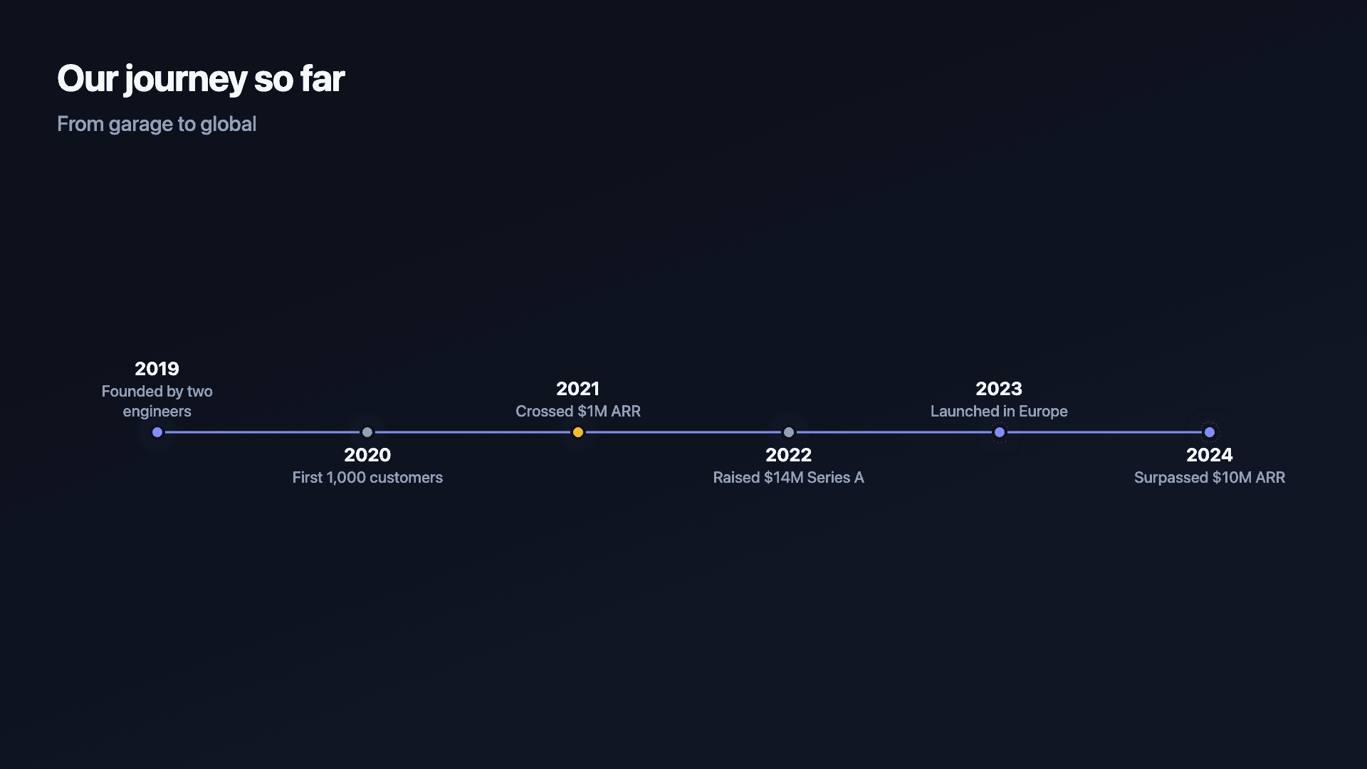
Most timeline tools give you a static image, a row of dots and dates you screenshot into a deck. This one animates each milestone onto the line in turn, so a company's history, a product's milestones, or a launch plan plays out as a short video or GIF instead of sitting flat on a page. If you need something to hold attention in a pitch deck, an investor update, or a LinkedIn post, the motion is the point, not an afterthought.
A timeline places events in order along a line, turning a list of dates into a sequence a reader can follow: a company's milestones, a fundraising path, a product's history. The order and the spacing carry the story. What's different here is how that story gets delivered, animated rather than printed.
That's the difference between a timeline someone glances at once and one they actually watch through to the end.
How it works
How a timeline works
Each milestone has a date or label and a short description, and they are laid out in order along a line so the eye travels through the sequence. Even spacing reads as a steady cadence; the labels do the explaining.
Keep descriptions short, a few words each, so the line stays scannable. A timeline is a summary, not a paragraph.
Examples
Example timelines
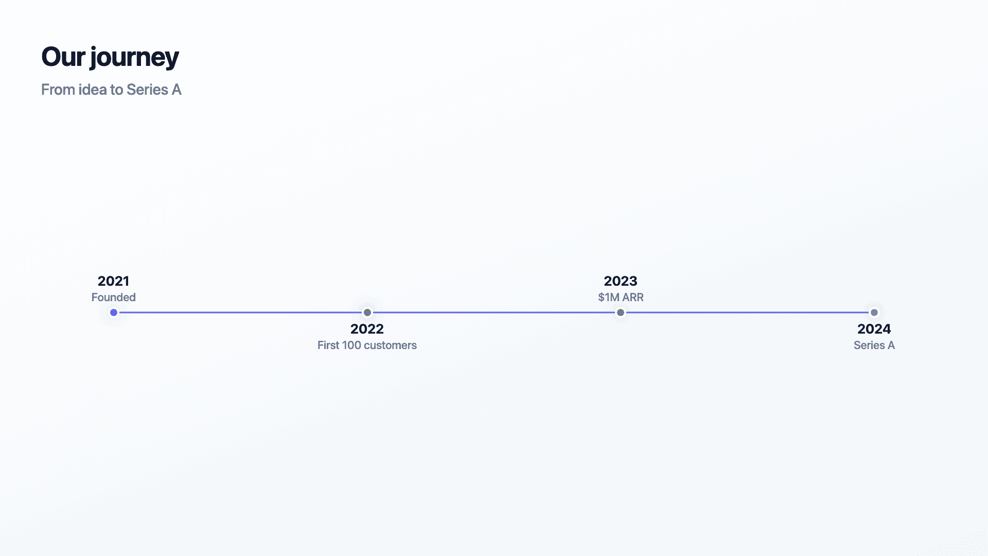
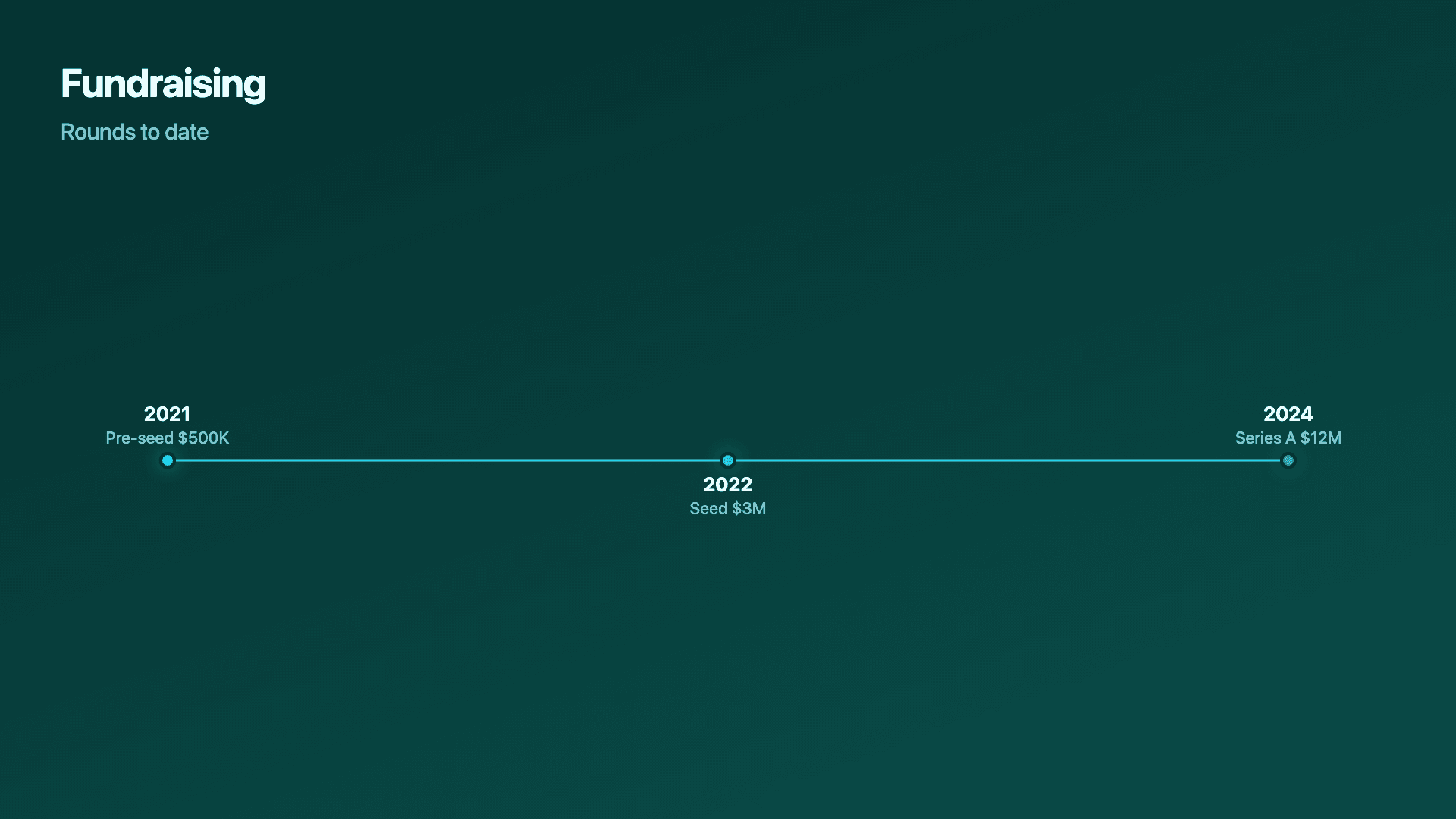
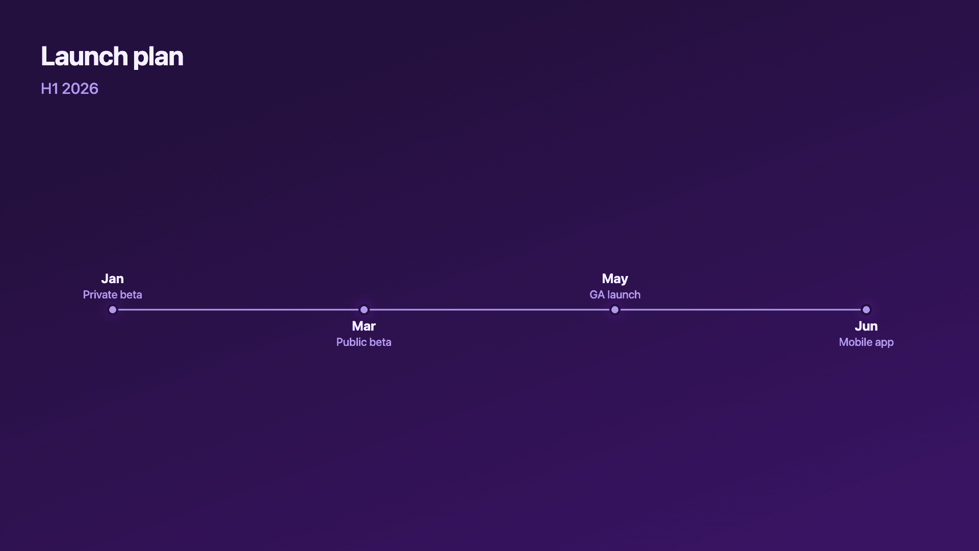
Real charts made in Reochart, each with its own data and theme. They animate automatically as you scroll.
Good fit
When to use a timeline
- ✓Company or product milestones
- ✓Fundraising history
- ✓A launch or rollout plan
- ✓A project or customer journey
- ✓A year-in-review recap
Reach for something else
When not to use a timeline
- ✕You are showing a quantity changing over time, use a line or area chart.
- ✕You have work grouped into lanes or phases, a roadmap fits better.
- ✕You have dozens of events, a timeline gets cramped; summarise the key ones.
- ✕The order does not matter, then it is just a list, not a timeline.
Compare
Timeline vs other charts
Timeline vs the alternatives.
| Visual | Best for | Avoid when |
|---|---|---|
| Timeline | Events in chronological order | Quantities changing over time |
| Roadmap | Plans grouped into lanes/phases | A simple linear history |
| Line chart | A metric trending over time | Discrete events with no value |
| Counter | A single headline number | A sequence of milestones |
Your data
What data you need
One row per milestone: a date or label and a short event description. Paste from a sheet or import a CSV. 4 to 8 milestones reads best.
| Date | Event |
|---|---|
| 2021 | Founded |
| 2022 | First 100 customers |
| 2023 | $1M ARR |
| 2024 | Series A |
Step by step
How to make a timeline
Drop your numbers in, or import a CSV.
Choose the chart, theme and animation speed.
Tune colours, labels and add your brand.
Download MP4, GIF, PNG or SVG.
Best practices
Get it right
- ✓Order milestones chronologically.
- ✓Keep each description to a few words.
- ✓Show the milestones that matter, not every event.
- ✓Use consistent date formats across the line.
- ✕Write full sentences on each point.
- ✕Cram in dozens of events until the line is unreadable.
- ✕Mix wildly different time scales without making it clear.
- ✕Use a timeline for a quantity that should be a line chart.
Watch out
Common mistakes to avoid
Long descriptions clutter the line. Keep each milestone to a few words; the timeline is a summary.
Show the key moments, not every event, or the line becomes unreadable.
If you are tracking a number over time, that is a line chart, not a timeline.
Mixing formats (2021, Q1, 'last spring') makes the sequence confusing. Pick one.
Why Reochart
Built for sharing, not just charting
- ✓No design skills required
- ✓Animated MP4 and GIF exports
- ✓PNG and scalable SVG too
- ✓Your brand colours and logo (Pro)
- ✓Paste from a sheet or import a CSV
- ✓Presentation and feed ready in minutes
FAQ
Frequently asked questions
What is a timeline?
A timeline is a visual that arranges events in chronological order along a single line, turning a list of dates into a sequence a reader can follow. Each entry carries a date or period label and a short description, and the spacing between them communicates pace: milestones clustered together read as a burst of activity, wide gaps read as a quiet stretch. Timelines are the standard way to present a company's history, a fundraising path, a product's release milestones or a launch plan, because the format does the ordering work for the reader instead of asking them to reconstruct it from a bulleted list. What separates an animated timeline from a static one is delivery. When each milestone arrives on the line in turn, the audience watches the story build rather than scanning a finished picture, which is why animated timelines hold attention in decks, videos and social posts.
What's the difference between a “timeline maker” and a “timeline generator”?
No difference, they're the same tool. This page builds an animated timeline whether you searched for a timeline maker, a timeline generator, a timeline creator or a chronology chart. All of them describe the same output: events plotted in date order along a line, exported as a video or an image.
What do I need to make one?
A date or label and a short description for each milestone. Paste them from a sheet or import a CSV.
Timeline or roadmap?
A timeline is a single chronological line of events. A roadmap groups work into lanes or phases (like Now / Next / Later). Reochart makes both.
How many milestones should it have?
Four to eight keeps it clean and scannable. Show the moments that matter rather than every event.
Can I make it animated?
Yes. Charts animate by default, and you can export the animation as an MP4 or GIF, or grab a static PNG or SVG if you prefer.
Can I export as SVG?
Yes. Pro exports a crisp, scalable SVG vector, alongside MP4, GIF and PNG. Every export renders at 1080p.
Is Reochart free?
Yes. The free plan lets you make every chart type except the animated bar chart race, and export an animated MP4 with a small watermark, no card needed. Pro adds the bar chart race, removes the watermark, and adds GIF and SVG, your brand colours and logo, longer videos and CSV import.
Keep exploring
Related generators
From the blog
Learn more about charts and data storytelling

11 min read
How to Create an Animated Number Counter
A step-by-step guide to building a number counter that actually lands: picking the number worth this treatment, setting an honest start point, adding the context that makes it mean something, and exporting an animated version for a launch post, a deck, or a milestone update.
Read article →

11 min read
How to Build a QBR Dashboard
A practical guide to building the handful of charts a quarterly business review actually needs: the growth number, the bridge that explains it, the pipeline read, the KPI scorecard, and the roadmap for what's next.
Read article →