SaaS Dashboard Chart Generator
Make dashboard-style charts to share, not just view. Export as PNG, SVG, GIF or MP4.
Free to try · No design skills · Ready in about two minutes
Trusted by 1,198 users, including people at
 ByteDance
 Arizona State
 Fox
Fox UT Austin
 Roche
Roche Tulane
 United Airlines
 Clemson
 NHS
NHS Ayming
 Marquette
 Kent State
 Ray White
 UC Riverside
 CBA
CBA Illinois Tech
 Venngage
 Hofstra
 House of Communication
 IIT Madras
 Sotherly Hotels
 Zenus.ai
Overview
What this tool is for
Your SaaS dashboard lives behind a login, built for monitoring, not for sharing. The moment you want to put those numbers in front of someone, an investor update, a customer review, a marketing report, a screenshot of your analytics tool looks cluttered, off-brand and often leaks more than you intended.
A share-ready chart is a different artefact from a monitoring tile. It shows the one or few numbers that matter for this audience, on your brand, with the noise stripped out. The dashboard's job is to surface everything; the shared chart's job is to communicate one thing clearly.
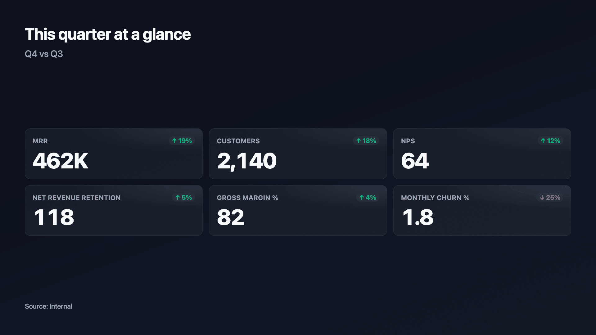
Reochart recreates the key dashboard tiles, KPI scorecards, growth lines, conversion funnels, as polished, animated, on-brand charts you can export and drop anywhere. Pull the numbers, pick the tile, and you have a visual that looks designed rather than dumped.
How it works
How to make share-ready dashboard charts
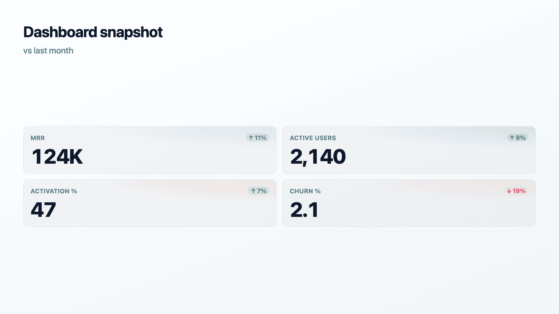
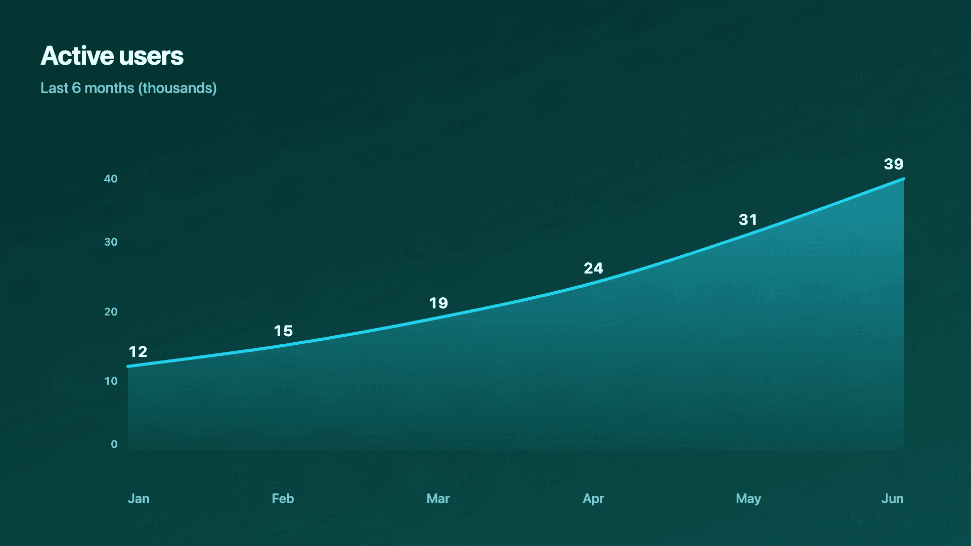
Pick the tiles worth sharing and rebuild them clean: a KPI scorecard for the headline numbers with trends, a line or area chart for a growth metric, a funnel for conversion. Enter the current figures (and previous values for trend arrows), set your brand colours, and export.
Resist recreating the whole dashboard. Choose the few tiles this audience cares about so the result communicates rather than overwhelms, then export a PNG for a deck or an MP4 for a post.
Examples
Example charts
Real charts made in Reochart, each with its own data and theme. They animate automatically as you scroll.

Good fit
When to use it
- ✓Sharing dashboard numbers externally
- ✓Investor and customer updates
- ✓Marketing and growth reports
- ✓Slides and one-pagers
- ✓A monthly metrics email
Reach for something else
When not to use it
- ✕You need a live, auto-updating view, that is your dashboard tool's job.
- ✕You want to monitor dozens of metrics, keep that in the dashboard.
- ✕The data is sensitive, double-check before sharing externally.
- ✕One number is the whole story, a counter beats a full tile set.
Compare
Which chart to use
Dashboard tile vs share-ready chart.
| Tile | Best chart | Why |
|---|---|---|
| Headline KPIs | Scorecard | Several metrics with trends |
| A growth metric | Line or area | Tells the trend cleanly |
| Conversion | Funnel | Drop-off across the journey |
| A single milestone | Number counter | One figure, full impact |
Your data
What data you need
For a scorecard, one row per metric with current and previous values. Growth and funnel tiles use label-and-value rows. Paste or import a CSV.
| Metric | Current | Previous |
|---|---|---|
| MRR | 124000 | 112000 |
| Active users | 2140 | 1980 |
| Activation % | 47 | 44 |
Step by step
How to make one
Drop your numbers in, or import a CSV.
Choose the chart, theme and animation speed.
Tune colours, labels and add your brand.
Download MP4, GIF, PNG or SVG.
Best practices
Get it right
- ✓Rebuild only the tiles this audience cares about.
- ✓Add previous values so trend arrows show.
- ✓Use your brand colours so it looks like yours.
- ✓Strip the monitoring noise; keep the message.
- ✕Recreate your entire dashboard in one graphic.
- ✕Screenshot your analytics tool and call it done.
- ✕Share sensitive internal numbers without checking.
- ✕Mix units across tiles without labelling them.
Watch out
Common mistakes to avoid
A monitoring view has dozens of tiles for a reason; an external audience needs three or four. Curate hard.
A screenshot of your analytics tool is off-brand and cluttered, and can leak data you did not mean to share. Rebuild clean.
A dashboard number out of context can mislead. Include the previous period so the direction reads.
You are not rebuilding the tool, you are communicating a point. Drop everything that does not serve it.
Why Reochart
Built for sharing, not just charting
- ✓No design skills required
- ✓Animated MP4 and GIF exports
- ✓PNG and scalable SVG too
- ✓Your brand colours and logo (Pro)
- ✓Paste from a sheet or import a CSV
- ✓Presentation and feed ready in minutes
FAQ
Frequently asked questions
What is a SaaS dashboard chart?
A SaaS dashboard chart is a share-ready version of the tiles a team normally watches behind a login: MRR and ARR, active users, churn, conversion, net revenue retention. The distinction that matters is purpose. A monitoring dashboard is built for the operator, so it shows everything at once and updates continuously, which is exactly the wrong shape for an audience seeing the numbers for the first time. A dashboard chart made for sharing does the opposite, showing the few metrics this particular reader needs, on brand, with the internal clutter and anything sensitive stripped out. That is why a rebuilt chart beats a screenshot for an investor update, a customer review or a marketing report, even though the underlying numbers are identical, and why a scorecard usually carries the summary with one chart beneath it.
Why not just screenshot my dashboard?
Screenshots are cluttered, off-brand, and can leak data you did not mean to share. A rebuilt chart shows only what matters, on your brand.
Which tiles should I rebuild?
Just the few this audience cares about: a KPI scorecard for headlines, a line or area for a growth metric, a funnel for conversion.
Can I match my brand?
Yes. On Pro you can set your brand colours and add your logo so every chart looks like yours.
Is this a live dashboard?
No, it makes share-ready charts you export. For live, auto-updating monitoring, keep using your dashboard tool.
Can I make it animated?
Yes. Charts animate by default, and you can export the animation as an MP4 or GIF, or grab a static PNG or SVG if you prefer.
Is Reochart free?
Yes. The free plan lets you make every chart type except the animated bar chart race, and export an animated MP4 with a small watermark, no card needed. Pro adds the bar chart race, removes the watermark, and adds GIF and SVG, your brand colours and logo, longer videos and CSV import.
Keep exploring
Related generators
From the blog
Learn more about charts and data storytelling

11 min read
How to Create an Animated Number Counter
A step-by-step guide to building a number counter that actually lands: picking the number worth this treatment, setting an honest start point, adding the context that makes it mean something, and exporting an animated version for a launch post, a deck, or a milestone update.
Read article →

11 min read
How to Build a QBR Dashboard
A practical guide to building the handful of charts a quarterly business review actually needs: the growth number, the bridge that explains it, the pipeline read, the KPI scorecard, and the roadmap for what's next.
Read article →