Animated Bar Chart Generator
Create professional animated bar charts from spreadsheet data. Export as PNG, SVG, GIF or MP4, no design skills needed.
Free to try · No design skills · Ready in about two minutes
Trusted by 1,198 users, including people at
 ByteDance
 Arizona State
 Fox
Fox UT Austin
 Roche
Roche Tulane
 United Airlines
 Clemson
 NHS
NHS Ayming
 Marquette
 Kent State
 Ray White
 UC Riverside
 CBA
CBA Illinois Tech
 Venngage
 Hofstra
 House of Communication
 IIT Madras
 Sotherly Hotels
 Zenus.ai
Overview
What is a bar chart?
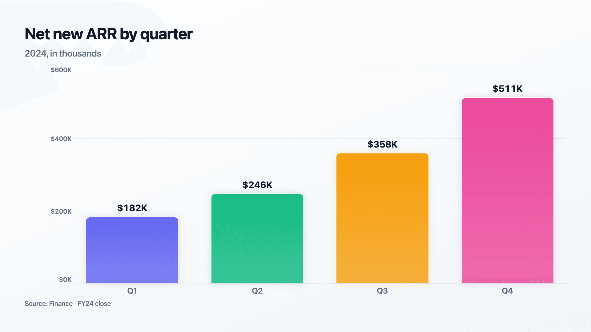
A bar chart is the most direct way to compare a value across a set of categories. Each category gets its own bar, and because bar length is proportional to the number, the comparison is read instantly, the eye simply measures which bar is longer. That immediacy is why the bar chart is the most widely used chart in business: quarterly results, sales by region, traffic by channel, survey answers, almost anything categorical.
Its strength is also its boundary. A bar chart is built for comparing distinct, separate categories, not for showing how a single value changes smoothly over continuous time, which is a line chart's job. The moment your categories become time periods you want to read as a flow rather than a comparison, reach for a line or area chart instead.
Where Reochart differs from a static spreadsheet chart is motion and polish. The bars animate up from zero, which does two things: it draws the eye in a busy feed, and it lets the tallest bar arrive last so it reads as the headline. You can drop the result straight into a LinkedIn post, a deck or an investor update, and export it as an MP4, GIF, PNG or SVG, with your own brand colours and logo on Pro.
How it works
How a bar chart works
A bar chart has a categorical axis (your labels) and a value axis (the numbers). Each category is drawn as a bar whose length maps to its value against that scale, so a bar that is twice as long represents twice the value.
The single most important rule is that the value axis must start at zero. Because we judge bars by length, starting the axis anywhere else visually distorts the comparison, a small real difference can be made to look enormous. Reochart always baselines bars at zero so your chart stays honest.
Examples
Example bar charts
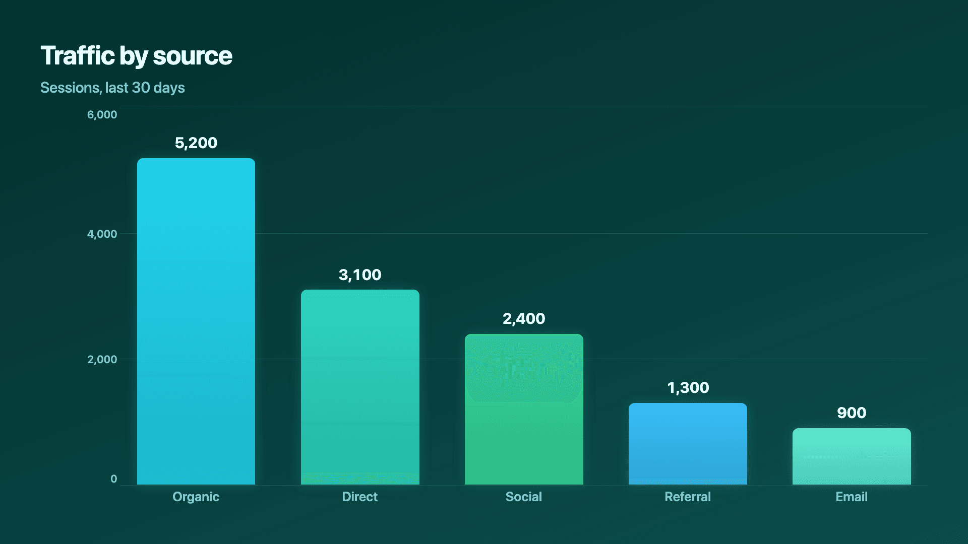
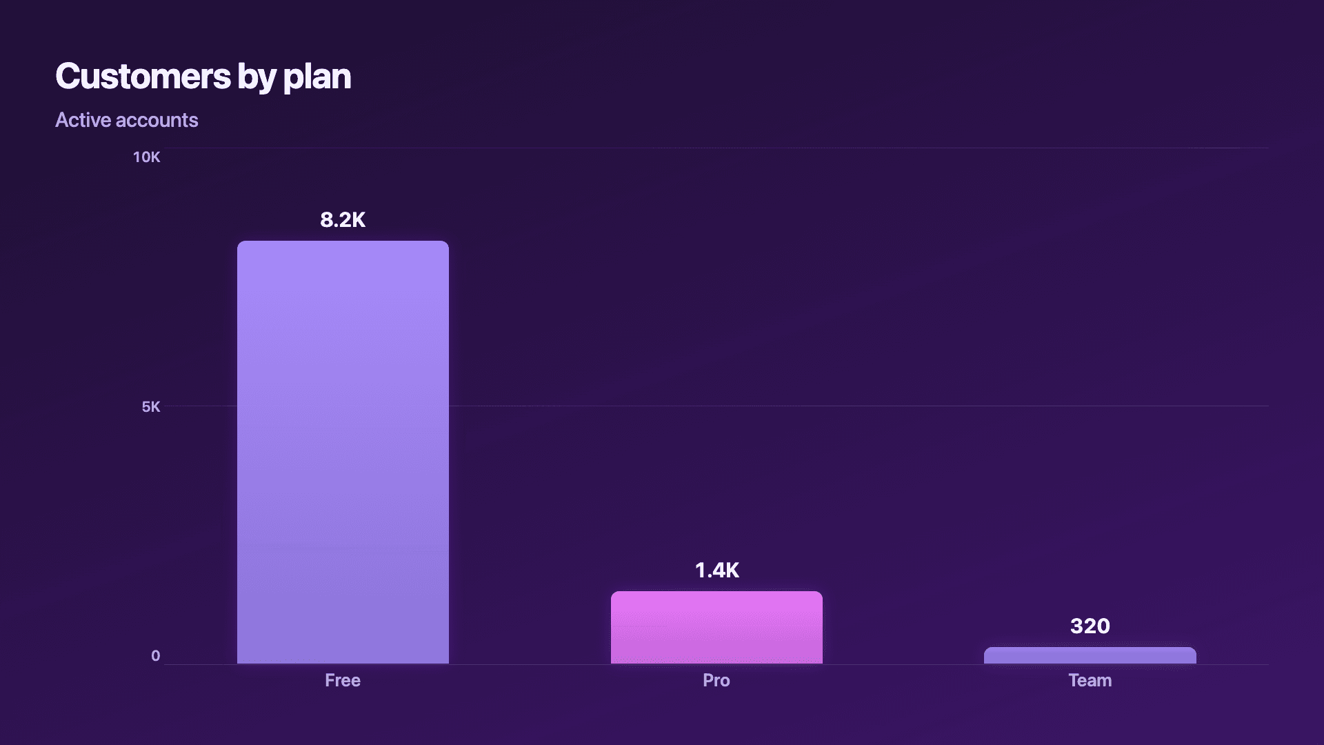
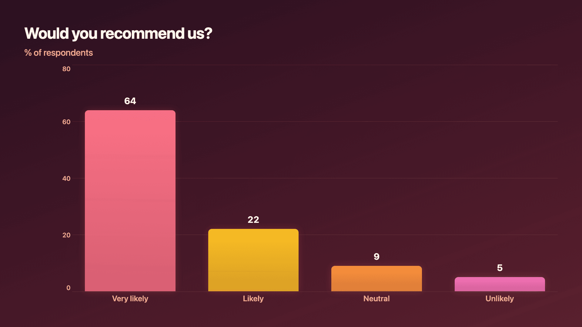
Real charts made in Reochart, each with its own data and theme. They animate automatically as you scroll.
Good fit
When to use a bar chart
- ✓Revenue or results by quarter
- ✓Sales or revenue by region
- ✓Website traffic by source
- ✓Customer count by plan
- ✓Survey or poll results
- ✓Any comparison across a few categories
Reach for something else
When not to use a bar chart
- ✕You are showing change over continuous time, use a line or area chart so the trend reads as a flow.
- ✕You have one total split into parts of a whole, a donut chart shows share more naturally.
- ✕You have more than about ten categories, the bars get cramped; rank and trim, or switch to a horizontal bar.
- ✕You need to compare two series within each category, use a grouped or stacked bar instead.
Compare
Bar chart vs other charts
Bar chart vs the alternatives, at a glance.
| Chart type | Best for | Avoid when |
|---|---|---|
| Bar / column | Comparing values across categories | Showing a trend over continuous time |
| Horizontal bar | Rankings and long category names | Time series |
| Line / area | A metric changing over time | Comparing unrelated categories |
| Grouped bar | Comparing 2-5 series per category | A single value per category |
| Stacked bar | A total and its composition | Comparing the inner segments precisely |
| Diverging bars | Signed values, both gains and losses | All your values are positive |
| Donut | Parts of one whole (a few slices) | Comparing many categories accurately |
Your data
What data you need
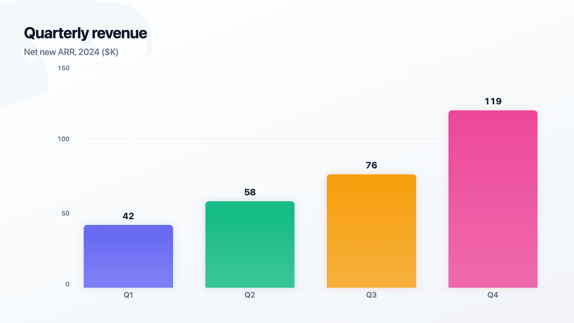
One row per bar: a category label and a number. Paste it straight from Excel or Google Sheets, or import a CSV. 3 to 8 rows reads best.
| Label | Value |
|---|---|
| Q1 | 42 |
| Q2 | 58 |
| Q3 | 76 |
| Q4 | 119 |
Step by step
How to make a bar chart
Drop your numbers in, or import a CSV.
Choose the chart, theme and animation speed.
Tune colours, labels and add your brand.
Download MP4, GIF, PNG or SVG.
Best practices
Get it right
- ✓Start the value axis at zero so bar lengths are truthful.
- ✓Sort bars by value when there is no natural order (skip this for time).
- ✓Keep to 3-8 bars for a punchy, scannable chart.
- ✓Label values directly so no one has to read off an axis.
- ✓Use one colour, and highlight a single bar only to make a point.
- ✕Truncate or zoom the axis, it exaggerates small differences.
- ✕Give every bar a different colour when the categories are equal.
- ✕Cram 15+ categories into a single chart.
- ✕Rotate labels vertical to fit; use a horizontal bar instead.
Watch out
Common mistakes to avoid
Starting bars above zero can make a 5% gap look like 50%. Always baseline at zero.
Past 8-10 categories the chart becomes a fence. Show the top few, or use a ranked horizontal bar.
A rainbow of bars implies the categories carry meaning they do not. One colour, one highlight.
With no natural order (like time), sort by value so the ranking is instant.
Why Reochart
Built for sharing, not just charting
- ✓No design skills required
- ✓Animated MP4 and GIF exports
- ✓PNG and scalable SVG too
- ✓Your brand colours and logo (Pro)
- ✓Paste from a sheet or import a CSV
- ✓Presentation and feed ready in minutes
FAQ
Frequently asked questions
What is a bar chart?
A bar chart is a data visualisation that uses rectangular bars to compare a numerical value across a set of categories. Each bar grows from a shared zero baseline, and the bar's length — or height if the bars are vertical — is directly proportional to its value, so the relative differences are visible at a glance without any mental arithmetic. Bar charts work best for comparing things that are distinct and unordered: product revenue by region, monthly sign-ups by channel, survey responses by option. They are the most widely understood chart type in business, which means your audience rarely needs to be taught how to read one. When categories have long labels or you want a ranked top-N list, switch to a horizontal bar layout so the labels have room to breathe.
What is the difference between a bar chart and a column chart?
They are the same idea. Strictly, a 'column chart' has vertical bars and a 'bar chart' has horizontal ones, but in everyday use the terms are interchangeable. Reochart offers both vertical and horizontal layouts.
When should I use a bar chart instead of a line chart?
Use a bar chart when your categories are discrete and unordered — different products, different regions, different teams. The bar's length makes it easy to compare magnitudes side by side, and there is no implied relationship between adjacent bars. Use a line chart when the x-axis is continuous time and the direction of change matters as much as the values — monthly revenue, weekly active users, daily sign-ups. The connected line communicates that each point leads to the next, which a bar chart does not. A common mistake is using a line chart for non-time categories ("satisfaction score by department"), which implies a trend or movement between departments that does not exist. When in doubt: categories → bar, time → line.
How many bars should a bar chart have?
Three to eight is the sweet spot. Beyond about ten, bars get cramped and hard to compare, so rank them and show the top few, or use a horizontal bar chart.
Should a bar chart start at zero?
Yes. Because we read bars by length, a non-zero baseline distorts the comparison. Reochart always starts the value axis at zero.
Can I make an animated bar chart?
Yes. Bars animate up from zero by default, and you can export the animation as an MP4 or GIF, or a static PNG or SVG.
How do I make a bar chart from a spreadsheet or CSV?
Paste your label-and-value rows straight from Excel or Google Sheets, or import a CSV (Pro). Reochart maps the columns automatically.
Can I export as SVG?
Yes. Pro exports a crisp, scalable SVG vector, alongside MP4, GIF and PNG. Every export renders at 1080p.
Can I use my own brand colours and logo?
On Pro, yes. Set a brand palette and add a logo that replaces the watermark on every export.
Is Reochart free?
Yes. The free plan lets you make every chart type except the animated bar chart race, and export an animated MP4 with a small watermark, no card needed. Pro adds the bar chart race, removes the watermark, and adds GIF and SVG, your brand colours and logo, longer videos and CSV import.
From the blog
Learn more about charts and data storytelling

11 min read
How to Create an Animated Number Counter
A step-by-step guide to building a number counter that actually lands: picking the number worth this treatment, setting an honest start point, adding the context that makes it mean something, and exporting an animated version for a launch post, a deck, or a milestone update.
Read article →

11 min read
How to Build a QBR Dashboard
A practical guide to building the handful of charts a quarterly business review actually needs: the growth number, the bridge that explains it, the pipeline read, the KPI scorecard, and the roadmap for what's next.
Read article →