Animated Waterfall Chart Generator
Show what moved a number up and down. Export as PNG, SVG, GIF or MP4.
Free to try · No design skills · Ready in about two minutes
Trusted by 1,198 users, including people at
 ByteDance
 Arizona State
 Fox
Fox UT Austin
 Roche
Roche Tulane
 United Airlines
 Clemson
 NHS
NHS Ayming
 Marquette
 Kent State
 Ray White
 UC Riverside
 CBA
CBA Illinois Tech
 Venngage
 Hofstra
 House of Communication
 IIT Madras
 Sotherly Hotels
 Zenus.ai
Overview
What is a waterfall chart?
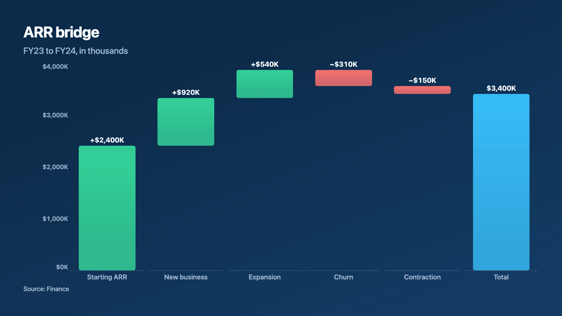
A waterfall chart explains how a starting number becomes an ending number by showing each change along the way as a floating bar that adds to or subtracts from the running total. It is the clearest answer to the question every finance and ops review asks: what actually moved the number?
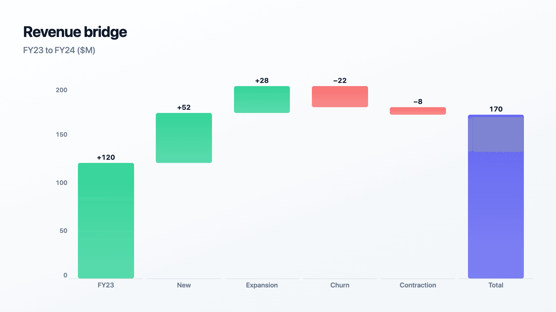
The format earns its keep when a single net figure hides a more interesting story. 'MRR grew by $30K' is fine; a waterfall that shows +52 new, +28 expansion, then minus 22 churn and minus 8 contraction tells you where the growth came from and what is dragging on it. The floating bars make gains and losses instantly distinguishable, usually by colour.
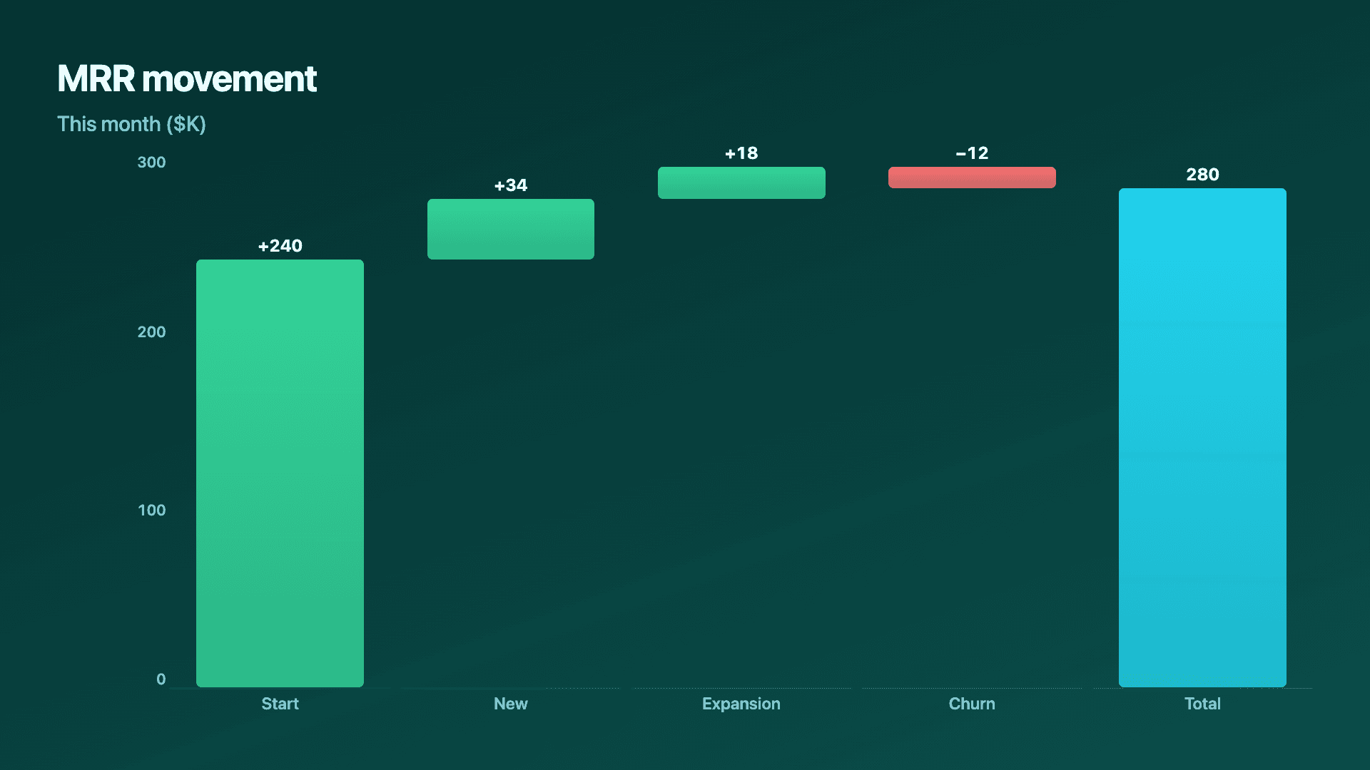
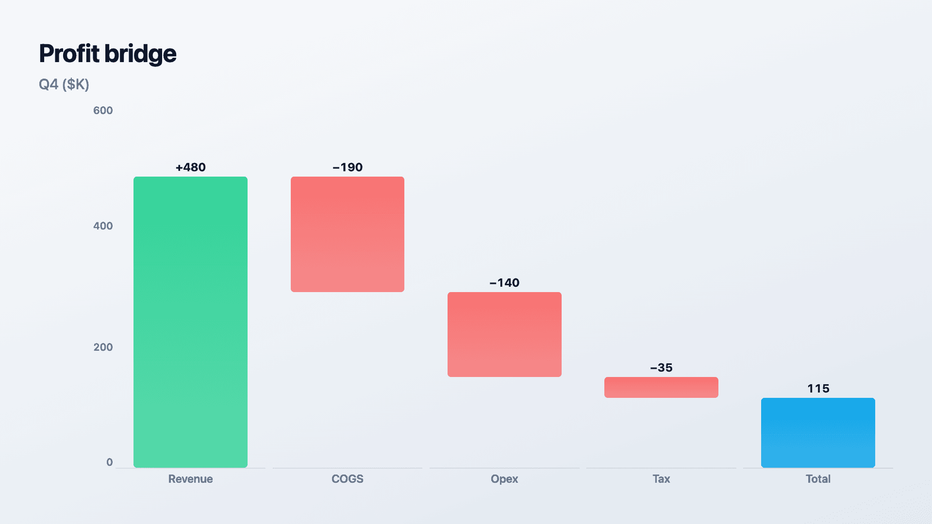
Reochart animates each step rising or dropping into place, so a profit bridge or a month-over-month movement builds in front of the viewer rather than landing all at once. Enter the start, the changes (negative for decreases) and the end. Export as MP4, GIF, PNG or SVG, on your brand on Pro.
How it works
How a waterfall chart works
The first bar sits on the baseline as the starting value. Each subsequent bar floats, beginning where the previous total ended, rising for a positive change and dropping for a negative one. The final bar returns to the baseline as the ending total, so the eye can trace the path from start to finish.
Enter increases as positive numbers and decreases as negatives. Reochart colours gains and losses differently and positions each floating step automatically, so you only supply the values.
Examples
Example waterfall charts
Real charts made in Reochart, each with its own data and theme. They animate automatically as you scroll.
Good fit
When to use a waterfall chart
- ✓A revenue or MRR bridge
- ✓A profit and loss breakdown
- ✓Headcount or budget changes
- ✓Variance: plan vs actual
- ✓Any 'what drove the change' question
Reach for something else
When not to use a waterfall chart
- ✕You are showing a smooth trend over time, use a line or area chart.
- ✕You just want to compare categories, use a bar chart.
- ✕There is no start-to-end story, the floating steps add nothing.
- ✕You have many tiny changes, group them or the bridge gets noisy.
Compare
Waterfall chart vs other charts
Waterfall vs the alternatives.
| Chart type | Best for | Avoid when |
|---|---|---|
| Waterfall | How a number moved start to end | A smooth time trend |
| Bar chart | Comparing independent categories | Cumulative add/subtract steps |
| Line / area | A metric trending over time | Discrete drivers of a change |
| Stacked bar | Composition of a total | A start-to-end bridge |
Your data
What data you need
First row is the starting value; each next row is a change (negative for a decrease). Reochart floats the steps and colours gains and losses. Paste or import a CSV.
| Step | Change |
|---|---|
| FY23 | 120 |
| New | 52 |
| Expansion | 28 |
| Churn | -22 |
| Contraction | -8 |
Step by step
How to make a waterfall chart
Drop your numbers in, or import a CSV.
Choose the chart, theme and animation speed.
Tune colours, labels and add your brand.
Download MP4, GIF, PNG or SVG.
Best practices
Get it right
- ✓Start with the opening value and end with the total.
- ✓Enter decreases as negative numbers.
- ✓Keep steps in the order the changes happened.
- ✓Group tiny movements into one 'Other' step.
- ✕Mix unrelated categories that do not sum to the total.
- ✕Use it for a smooth trend that belongs on a line chart.
- ✕List so many micro-steps the bridge becomes noise.
- ✕Forget the closing total bar, the story needs its end.
Watch out
Common mistakes to avoid
A bridge without its ending bar leaves the story unfinished. Always show where the running total lands.
If the changes do not actually add up to the end value, the chart misleads. Make the maths reconcile.
A dozen tiny movements bury the drivers. Group small items so the big movers stand out.
A waterfall shows discrete add/subtract steps, not a continuous trend. For the latter, use a line chart.
Why Reochart
Built for sharing, not just charting
- ✓No design skills required
- ✓Animated MP4 and GIF exports
- ✓PNG and scalable SVG too
- ✓Your brand colours and logo (Pro)
- ✓Paste from a sheet or import a CSV
- ✓Presentation and feed ready in minutes
FAQ
Frequently asked questions
What is a waterfall chart?
A waterfall chart shows how a starting value becomes an ending value by drawing each intermediate change as a bar that floats at the running total rather than sitting on the baseline. The floating position is the whole trick: because each step begins where the previous one ended, the bars descend and climb like water down a staircase, and the cumulative effect of a series of gains and losses becomes visible instead of being collapsed into one net figure. Finance and operations teams reach for it constantly, since “revenue grew $30K” tells you far less than a bridge showing +52K new, +28K expansion, −22K churn and −8K contraction. Gains and losses are usually coloured differently so the drag is as legible as the growth. It is also called a bridge chart, a cascade chart or a Mario chart, after the floating-platform resemblance.
What's the difference between a waterfall chart maker, creator, and generator?
Nothing — they're the same tool. Whether you're searching for a waterfall chart generator, a waterfall chart creator, or a waterfall chart maker, this builds the same thing: a chart that steps from a starting value through positive and negative drivers to an ending value, animated and exportable as MP4, GIF, PNG, or SVG.
What is it good for?
Explaining the drivers behind a change, a revenue or MRR bridge, a profit and loss breakdown, or plan-versus-actual variance.
How do I enter decreases?
As negative numbers. The first row is your starting value, each subsequent row is a change, and Reochart colours gains and losses and positions the floating steps.
Waterfall or stacked bar?
Use a waterfall to show how a number moved from a start to an end. Use a stacked bar to show the composition of a total at a point in time.
Can I make it animated?
Yes. Charts animate by default, and you can export the animation as an MP4 or GIF, or grab a static PNG or SVG if you prefer.
Can I export as SVG?
Yes. Pro exports a crisp, scalable SVG vector, alongside MP4, GIF and PNG. Every export renders at 1080p.
Is Reochart free?
Yes. The free plan lets you make every chart type except the animated bar chart race, and export an animated MP4 with a small watermark, no card needed. Pro adds the bar chart race, removes the watermark, and adds GIF and SVG, your brand colours and logo, longer videos and CSV import.
Keep exploring
Related generators
From the blog
Learn more about charts and data storytelling

11 min read
How to Create an Animated Number Counter
A step-by-step guide to building a number counter that actually lands: picking the number worth this treatment, setting an honest start point, adding the context that makes it mean something, and exporting an animated version for a launch post, a deck, or a milestone update.
Read article →

11 min read
How to Build a QBR Dashboard
A practical guide to building the handful of charts a quarterly business review actually needs: the growth number, the bridge that explains it, the pipeline read, the KPI scorecard, and the roadmap for what's next.
Read article →