Animated Horizontal Bar Chart Generator
Ranked categories sorted high to low. Export as PNG, SVG, GIF or MP4.
Free to try · No design skills · Ready in about two minutes
Trusted by 1,198 users, including people at
 ByteDance
 Arizona State
 Fox
Fox UT Austin
 Roche
Roche Tulane
 United Airlines
 Clemson
 NHS
NHS Ayming
 Marquette
 Kent State
 Ray White
 UC Riverside
 CBA
CBA Illinois Tech
 Venngage
 Hofstra
 House of Communication
 IIT Madras
 Sotherly Hotels
 Zenus.ai
Overview
What is a horizontal bar chart?
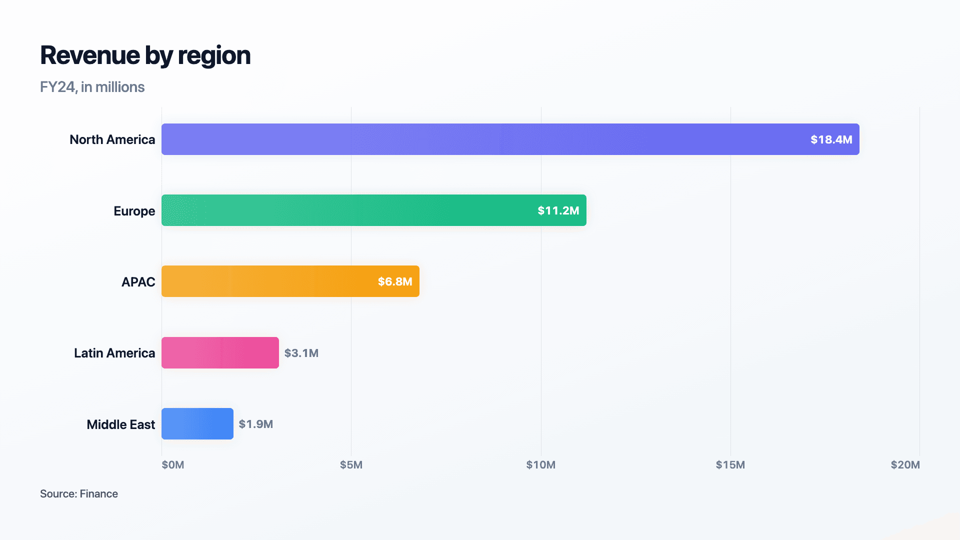
A horizontal bar chart turns vertical columns on their side, so the bars run left to right and the categories stack down the page. It solves two problems that vertical bars struggle with: long category names (which get cramped or rotated under columns) and rankings (which read most naturally as a top-to-bottom list).
Sorted high to low, a horizontal bar chart becomes a leaderboard, the eye starts at the longest bar at the top and travels down. That ordering is the secret to its clarity: a ranked horizontal bar chart answers 'who is winning?' before the viewer has read a single number.
Reochart animates the bars sliding out from the left so the ranking lands instantly, and comfortably handles up to a dozen rows with their labels intact. Export as MP4, GIF, PNG or SVG, with your brand colours and logo on Pro.
How it works
How a horizontal bar chart works
Each bar's length is proportional to its value, and the category sits to the left of the bar where there is room for a full label. Sorting from largest at the top to smallest at the bottom turns the chart into a ranking the eye can read in one pass.
Start every bar from a common zero baseline so lengths are comparable. Keep the list to around a dozen rows; for longer data, show the top few and group the rest as 'Other'.
Examples
Example horizontal bar charts
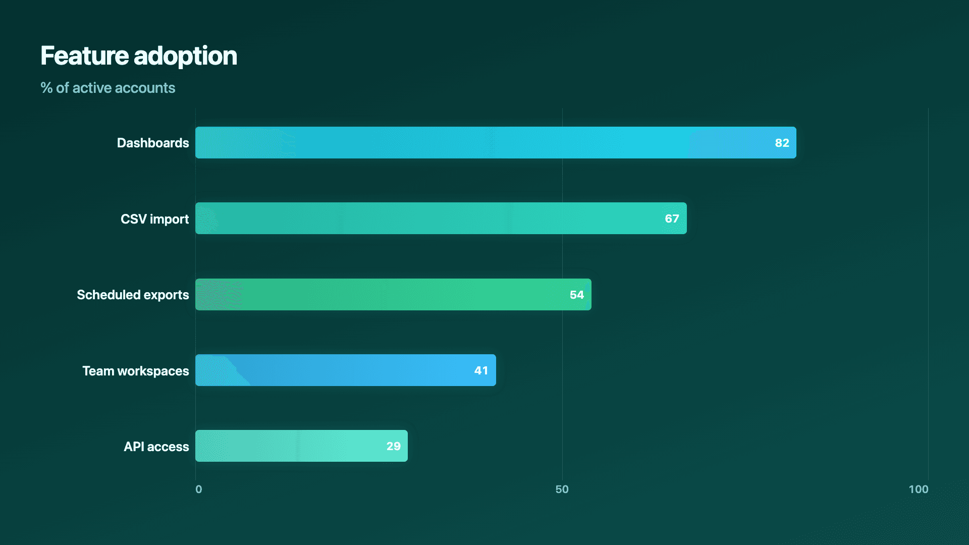
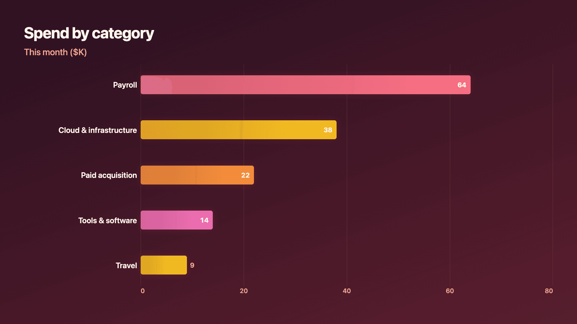
Real charts made in Reochart, each with its own data and theme. They animate automatically as you scroll.
Good fit
When to use a horizontal bar chart
- ✓Top-N rankings and leaderboards
- ✓Revenue by region or segment
- ✓Long category names
- ✓Survey results and feature adoption
- ✓Any 'which is biggest' comparison
Reach for something else
When not to use a horizontal bar chart
- ✕Your data is a trend over time, use a line or area chart.
- ✕You are showing parts of a whole, use a donut or stacked bar.
- ✕You have only two or three items, vertical bars or a counter may land harder.
- ✕Categories have a natural left-to-right order (like months), vertical bars read more naturally.
Compare
Horizontal bar vs other charts
Horizontal bar vs the alternatives.
| Chart type | Best for | Avoid when |
|---|---|---|
| Horizontal bar | Rankings and long labels | A trend over time |
| Vertical bar | Few categories, time-ordered data | Long category names |
| Lollipop | A lighter, modern ranked list | You need solid visual weight |
| Donut | Parts of a whole | Comparing many distinct totals |
Your data
What data you need
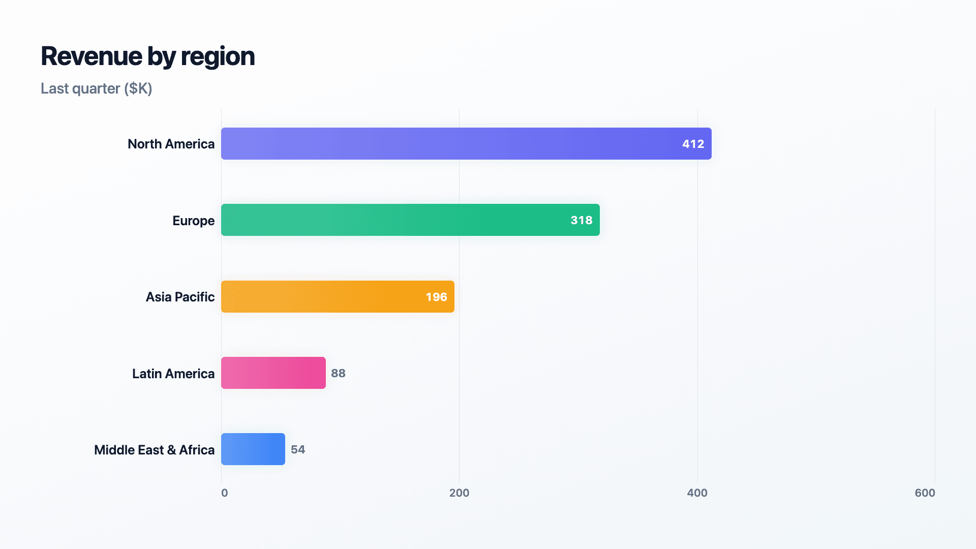
One row per category: a label and a value. Paste from a sheet or import a CSV. Reochart sorts high to low; up to a dozen rows stays readable.
| Category | Value |
|---|---|
| North America | 412 |
| Europe | 318 |
| Asia Pacific | 196 |
| Latin America | 88 |
Step by step
How to make a horizontal bar chart
Drop your numbers in, or import a CSV.
Choose the chart, theme and animation speed.
Tune colours, labels and add your brand.
Download MP4, GIF, PNG or SVG.
Best practices
Get it right
- ✓Sort bars from largest at the top to smallest at the bottom.
- ✓Start every bar from a common zero baseline.
- ✓Use the left-hand space for full, unabbreviated labels.
- ✓Group a long tail into a single 'Other' row.
- ✕Leave bars in a random order so the ranking is lost.
- ✕Truncate the axis so short bars look longer than they are.
- ✕Cram more than a dozen rows onto one chart.
- ✕Use it for a time series that belongs on a line chart.
Watch out
Common mistakes to avoid
The whole advantage of a horizontal bar chart is the ranking. Leaving bars unsorted throws that away, sort high to low.
If bars do not start at zero, their lengths no longer reflect the real values and the comparison lies.
Past a dozen rows the chart gets tall and tiring. Show the top performers and bucket the rest.
Months or weeks have a natural order; a vertical bar or line chart reads more naturally for time.
Why Reochart
Built for sharing, not just charting
- ✓No design skills required
- ✓Animated MP4 and GIF exports
- ✓PNG and scalable SVG too
- ✓Your brand colours and logo (Pro)
- ✓Paste from a sheet or import a CSV
- ✓Presentation and feed ready in minutes
FAQ
Frequently asked questions
What is a horizontal bar chart?
A horizontal bar chart is a bar chart rotated a quarter turn, so the bars run left to right from a shared baseline and the categories stack down the page. That rotation solves two problems vertical columns handle badly. Long category names get a full line of horizontal space to themselves instead of being rotated, abbreviated or truncated under a column, and rankings read top to bottom, which is the direction people already read a ranked list. Bar length stays directly proportional to value, so comparison is as accurate as it is with vertical bars; only the orientation changes, not how the encoding works. Use it for top-ten lists, survey responses, product or region comparisons and leaderboards, essentially anywhere the categories are named things rather than points in time. Time-ordered data still reads more naturally as vertical columns running left to right.
Is a horizontal bar chart the same as a bar graph turned sideways?
Yes, that is exactly what it is, and the terms overlap heavily in search. A horizontal bar chart, a sideways bar graph, a ranked bar chart and a horizontal column chart all describe the same visual: categories listed down the page with bars extending rightward in proportion to their values. Some tools reserve “column chart” for the vertical version and “bar chart” for the horizontal one, which is where most of the confusion between the terms comes from.
Horizontal or vertical bars?
Use horizontal bars for rankings and long labels, and vertical bars (columns) for a few categories or time-ordered data like months.
How many bars can it handle?
Up to about a dozen rows stays readable. For longer lists, show the top performers and group the rest into an 'Other' row.
Will my long category names fit?
Yes, that is the point. Labels sit to the left of each bar where there is room for the full name, no rotating or truncating.
Can I make it animated?
Yes. Charts animate by default, and you can export the animation as an MP4 or GIF, or grab a static PNG or SVG if you prefer.
Can I export as SVG?
Yes. Pro exports a crisp, scalable SVG vector, alongside MP4, GIF and PNG. Every export renders at 1080p.
Is Reochart free?
Yes. The free plan lets you make every chart type except the animated bar chart race, and export an animated MP4 with a small watermark, no card needed. Pro adds the bar chart race, removes the watermark, and adds GIF and SVG, your brand colours and logo, longer videos and CSV import.
Keep exploring
Related generators
From the blog
Learn more about charts and data storytelling

11 min read
How to Create an Animated Number Counter
A step-by-step guide to building a number counter that actually lands: picking the number worth this treatment, setting an honest start point, adding the context that makes it mean something, and exporting an animated version for a launch post, a deck, or a milestone update.
Read article →

11 min read
How to Build a QBR Dashboard
A practical guide to building the handful of charts a quarterly business review actually needs: the growth number, the bridge that explains it, the pipeline read, the KPI scorecard, and the roadmap for what's next.
Read article →