Animated Line Chart Generator
Turn a metric over time into a clean animated line chart, single or multi-line. Export as PNG, SVG, GIF or MP4.
Free to try · No design skills · Ready in about two minutes
Trusted by 1,198 users, including people at
 ByteDance
 Arizona State
 Fox
Fox UT Austin
 Roche
Roche Tulane
 United Airlines
 Clemson
 NHS
NHS Ayming
 Marquette
 Kent State
 Ray White
 UC Riverside
 CBA
CBA Illinois Tech
 Venngage
 Hofstra
 House of Communication
 IIT Madras
 Sotherly Hotels
 Zenus.ai
Overview
What is a line chart?
A line chart plots data points along a continuous axis, almost always time, and connects them so the shape of the trend is obvious: rising, falling, flat or volatile. It is the default choice whenever the question is 'how is this changing?', from weekly active users to monthly revenue to a stock price.
What makes the line chart powerful is continuity. Because the x-axis is continuous, the slope between points carries meaning, a steep climb reads as fast growth, a plateau as stalling. That is also its boundary: a line chart only makes sense when the x-axis is ordered and continuous. For separate, unrelated categories, a bar chart is the right tool.
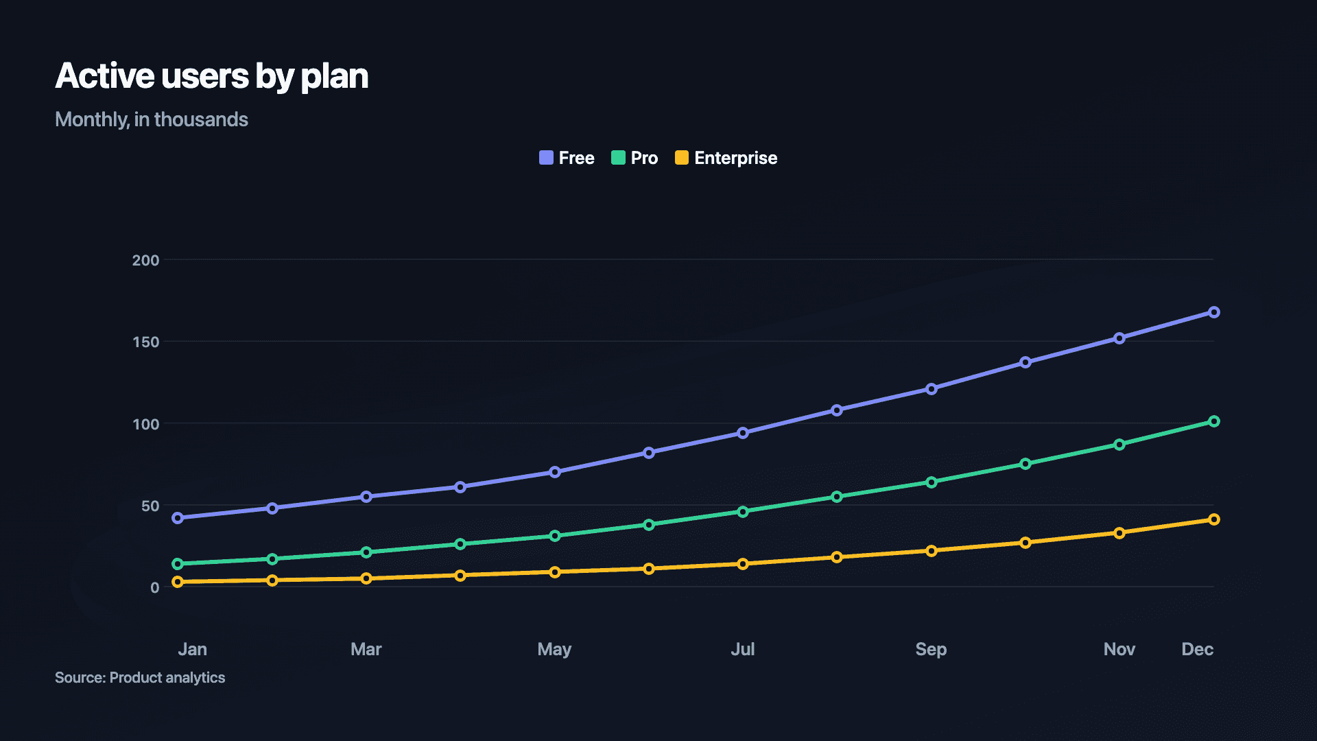
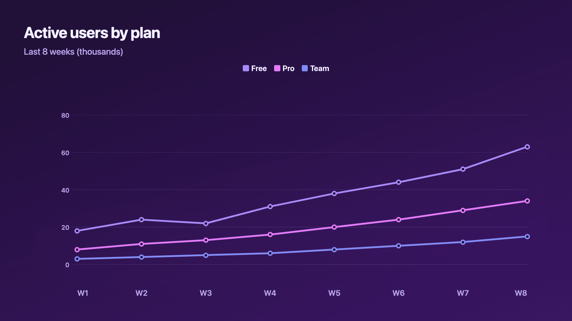
Reochart draws the line on from left to right as it animates, so the trend unfolds like a story rather than appearing all at once, which is exactly what stops the scroll on LinkedIn or X. You can plot a single line, or up to five together to compare plans, segments or cohorts on one chart, each with its own colour and a legend. Export as MP4, GIF, PNG or SVG, with your brand colours on Pro.
How it works
How a line chart works
Each data point is positioned by its x-value (the time period) and its y-value (the metric), then consecutive points are joined. The eye reads the line's direction and steepness as the rate of change, so the gaps between points should represent equal time intervals or the slope misleads.
With several series, each line gets its own colour and a legend entry. Keep it to a handful, beyond about five lines they start to cross and tangle, and the comparison is lost.
Examples
Example line charts
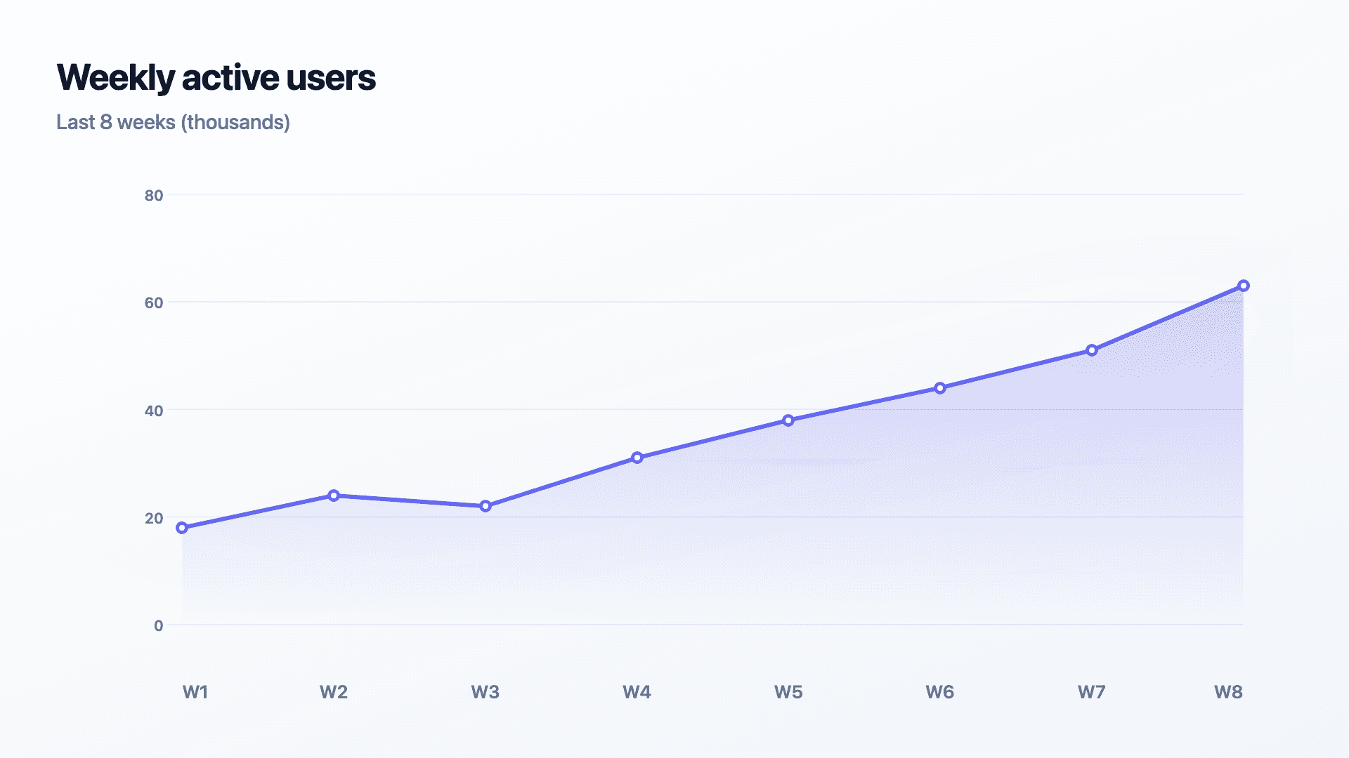
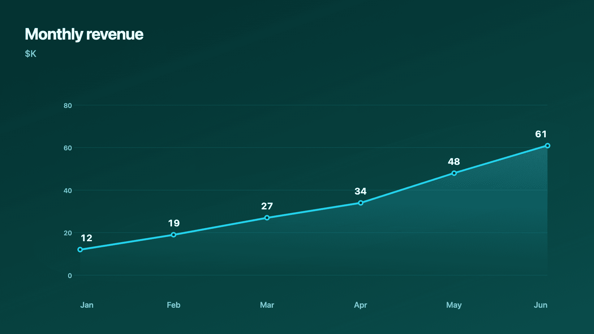
Real charts made in Reochart, each with its own data and theme. They animate automatically as you scroll.
Good fit
When to use a line chart
- ✓Growth or revenue over time
- ✓Weekly or monthly active users
- ✓MRR / ARR trend
- ✓Comparing two to five series
- ✓Cohort or retention curves
- ✓Any 'how did this change' question
Reach for something else
When not to use a line chart
- ✕Your x-axis is separate categories, not time, use a bar chart so they are not implied to be a sequence.
- ✕You have only two or three points, a bar chart or a counter often lands harder.
- ✕You are comparing more than about five series, the lines tangle; split them up.
- ✕You want to show parts of a whole, use a donut or stacked chart.
Compare
Line chart vs other charts
Line chart vs the alternatives.
| Chart type | Best for | Avoid when |
|---|---|---|
| Line | A trend over continuous time | Separate, unrelated categories |
| Area | A single trend you want to feel bigger | Comparing several precise series |
| Bar / column | Comparing values across categories | A continuous time trend |
| Multi-line | Comparing 2-5 series over time | More than ~5 series (they tangle) |
Your data
What data you need
One row per time period: a label and a value (add more columns for extra series). Paste from a sheet or import a CSV. 6 to 12 points reads best.
| Period | Value |
|---|---|
| Jan | 12 |
| Feb | 19 |
| Mar | 27 |
| Apr | 34 |
Step by step
How to make a line chart
Drop your numbers in, or import a CSV.
Choose the chart, theme and animation speed.
Tune colours, labels and add your brand.
Download MP4, GIF, PNG or SVG.
Best practices
Get it right
- ✓Use equal time intervals between points so the slope is honest.
- ✓Label the latest value, it is usually the headline.
- ✓Keep multi-line charts to five series or fewer.
- ✓Give each series a clear, legible name in the legend.
- ✕Use a line chart for non-time categories.
- ✕Overcrowd with too many series until lines cross constantly.
- ✕Hide the trend by starting mid-series; show enough history for context.
- ✕Rely on colour alone if series sit very close together.
Watch out
Common mistakes to avoid
Lines imply continuity. Using them for unrelated categories suggests a sequence that is not real, use bars.
Past five series the chart becomes spaghetti. Split into small multiples or highlight one line at a time.
If points are not evenly spaced in time, the slope lies. Keep intervals consistent.
A two-point line says little. Show enough history for the trend to mean something.
Why Reochart
Built for sharing, not just charting
- ✓No design skills required
- ✓Animated MP4 and GIF exports
- ✓PNG and scalable SVG too
- ✓Your brand colours and logo (Pro)
- ✓Paste from a sheet or import a CSV
- ✓Presentation and feed ready in minutes
FAQ
Frequently asked questions
What is a line chart?
A line chart is a data visualisation that plots individual data points along a continuous axis — almost always time — and connects them with a line. The line's slope is the message: a steep rise signals rapid growth, a flat line signals stagnation, and a dip draws the eye to something worth investigating. Line charts are the default choice for showing how a metric changes over a period: weekly revenue, daily active users, monthly churn rate, quarterly Net Promoter Score. They work well with multiple series (up to about four or five), where each line is a different dimension — country, product, cohort — so you can compare trajectories at a glance. Beyond five series the chart becomes tangled; at that point, small multiples or a single highlighted series with the rest grayed out is easier to read.
When should I use a line chart instead of a bar chart?
Use a line chart when the x-axis is continuous time and you care about the trend. Use a bar chart to compare distinct, unrelated categories.
Can I show more than one line?
Yes, up to five series on one chart, each with its own colour and a legend, ideal for comparing plans, segments or cohorts.
Line chart or area chart?
A line is cleaner for comparing series precisely; an area chart fills under a single line to make growth feel bigger.
How many data points should it have?
Six to twelve points usually reads best. Too few and a bar chart is clearer; too many and labels crowd.
Can I make it animated?
Yes. Charts animate by default, and you can export the animation as an MP4 or GIF, or grab a static PNG or SVG if you prefer.
Can I export as SVG?
Yes. Pro exports a crisp, scalable SVG vector, alongside MP4, GIF and PNG. Every export renders at 1080p.
How do I make a line chart from a spreadsheet?
Paste your period-and-value rows from Excel or Google Sheets, or import a CSV (Pro). Extra columns become extra lines.
Is Reochart free?
Yes. The free plan lets you make every chart type except the animated bar chart race, and export an animated MP4 with a small watermark, no card needed. Pro adds the bar chart race, removes the watermark, and adds GIF and SVG, your brand colours and logo, longer videos and CSV import.
Keep exploring
Related generators
From the blog
Learn more about charts and data storytelling

11 min read
How to Create an Animated Number Counter
A step-by-step guide to building a number counter that actually lands: picking the number worth this treatment, setting an honest start point, adding the context that makes it mean something, and exporting an animated version for a launch post, a deck, or a milestone update.
Read article →

11 min read
How to Build a QBR Dashboard
A practical guide to building the handful of charts a quarterly business review actually needs: the growth number, the bridge that explains it, the pipeline read, the KPI scorecard, and the roadmap for what's next.
Read article →