Animated Lollipop Chart Generator
A minimal, modern take on ranked values. Export as PNG, SVG, GIF or MP4.
Free to try · No design skills · Ready in about two minutes
Trusted by 1,198 users, including people at
 ByteDance
 Arizona State
 Fox
Fox UT Austin
 Roche
Roche Tulane
 United Airlines
 Clemson
 NHS
NHS Ayming
 Marquette
 Kent State
 Ray White
 UC Riverside
 CBA
CBA Illinois Tech
 Venngage
 Hofstra
 House of Communication
 IIT Madras
 Sotherly Hotels
 Zenus.ai
Overview
What is a lollipop chart?
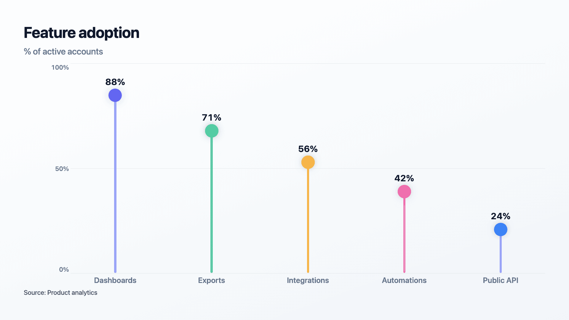
A lollipop chart shows the same thing as a bar chart, a value per category, but replaces each solid bar with a thin stem ending in a dot. The position of the dot encodes the value exactly as a bar's length would, but with a fraction of the ink. The result is a ranked comparison that feels lighter, more modern and more design-led.
That reduced visual weight is the reason to choose it. When a slide is dense, or when several solid bars start to feel heavy and repetitive, a lollipop chart keeps the data clear while giving the layout room to breathe. It is a favourite for feature adoption, survey results and any ranked set of metrics in a polished deck.
Reochart animates the stems extending and the dots settling into place, so even a simple ranking gets a moment of motion. Export as MP4, GIF, PNG or SVG, with your own brand colours on Pro.
How it works
How a lollipop chart works
Each item gets a stem that runs from a common baseline to a dot, and the dot's distance from the baseline is proportional to the value, exactly like a bar's length. Sorting from highest to lowest turns it into a clean ranking.
Because the dot carries the reading, the value label usually sits next to the dot. Keep stems thin and dots consistent in size so only position, not weight, communicates the number.
Examples
Example lollipop charts
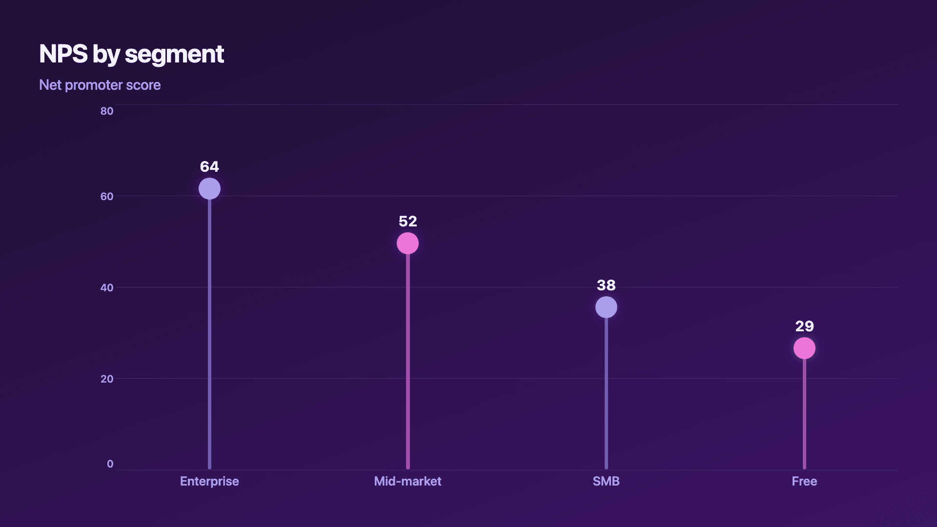
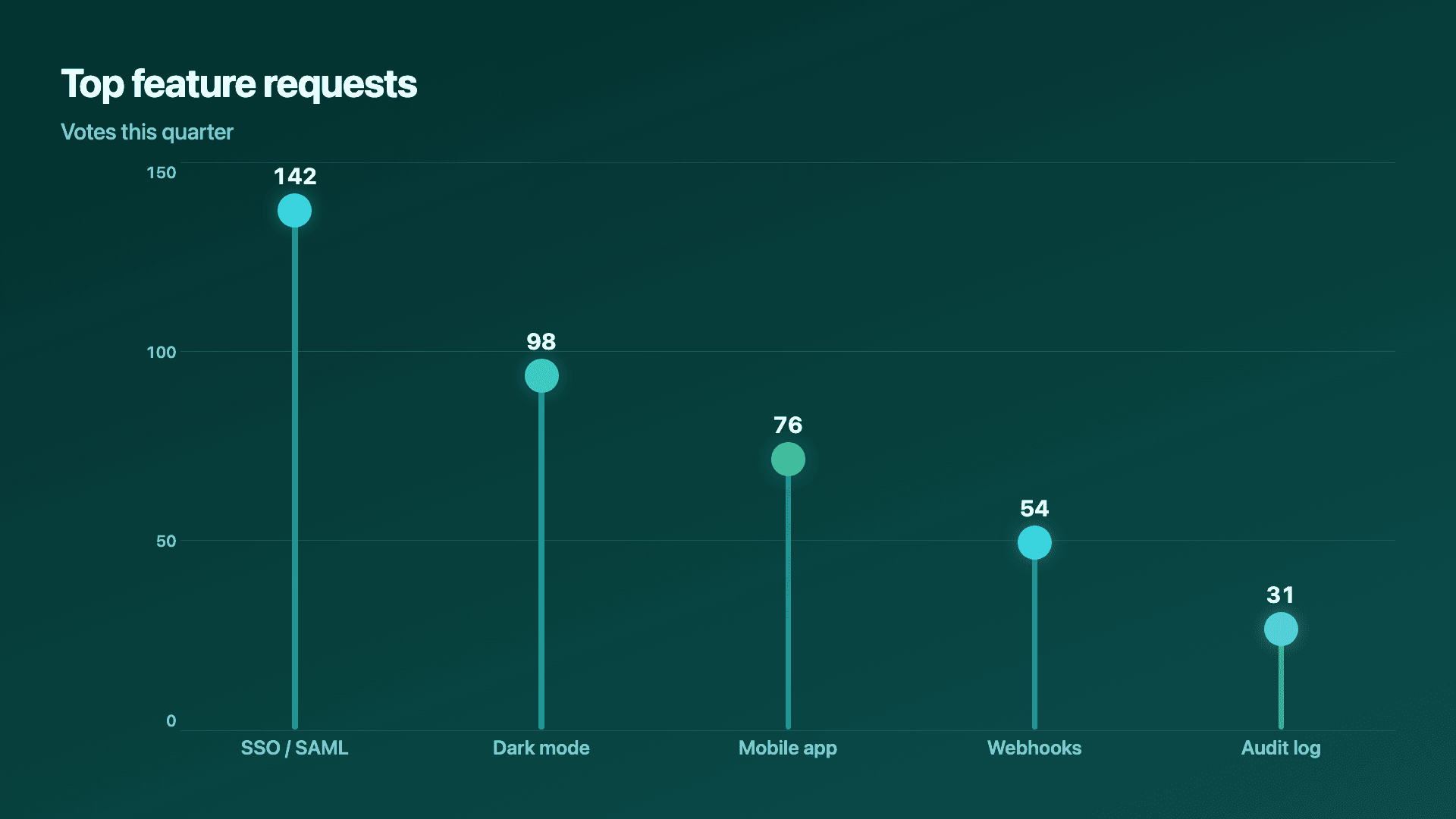
Real charts made in Reochart, each with its own data and theme. They animate automatically as you scroll.
Good fit
When to use a lollipop chart
- ✓Feature adoption and usage
- ✓Ranked metrics and survey results
- ✓Minimal, design-led decks
- ✓When solid bars feel too heavy
- ✓A clean leaderboard of requests or votes
Reach for something else
When not to use a lollipop chart
- ✕You are showing a trend over time, use a line or area chart.
- ✕You need parts of a whole, use a donut or stacked bar.
- ✕Values are extremely close together, the dots can be hard to tell apart; bars give more visual weight.
- ✕You have dozens of items, the stems get noisy; show the top few.
Compare
Lollipop chart vs other charts
Lollipop vs the alternatives.
| Chart type | Best for | Avoid when |
|---|---|---|
| Lollipop | A light, modern ranked list | Values that sit very close together |
| Bar chart | Solid visual weight for comparisons | A minimal, airy aesthetic |
| Horizontal bar | Rankings with long labels | You want reduced ink |
| Donut | Parts of a whole | Comparing many distinct totals |
Your data
What data you need
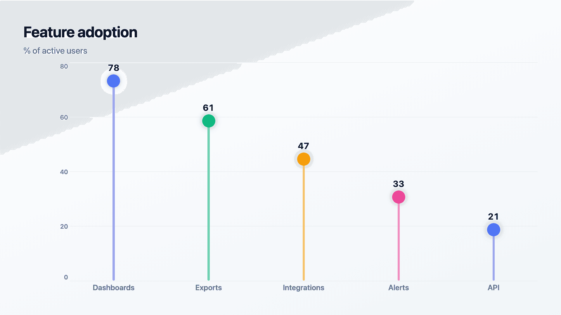
One row per item: a label and a value. Paste from a sheet or import a CSV. Reochart sorts high to low; up to about a dozen rows stays clean.
| Category | Value |
|---|---|
| Dashboards | 78 |
| Exports | 61 |
| Integrations | 47 |
| Alerts | 33 |
Step by step
How to make a lollipop chart
Drop your numbers in, or import a CSV.
Choose the chart, theme and animation speed.
Tune colours, labels and add your brand.
Download MP4, GIF, PNG or SVG.
Best practices
Get it right
- ✓Sort from highest to lowest for a clear ranking.
- ✓Keep dots the same size so only position reads.
- ✓Place the value label next to each dot.
- ✓Use it when a layout needs to feel light and modern.
- ✕Use it when values are nearly identical and dots overlap.
- ✕Vary dot sizes, that adds a second, confusing variable.
- ✕Cram in dozens of items until the stems look like a fence.
- ✕Reach for it when you actually want bold visual weight.
Watch out
Common mistakes to avoid
When values barely differ, the dots cluster and the ranking is hard to read. A bar chart's solid length copes better.
If dots change size as well as position, viewers read two variables where there is one. Keep dots uniform.
A lollipop chart is at its best as a ranking. Sort high to low so the order does the talking.
Past a dozen items the thin stems get busy. Show the top few and group the rest.
Why Reochart
Built for sharing, not just charting
- ✓No design skills required
- ✓Animated MP4 and GIF exports
- ✓PNG and scalable SVG too
- ✓Your brand colours and logo (Pro)
- ✓Paste from a sheet or import a CSV
- ✓Presentation and feed ready in minutes
FAQ
Frequently asked questions
What is a lollipop chart?
A lollipop chart is a bar chart with the bars thinned to lines and a dot placed at the end of each one, so the value is encoded by the dot's position along the axis rather than by a filled rectangle. It reads identically to a bar chart, since the distance from the baseline is doing the same work, but it uses far less ink, which is why it is often chosen for design-led reports and decks where a wall of solid bars feels heavy. Edward Tufte's data-ink argument is the usual justification: the interior of a bar carries no information that the bar's end does not already carry, so removing it costs the reader nothing. The trade-off is visual weight. Where values sit very close together, or where a chart needs to read from across a room, solid bars hold up better than dots.
Is a lollipop chart the same as a dot plot?
They are close relatives rather than the same chart. A lollipop chart keeps a stem running from the baseline to the dot, so the eye still measures a length. A dot plot, including the Cleveland variety, drops the stem and leaves only the dot, which is lighter still but slightly harder to read precisely. Depending on the tool, both get called lollipop charts, stem-and-dot charts or dot plots, and both replace solid bars for the same reason.
When should I use a lollipop chart?
When you want the clarity of a bar chart but a cleaner, less ink-heavy aesthetic, ideal for design-led decks and ranked metrics.
Lollipop or bar chart?
They read the same way. Choose a lollipop for a light, modern feel; choose bars when you want bold visual weight or when values sit very close together.
How many items can it show?
Up to about a dozen stays clean. For longer lists, show the top performers and group the rest.
Can I make it animated?
Yes. Charts animate by default, and you can export the animation as an MP4 or GIF, or grab a static PNG or SVG if you prefer.
Can I export as SVG?
Yes. Pro exports a crisp, scalable SVG vector, alongside MP4, GIF and PNG. Every export renders at 1080p.
Is Reochart free?
Yes. The free plan lets you make every chart type except the animated bar chart race, and export an animated MP4 with a small watermark, no card needed. Pro adds the bar chart race, removes the watermark, and adds GIF and SVG, your brand colours and logo, longer videos and CSV import.
Keep exploring
Related generators
From the blog
Learn more about charts and data storytelling

11 min read
How to Create an Animated Number Counter
A step-by-step guide to building a number counter that actually lands: picking the number worth this treatment, setting an honest start point, adding the context that makes it mean something, and exporting an animated version for a launch post, a deck, or a milestone update.
Read article →

11 min read
How to Build a QBR Dashboard
A practical guide to building the handful of charts a quarterly business review actually needs: the growth number, the bridge that explains it, the pipeline read, the KPI scorecard, and the roadmap for what's next.
Read article →