Animated Bullet Chart Generator
Actual vs target for every KPI, with a tick where the goal sits. Export as PNG, SVG, GIF or MP4.
Free to try · No design skills · Ready in about two minutes
Trusted by 1,198 users, including people at
 ByteDance
 Arizona State
 Fox
Fox UT Austin
 Roche
Roche Tulane
 United Airlines
 Clemson
 NHS
NHS Ayming
 Marquette
 Kent State
 Ray White
 UC Riverside
 CBA
CBA Illinois Tech
 Venngage
 Hofstra
 House of Communication
 IIT Madras
 Sotherly Hotels
 Zenus.ai
Overview
What is a bullet chart?
A bullet chart was designed to replace the gauge/speedometer for exactly one job: showing an actual value against a target in the smallest possible space. The bar grows to the actual value, and a tick marks the target, so "did we hit it" is answered by a single glance at whether the bar has crossed the tick, not by reading two numbers and doing the subtraction yourself.
That density is what makes it the OKR-review and QBR workhorse. Five goals fit in five thin rows instead of five gauges eating a whole slide each, and because every row shares the same simple shape, a room can scan all five in the time it would take to read one paragraph. Reochart turns the value green the moment a row reaches its target, so the wins and the misses separate themselves without you narrating each one.
It's a point-in-time status check, not a trend. A bullet chart tells you where you stand against a goal right now; it doesn't show how you got there or where you're headed, which is a line chart's job. Use both together when a review needs both the status and the trajectory.
How it works
How a bullet chart works
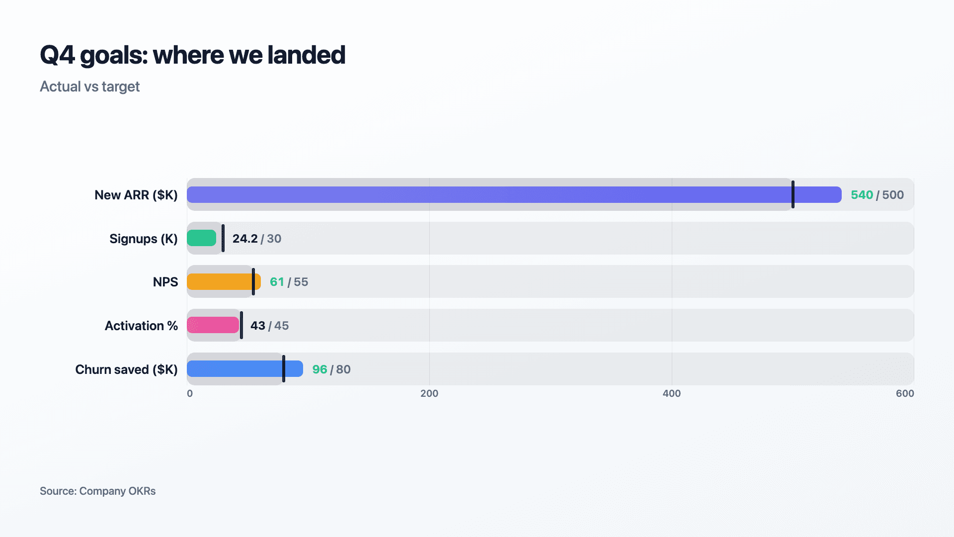
Each row is one KPI with an actual value and a target. The bar's length is proportional to the actual, drawn against a shared axis so every row's scale is comparable, and a vertical tick marks where the target sits on that same axis.
Reochart animates the bar growing to its actual value first, then lands the target tick a beat later so the eye registers the bar's length before it's asked to judge it against the goal. Once a row's bar reaches or passes its target, its value renders in green so hits are unmistakable even at a glance.
Examples
Example bullet charts
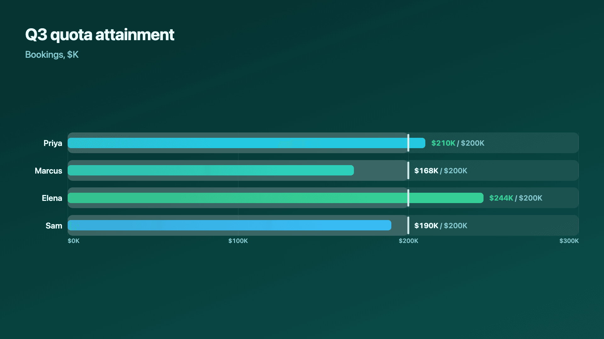
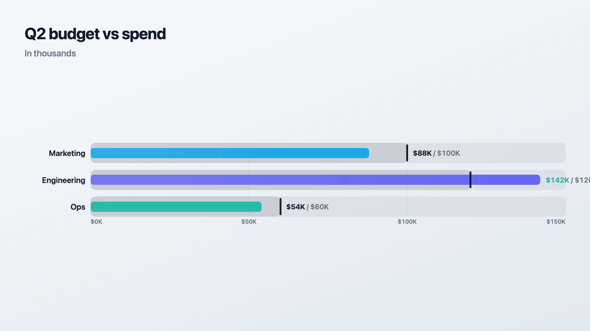
Real charts made in Reochart, each with its own data and theme. They animate automatically as you scroll.
Good fit
When to use a bullet chart
- ✓OKR and goal reviews
- ✓Quarterly business reviews
- ✓Any actual-vs-target scorecard
- ✓Sales quota or budget attainment
Reach for something else
When not to use a bullet chart
- ✕There's no target or goal to measure against, a plain bar chart compares the values on their own.
- ✕The story is a trend over time rather than a point-in-time status check, a line chart shows the trajectory a bullet chart can't.
- ✕You have more than about 8 KPIs, rows get thin and the tick marks harder to distinguish; split into two charts or trim to what the room actually acts on.
- ✕The target itself is more interesting than the actual, e.g. tracking how a goal changed over the year, a line chart with a target line reads better.
Compare
Bullet chart vs other charts
Bullet chart vs the alternatives, at a glance.
| Chart type | Best for | Avoid when |
|---|---|---|
| Bullet | Actual vs target, several KPIs at once | No target exists, or the story is a trend |
| Bar / column | Comparing values with no target | You need to show goal attainment |
| Radial gauge | One single value against one goal | You're comparing several KPIs at once |
| KPI scorecard | A wider board of metrics with deltas | You specifically need a visual target marker |
Your data
What data you need
One row per KPI: a label, the actual value, and the target. Paste straight from Excel or Sheets, or import a CSV. 3 to 6 rows keeps every tick easy to read.
| Label | Value | Target |
|---|---|---|
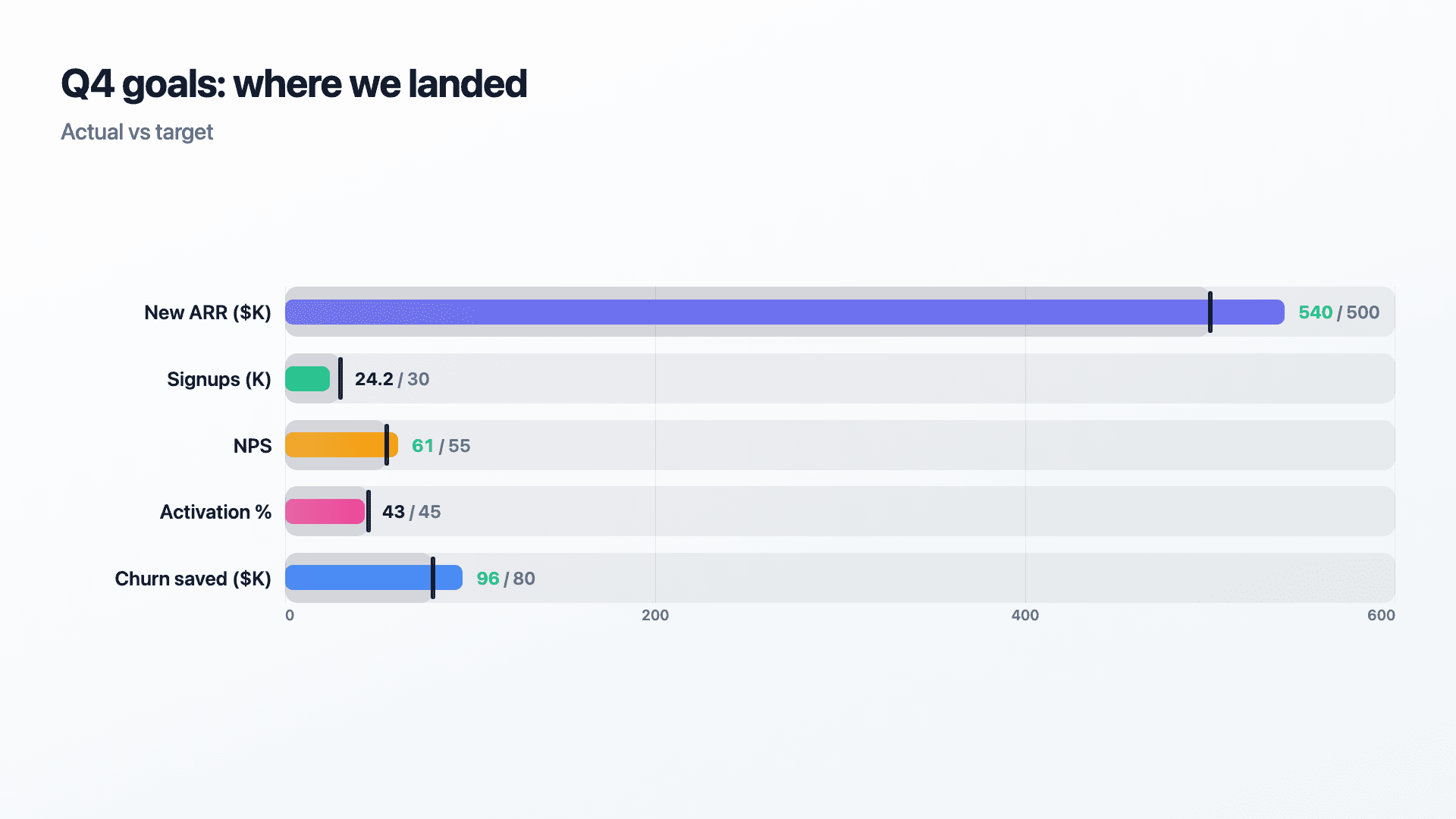
| New ARR ($K) | 540 | 500 |
| Signups (K) | 24.2 | 30 |
| NPS | 61 | 55 |
| Activation % | 43 | 45 |
Step by step
How to make a bullet chart
Drop your numbers in, or import a CSV.
Choose the chart, theme and animation speed.
Tune colours, labels and add your brand.
Download MP4, GIF, PNG or SVG.
Best practices
Get it right
- ✓Keep to 3-6 rows so tick marks and bars both stay easy to read.
- ✓Use the same unit or a clearly labelled one per row, don't mix $K and % without saying so.
- ✓Sort rows by how far they are from target when the room needs to triage, not just review.
- ✓Let the green highlight do the talking, don't over-annotate rows that already hit target.
- ✕Chart a KPI with no real target, that's just a bar chart with an extra column.
- ✕Cram in 10+ rows, thin bars make the target ticks hard to place precisely.
- ✕Use it to show a trend, a single bullet chart is a snapshot, not a timeline.
- ✕Bury the miss, a bullet chart's whole value is making misses as visible as hits.
Watch out
Common mistakes to avoid
A bullet chart's tick is the point. If a KPI has no meaningful target, a plain bar chart is simpler and just as clear.
Past 6-8 KPIs, bars thin out and target ticks get hard to place. Trim to what the room actually decides on.
A row in dollars next to a row in percent, unlabelled, invites the wrong comparison. Name the unit in the label.
A bullet chart is a point-in-time snapshot. If the story is how a metric moved over the quarter, use a line chart instead.
Why Reochart
Built for sharing, not just charting
- ✓No design skills required
- ✓Animated MP4 and GIF exports
- ✓PNG and scalable SVG too
- ✓Your brand colours and logo (Pro)
- ✓Paste from a sheet or import a CSV
- ✓Presentation and feed ready in minutes
FAQ
Frequently asked questions
What is a bullet chart?
A bullet chart is a compact bar showing an actual value with a perpendicular tick marking its target, so performance against a goal reads in a single glance. Stephen Few designed it as a replacement for the dashboard gauge, on the argument that a gauge spends an enormous amount of space to communicate one number, while a bullet chart carries the same information plus the target in a strip a fraction of the size. That efficiency is the entire point: because each one is small, a dozen can be stacked in a column and scanned like a list, which is exactly what a KPI review or an operational dashboard needs. Use a gauge when one metric deserves a whole frame and the presentation is the point, and a bullet chart when several metrics each need a verdict against their own target.
What data do I need?
A label, an actual value and a target per row. Rows that reach their target show the value in green.
Bullet chart or radial gauge?
A gauge is built for one metric filling a ring toward one goal. A bullet chart compares several KPIs against their targets side by side in far less space.
How many KPIs can one bullet chart hold?
3 to 6 is the sweet spot. Past about 8, bars get thin and the target ticks are harder to line up precisely — split into two charts instead.
What turns a value green?
Reaching or passing its target. It's an instant visual cue for which goals were hit without reading every number.
Can I make it animated?
Yes. Bars grow to their actual value and the target tick lands a beat later by default; export the animation as an MP4 or GIF, or grab a static PNG or SVG.
Can I export as SVG?
Yes. Pro exports a crisp, scalable SVG vector, alongside MP4, GIF and PNG. Every export renders at 1080p.
Can I use my own brand colours and logo?
On Pro, yes. Set a brand palette and add a logo that replaces the watermark on every export.
Is Reochart free?
Yes. The free plan lets you make every chart type except the animated bar chart race, and export an animated MP4 with a small watermark, no card needed. Pro adds the bar chart race, removes the watermark, and adds GIF and SVG, your brand colours and logo, longer videos and CSV import.
From the blog
Learn more about charts and data storytelling

11 min read
How to Create an Animated Number Counter
A step-by-step guide to building a number counter that actually lands: picking the number worth this treatment, setting an honest start point, adding the context that makes it mean something, and exporting an animated version for a launch post, a deck, or a milestone update.
Read article →

11 min read
How to Build a QBR Dashboard
A practical guide to building the handful of charts a quarterly business review actually needs: the growth number, the bridge that explains it, the pipeline read, the KPI scorecard, and the roadmap for what's next.
Read article →