Animated Table Maker
A clean data table that builds row by row and spotlights the rows that matter. Export as PNG, SVG, GIF or MP4.
Free to try · No design skills · Ready in about two minutes
Trusted by 1,198 users, including people at
 ByteDance
 Arizona State
 Fox
Fox UT Austin
 Roche
Roche Tulane
 United Airlines
 Clemson
 NHS
NHS Ayming
 Marquette
 Kent State
 Ray White
 UC Riverside
 CBA
CBA Illinois Tech
 Venngage
 Hofstra
 House of Communication
 IIT Madras
 Sotherly Hotels
 Zenus.ai
Overview
What is a highlight table?
Sometimes the audience doesn't want an abstraction of the numbers, they want the numbers. A bar's length is a great way to compare magnitude at a glance, but a pricing table, a league standing, or a financial line item is often read for its exact figure, not estimated from how long a bar looks. An animated table gives that audience the literal numbers, with the motion and emphasis a static spreadsheet screenshot can't offer.
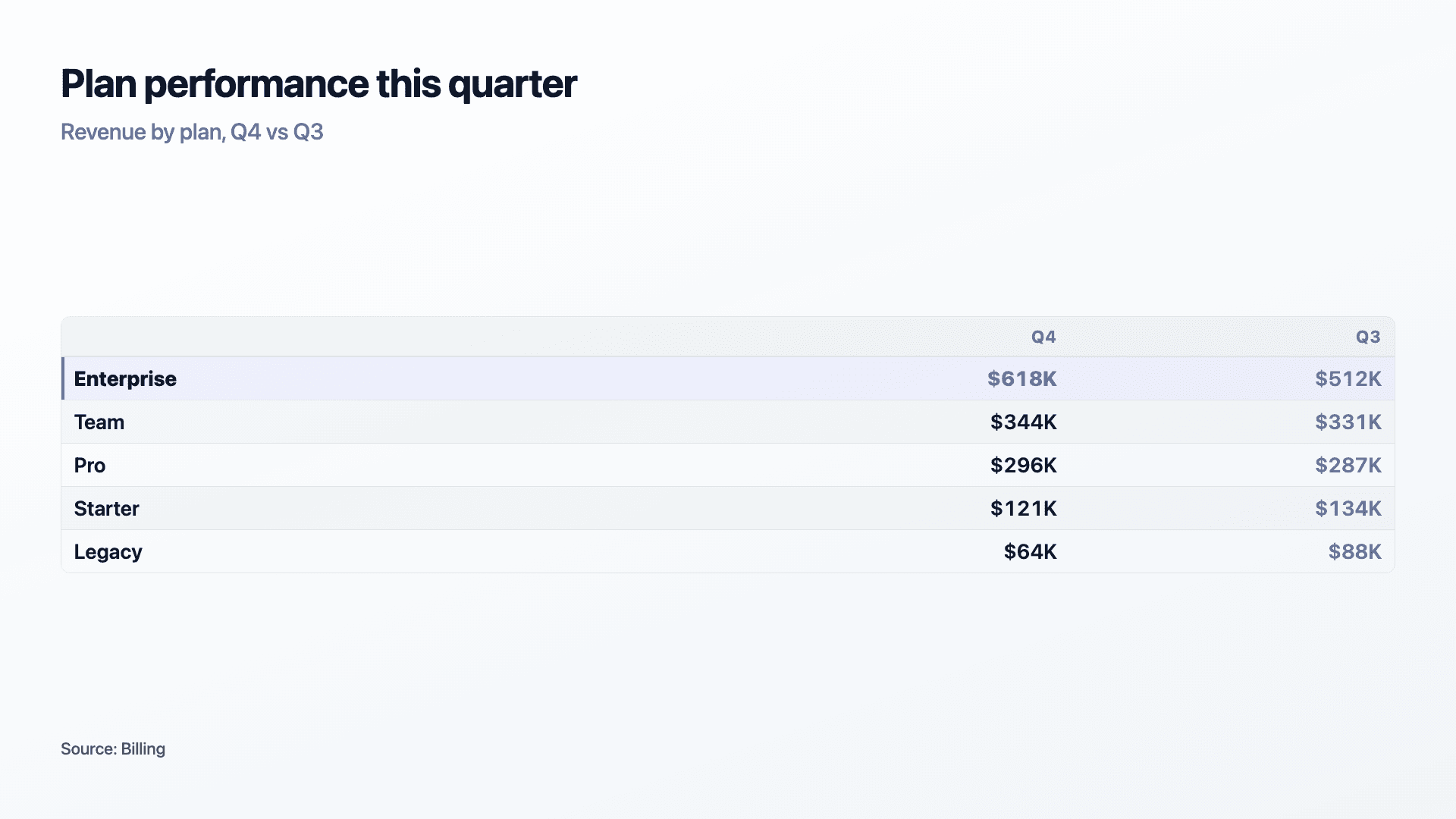
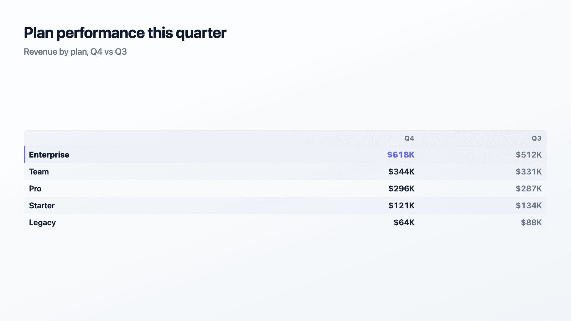
Rows slide in one by one instead of appearing all at once, which gives even a plain table a sense of build and pacing, and the rows you pin light up in your accent colour with a sweep and bold text, so the figure you want the room to remember lands last and loudest. A second column lets you show a period-over-period comparison, this quarter next to last, without needing a second chart.
It's a deliberate trade against the visual comparison a bar chart gives you for free. If the point is 'which is bigger', bars answer that faster than a column of numbers ever will. Reach for a table when the point is 'here is the exact figure', and let the highlight do the work of pointing at the one that matters.
How it works
How a highlight table works
Each row has a label and one or two numeric columns, e.g. this period and last period. Rows render top to bottom in the order you enter them, each sliding in with a brief stagger so the table builds instead of appearing as a static block.
Any row you pin gets an accent-coloured sweep, bolder text, and a coloured left edge once it lands, separating it visually from the rest without needing an arrow or a callout box. Use it on the one line the audience should walk away remembering.
Examples
Example highlight tables
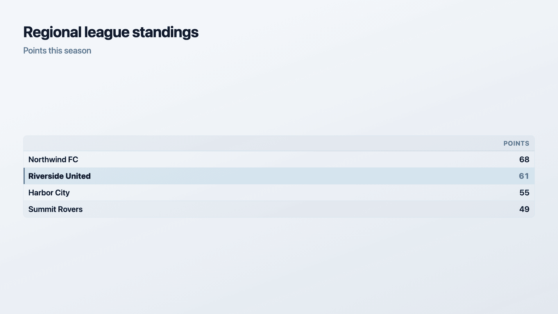
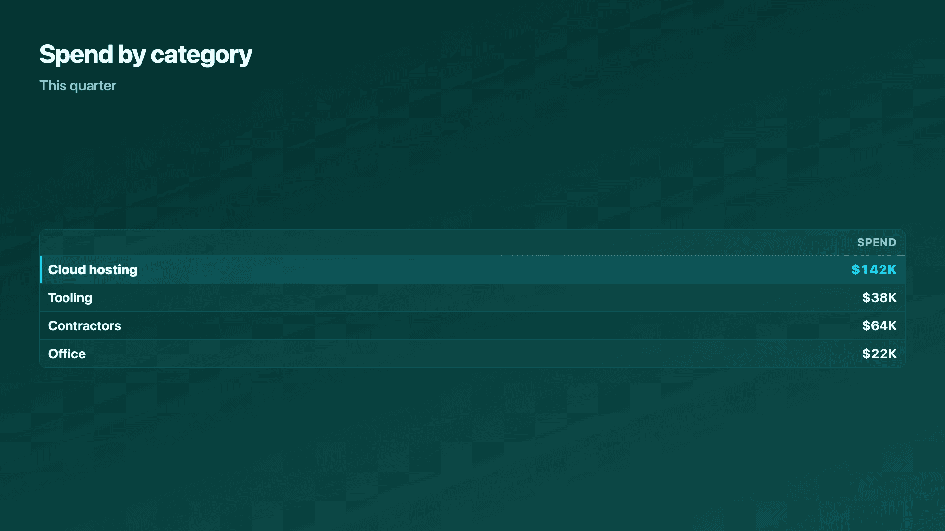
Real charts made in Reochart, each with its own data and theme. They animate automatically as you scroll.
Good fit
When to use a highlight table
- ✓Pricing and plan comparisons
- ✓League tables and standings
- ✓Financial lines where exact figures matter
- ✓Any list where one row is the one to remember
Reach for something else
When not to use a highlight table
- ✕The audience needs to compare magnitude at a glance rather than read exact figures, a bar chart makes size differences visible without reading a single number.
- ✕You have more rows than a screen holds without scrolling, a table that scrolls loses its build-in-one-view impact; trim to the rows that matter or use a bar/ranking chart for a longer list.
- ✕There is no natural row-and-column structure to the data, a chart type built for the actual shape (funnel, waterfall, matrix) will communicate faster.
- ✕The point is a trend over time, a line or area chart shows a trajectory a table of numbers can't convey at a glance.
Compare
Highlight table vs other charts
Highlight table vs the alternatives, at a glance.
| Chart type | Best for | Avoid when |
|---|---|---|
| Highlight table | Exact figures the audience will want to check | Magnitude comparison matters more than the figure |
| Bar / column | Comparing values across categories at a glance | The audience wants to read exact numbers |
| KPI scorecard | A wider board of metrics with deltas | You need a row-by-row, list-style layout |
| Ranking | A numbered top-N leaderboard | You need two full numeric columns per row |
Your data
What data you need
One row per line item: a label, a value, and an optional second value for a period-over-period comparison. Pin the row you want spotlighted. Paste straight from Excel or Sheets, or import a CSV. Up to about 10 rows fits one screen cleanly.
| Label | Value | Prev. |
|---|---|---|
| Enterprise | 618 | 512 |
| Team | 344 | 331 |
| Pro | 296 | 287 |
| Starter | 121 | 134 |
Step by step
How to make a highlight table
Drop your numbers in, or import a CSV.
Choose the chart, theme and animation speed.
Tune colours, labels and add your brand.
Download MP4, GIF, PNG or SVG.
Best practices
Get it right
- ✓Keep to about 10 rows or fewer so the table fits one view without scrolling.
- ✓Pin only the row (or two) that the audience should actually remember.
- ✓Use the second column for a real comparison, last period, target, or a benchmark.
- ✓Order rows so the ranking or sequence is obvious without needing a sort column.
- ✕Pin more than a couple of rows, if everything is highlighted nothing is.
- ✕Let the table run long enough to need scrolling, trim it or switch to a bar chart.
- ✕Use it when the point is comparing size, not reading figures, a bar chart does that job faster.
- ✕Leave the second column unlabeled, say clearly what it represents (Q3, target, last year).
Watch out
Common mistakes to avoid
Pin more than one or two rows and the accent sweep stops meaning anything. Reserve it for the number that matters most.
A table that needs scrolling loses the build-in-one-view effect the animation is for. Trim to what fits, or use a bar/ranking chart for a longer list.
If the point is 'which is bigger', a column of numbers makes the reader do the comparison themselves. A bar chart does it visually and faster.
A number next to another number with no header invites the wrong comparison. Always title both columns clearly.
Why Reochart
Built for sharing, not just charting
- ✓No design skills required
- ✓Animated MP4 and GIF exports
- ✓PNG and scalable SVG too
- ✓Your brand colours and logo (Pro)
- ✓Paste from a sheet or import a CSV
- ✓Presentation and feed ready in minutes
FAQ
Frequently asked questions
What is a table chart?
A table chart is a data table treated as a designed visual rather than a spreadsheet paste, with the rows built in one at a time and the ones that matter given visual emphasis. It occupies a genuine gap between a spreadsheet and a chart. A chart trades exact values for an instantly readable shape, which is the right trade for a trend and the wrong one for a price list, a league table or a set of financial line items where the reader wants the actual numbers. A plain table keeps the precision but gives every row identical weight, so nothing guides attention. Highlighting a row restores that guidance without giving up the figures, which is why the format suits pricing comparisons, standings, results summaries and any table where one row is the point being made.
When should I use a table instead of a chart?
When the exact figures are the message — pricing, standings, financial lines — or when the audience will want to check the numbers, not estimate them from bar lengths.
How do I highlight a row?
Pin any row in the editor and it animates in with an accent sweep, bold text and a coloured edge in the video.
Highlight table or bar chart?
Use a table when exact figures matter and the audience will want to read them directly. Use a bar chart when the point is comparing size, and precise numbers are secondary.
How many rows can a highlight table hold?
About 10 fits cleanly on one screen, which is the point of the format — a table that needs scrolling loses its build-in-one-view impact.
Can I show a period-over-period comparison?
Yes. Add a second value per row (this period, last period, or a target) and both columns render with their own header.
Can I make it animated?
Yes. Rows slide in one by one by default, and you can export the animation as an MP4 or GIF, or grab a static PNG or SVG.
Can I export as SVG?
Yes. Pro exports a crisp, scalable SVG vector, alongside MP4, GIF and PNG. Every export renders at 1080p.
Can I use my own brand colours and logo?
On Pro, yes. Set a brand palette and add a logo that replaces the watermark on every export.
Is Reochart free?
Yes. The free plan lets you make every chart type except the animated bar chart race, and export an animated MP4 with a small watermark, no card needed. Pro adds the bar chart race, removes the watermark, and adds GIF and SVG, your brand colours and logo, longer videos and CSV import.
From the blog
Learn more about charts and data storytelling

11 min read
How to Create an Animated Number Counter
A step-by-step guide to building a number counter that actually lands: picking the number worth this treatment, setting an honest start point, adding the context that makes it mean something, and exporting an animated version for a launch post, a deck, or a milestone update.
Read article →

11 min read
How to Build a QBR Dashboard
A practical guide to building the handful of charts a quarterly business review actually needs: the growth number, the bridge that explains it, the pipeline read, the KPI scorecard, and the roadmap for what's next.
Read article →