Animated Sankey Diagram Generator
Show where a total flows: ribbons sweep from sources to outcomes, sized by value. Export as PNG, SVG, GIF or MP4.
Free to try · No design skills · Ready in about two minutes
Trusted by 1,203 users, including people at
 ByteDance
 Arizona State
 Fox
Fox UT Austin
 Roche
Roche Tulane
 United Airlines
 Clemson
 NHS
NHS Ayming
 Marquette
 Kent State
 Ray White
 UC Riverside
 CBA
CBA Illinois Tech
 Venngage
 Hofstra
 House of Communication
 IIT Madras
 Sotherly Hotels
 Zenus.ai
Overview
What is a sankey diagram?
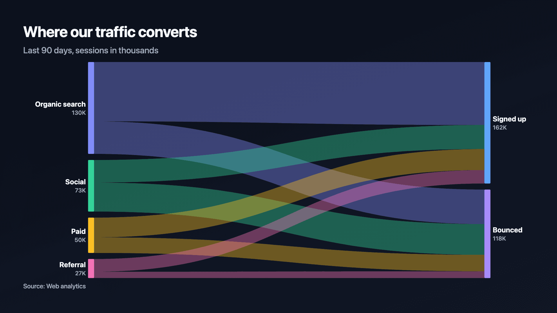
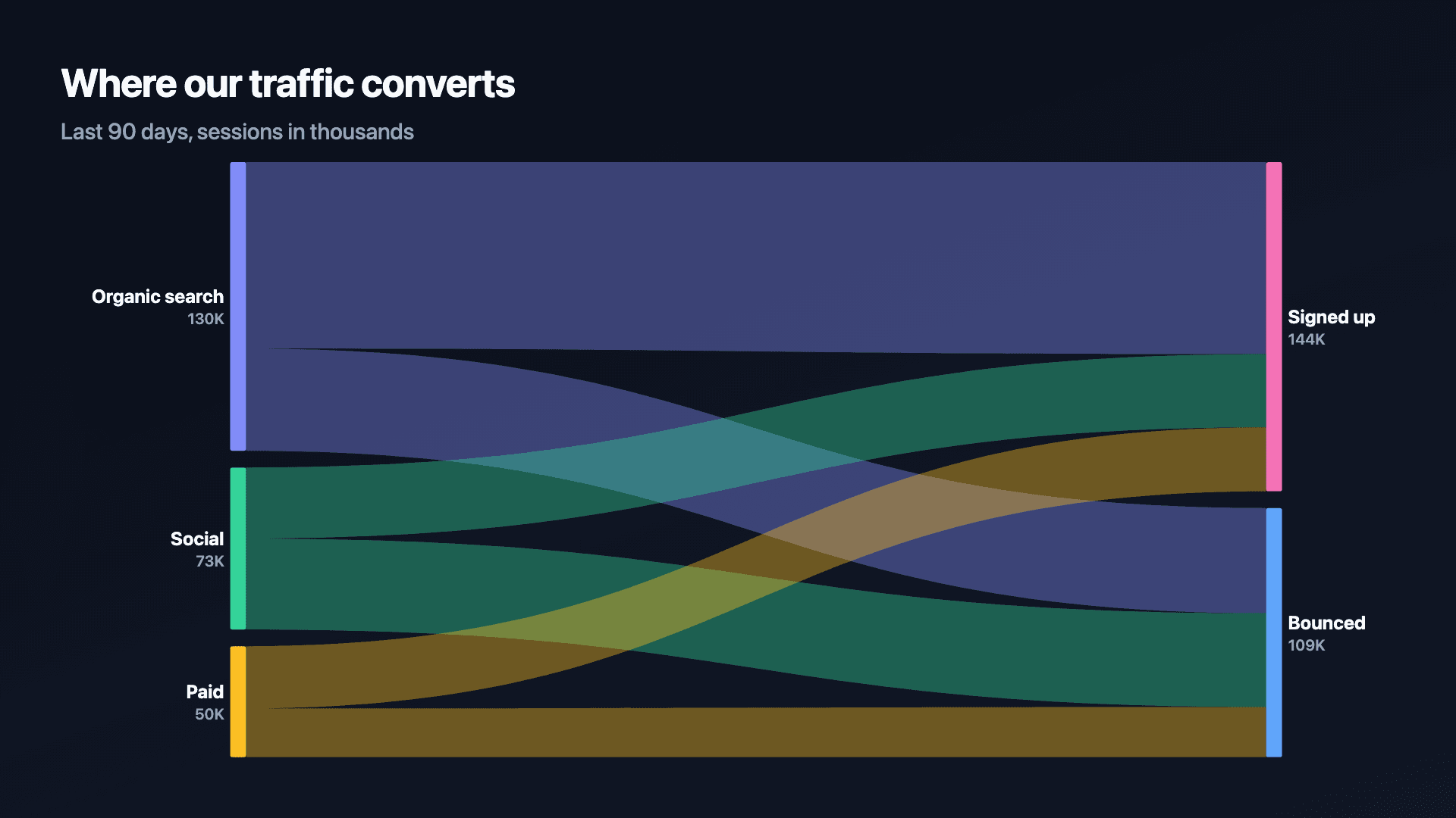
A sankey diagram shows how a total splits and where it lands: value-proportional ribbons connect sources on the left to outcomes on the right, so the width of a ribbon is literally its size. It answers the question a funnel can't — where did the rest go? Traffic doesn't just convert or vanish; it converts, bounces, or signs up at different rates from different sources, and a sankey shows all of those paths in one picture instead of forcing a single narrowing line.
The format's real strength is branching. A funnel is one path getting narrower; a sankey is several sources feeding several outcomes, which is the shape of most real flows — traffic sources into signup outcomes, a budget into spend categories, a pipeline into won, lost, and pushed. The moment you have more than one source or more than one outcome, a sankey earns its keep.
Reochart animates each ribbon sweeping left to right in sequence, so the audience watches the total find its destinations rather than absorbing a static tangle of lines all at once. Export it as an MP4 or GIF for a deck or a post, or a static PNG or SVG when a still image is all you need.
How it works
How a sankey diagram works
Each row in your data is one flow: where it starts (the From column), where it lands (the To column), and its size (the value). Reochart groups rows sharing a From into one source node and rows sharing a To into one outcome node, stacking each node's height in proportion to its total.
Ribbons connect each From to its To, drawn as smooth curves whose width is proportional to the flow's value, so two ribbons of very different sizes are visually unmistakable. Ribbons sweep in left to right, one after another, so the total's journey reads as a sequence rather than landing all at once.
Examples
Example sankey diagrams
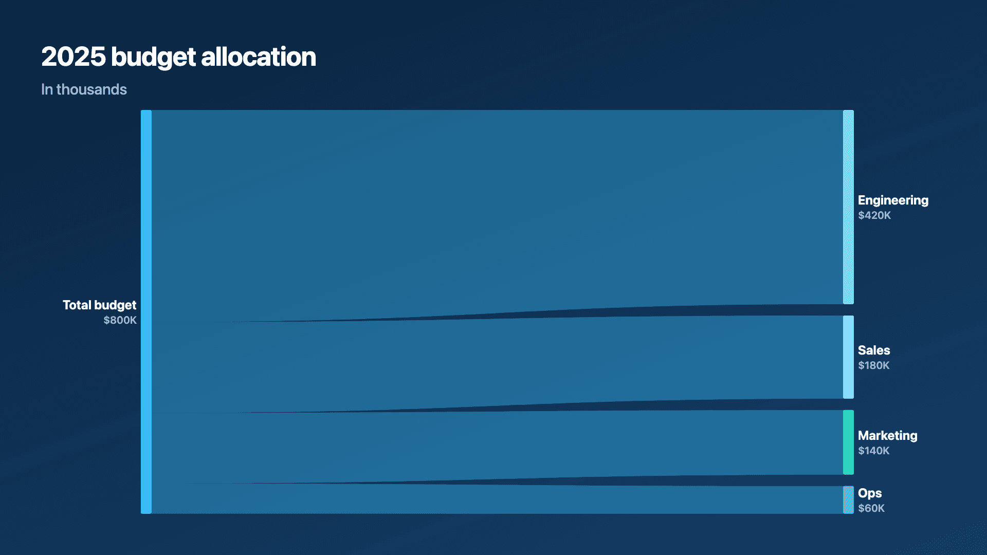
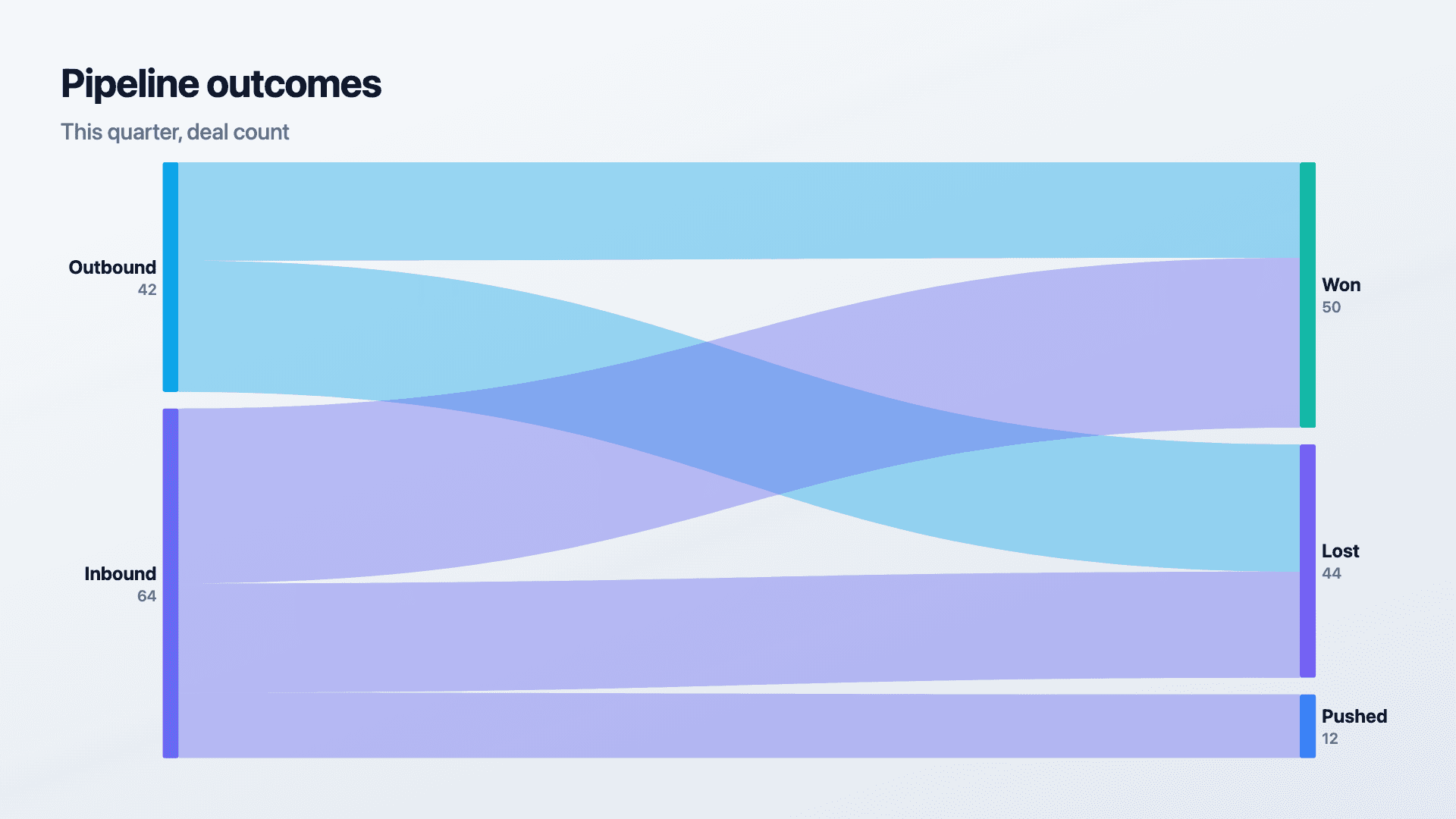
Real charts made in Reochart, each with its own data and theme. They animate automatically as you scroll.
Good fit
When to use a sankey diagram
- ✓Traffic sources → signups vs bounces
- ✓Budget or spend allocation
- ✓Pipeline splitting into won and lost
- ✓Any total that branches into more than one path
Reach for something else
When not to use a sankey diagram
- ✕There's only one path narrowing through stages with no branching, that's a funnel; use a funnel chart instead.
- ✕You only have 2-3 flows total, a stacked bar shows the same split with less visual overhead.
- ✕The audience needs exact figures at a glance, ribbon width invites a visceral read, not a precise one; pair it with a scorecard or table if precision matters.
- ✕Your flows have more than about 12 rows, ribbons start to overlap and cross so much the picture stops resolving.
Compare
Sankey diagram vs other charts
Sankey vs the alternatives, at a glance.
| Chart type | Best for | Avoid when |
|---|---|---|
| Sankey | Branching flows: many sources, many outcomes | A single narrowing path, or only 2-3 flows |
| Funnel | One path narrowing through stages | Multiple sources or multiple outcomes |
| Stacked bar | A simple split into a few segments | You need to show the flow itself, not just totals |
| Waterfall | What moved a number from start to end | You're showing where volume lands, not a running total |
Your data
What data you need
One row per flow: where it starts, where it lands, and its size. Repeat a From across rows to split it into several outcomes. Paste straight from Excel or Sheets, or import a CSV. Up to about 12 flows reads cleanly.
| From | To | Value |
|---|---|---|
| Organic search | Signed up | 84 |
| Organic search | Bounced | 46 |
| Social | Signed up | 32 |
| Social | Bounced | 41 |
Step by step
How to make a sankey diagram
Drop your numbers in, or import a CSV.
Choose the chart, theme and animation speed.
Tune colours, labels and add your brand.
Download MP4, GIF, PNG or SVG.
Best practices
Get it right
- ✓Keep to 4-8 sources and 2-4 outcomes so ribbons stay legible.
- ✓Order flows so the biggest ribbons anchor the top of each stack.
- ✓Use consistent naming for outcomes ("Signed up", "Bounced") across every source row.
- ✓Pair it with the exact totals in a caption or source line if precision matters to your audience.
- ✕Cram in more than about 12 flows, ribbons start crossing and the picture stops resolving.
- ✕Use it for a single narrowing path with no branching, that's a funnel's job.
- ✕Mix unrelated totals in one diagram, every flow should share the same underlying total.
- ✕Forget to label the To side clearly, outcomes are what the audience is scanning for first.
Watch out
Common mistakes to avoid
Past about 12 rows, ribbons overlap so much the diagram becomes a tangle instead of a story. Group smaller sources into "Other".
A sankey's value is branching. One source into one outcome with no splits is a funnel, or just a number.
"Signed up" in one row and "Sign-up" in another creates a phantom extra node. Keep To labels exactly consistent.
Ribbon width is a visceral read, not a precise one. If exact figures matter, add them in the title, subtitle, or a companion table.
Why Reochart
Built for sharing, not just charting
- ✓No design skills required
- ✓Animated MP4 and GIF exports
- ✓PNG and scalable SVG too
- ✓Your brand colours and logo (Pro)
- ✓Paste from a sheet or import a CSV
- ✓Presentation and feed ready in minutes
FAQ
Frequently asked questions
What is a sankey diagram?
A Sankey diagram is a flow diagram in which the width of every ribbon is proportional to the quantity it carries, connecting sources on one side to destinations on the other. Because width encodes value directly, the picture is quantitative rather than schematic: a ribbon twice as thick is carrying twice as much, and a reader takes that in without consulting a legend. The format is named after Matthew Sankey, who used it in 1898 to show energy losses in a steam engine, and energy and material flow analysis are still its classic home. In practice it now covers any branching total: web traffic sources into signup outcomes, a budget into spend categories, a sales pipeline into won, lost and pushed. Its advantage over a funnel is that it shows where the rest went, not just how many made it through each narrowing stage.
Is a “Sankey diagram” the same as a “Sankey chart” or a “flow diagram”?
Sankey diagram and Sankey chart are the same thing, and this page builds either. “Flow diagram” is broader, since it also covers process flowcharts where the arrows carry no size at all. What makes a diagram a Sankey specifically is that ribbon width is proportional to value, so the picture carries quantities rather than only showing the direction things move in.
What data do I need?
One row per flow: where it starts (From), where it lands (To), and its size. Repeat a From across several rows to split it.
Sankey or funnel?
A funnel shows one path narrowing through stages. A sankey handles branching — multiple sources, multiple outcomes — in a single picture. If your flow is a single sequence, use the funnel chart generator instead.
How many flows can a sankey diagram show?
It stays readable up to about 12 flows. Past that, ribbons start crossing enough that the picture stops resolving — group smaller sources into an "Other" row.
Can outcomes become sources further along?
Reochart's sankey is two-stage (sources → outcomes). For a multi-stage flow, chain two sankeys or use a funnel if the path is a single sequence.
Can I make it animated?
Yes. Ribbons sweep in left to right by default, and you can export the animation as an MP4 or GIF, or grab a static PNG or SVG.
Can I export as SVG?
Yes. Pro exports a crisp, scalable SVG vector, alongside MP4, GIF and PNG. Every export renders at 1080p.
Can I use my own brand colours and logo?
On Pro, yes. Set a brand palette and add a logo that replaces the watermark on every export.
Is Reochart free?
Yes. The free plan lets you make every chart type except the animated bar chart race, and export an animated MP4 with a small watermark, no card needed. Pro adds the bar chart race, removes the watermark, and adds GIF and SVG, your brand colours and logo, longer videos and CSV import.
Keep exploring
Related generators
From the blog
Learn more about charts and data storytelling

11 min read
How to Create an Animated Number Counter
A step-by-step guide to building a number counter that actually lands: picking the number worth this treatment, setting an honest start point, adding the context that makes it mean something, and exporting an animated version for a launch post, a deck, or a milestone update.
Read article →

11 min read
How to Build a QBR Dashboard
A practical guide to building the handful of charts a quarterly business review actually needs: the growth number, the bridge that explains it, the pipeline read, the KPI scorecard, and the roadmap for what's next.
Read article →