Animated Pictogram Maker
Turn counts into rows of icons that pop in one by one — the classic "1 in 10" visual. Export as PNG, SVG, GIF or MP4.
Free to try · No design skills · Ready in about two minutes
Trusted by 1,198 users, including people at
 ByteDance
 Arizona State
 Fox
Fox UT Austin
 Roche
Roche Tulane
 United Airlines
 Clemson
 NHS
NHS Ayming
 Marquette
 Kent State
 Ray White
 UC Riverside
 CBA
CBA Illinois Tech
 Venngage
 Hofstra
 House of Communication
 IIT Madras
 Sotherly Hotels
 Zenus.ai
Overview
What is a pictogram?
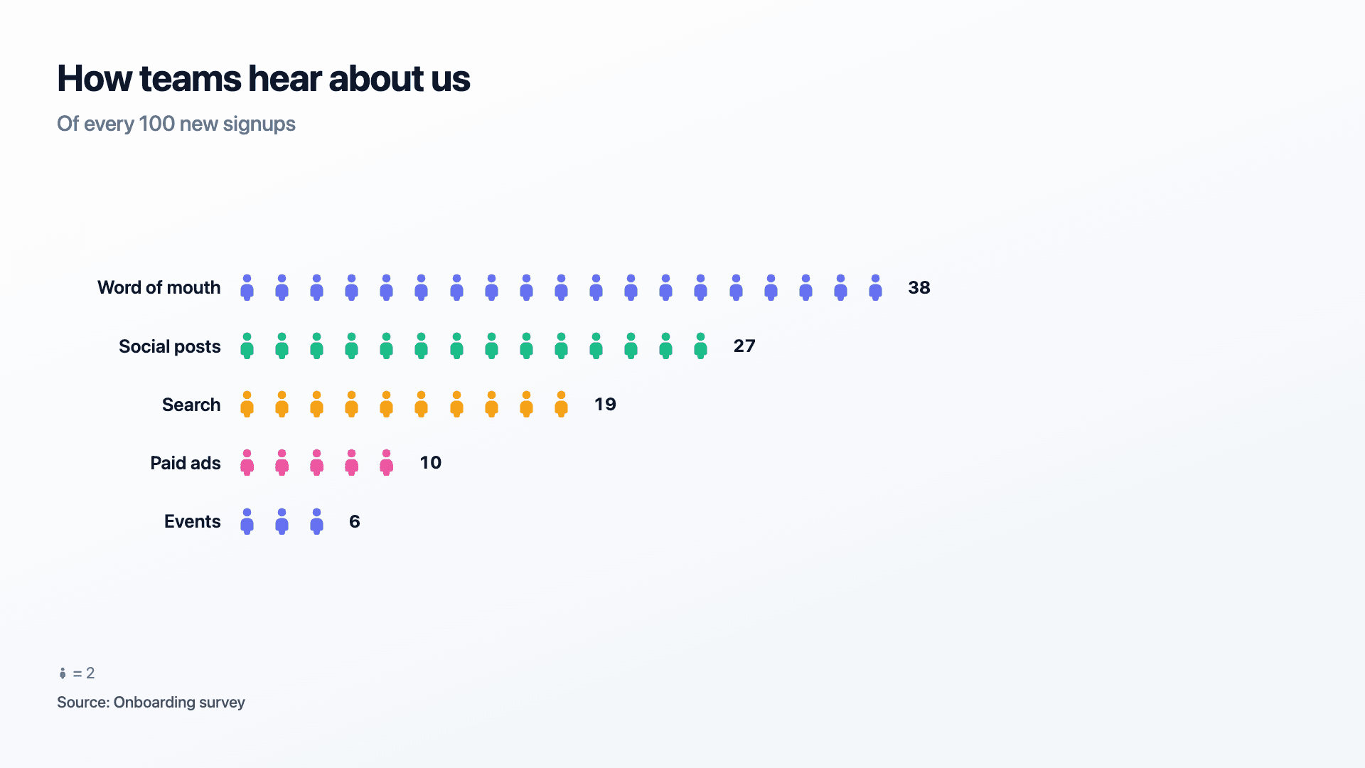
A pictogram, or icon array, shows a value as a row of repeated icons rather than a bar or a slice. It is the oldest trick in data visualisation because it works on a level bars don't reach: 38 little figures out of 100 is not just a number, it's a crowd you can picture. "38% of signups come from word of mouth" is a fact; watching 38 of 100 figures fill in is a feeling.
The format has a natural ceiling. Past 15-20 icons in a row, the count becomes a texture instead of something countable, and the chart stops feeling precise. That's why Reochart picks a sensible unit automatically, one icon can stand for 1, or for 5, or for 200, whatever keeps the row readable, and always prints the exact value at the end so the rounded icons never quietly become a lie.
Where Reochart differs from a static icon grid is motion and honesty together. Icons pop in one at a time so the count builds in front of the viewer, and when a unit above 1 is in play, a small legend line says so explicitly, e.g. "= 5 people", so nobody mistakes 8 icons for 8 people when it's actually 40.
How it works
How a pictogram works
Each row is one category with a label and a value. Reochart looks at the largest value in your dataset and picks a unit, 1, 2, 5, or a round multiple of ten, so that the longest row lands at roughly 15-20 icons rather than sprawling into an uncountable wall.
Every icon in a row pops in with a quick, staggered entrance, and the row's exact value fades in beside the last icon once it lands. If the chosen unit is greater than 1, a legend below the chart spells out what one icon represents, so the visceral read ("look how many") and the precise read (the printed number) never contradict each other.
Examples
Example pictograms
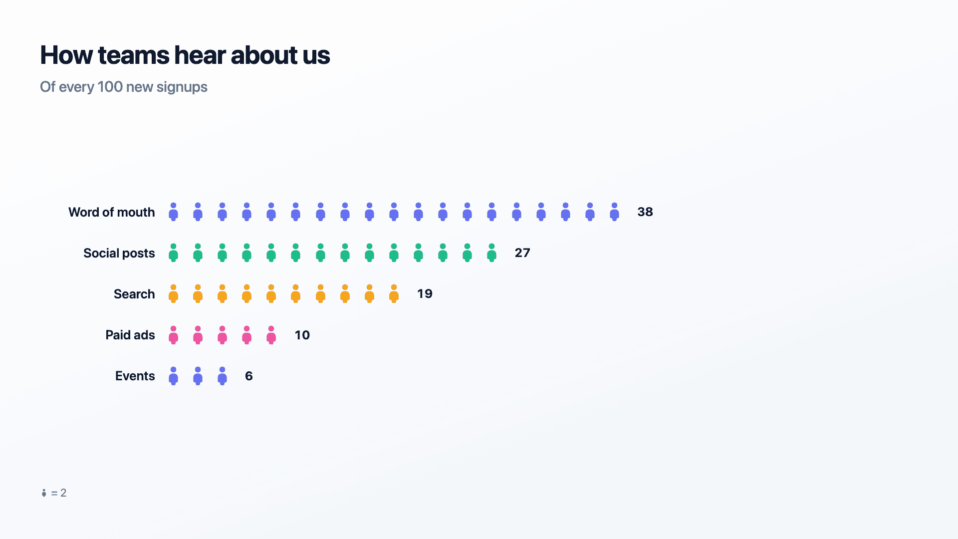
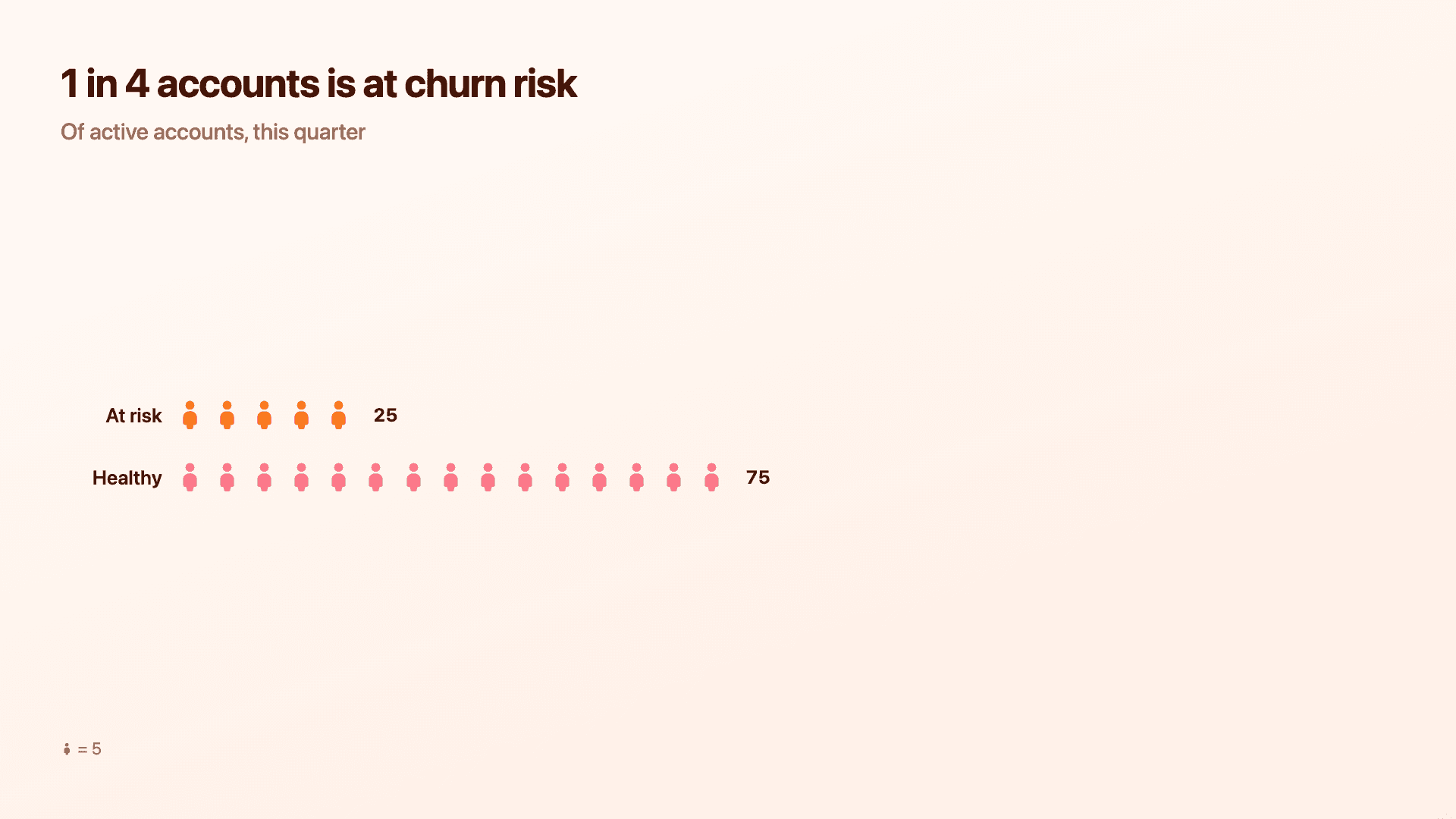
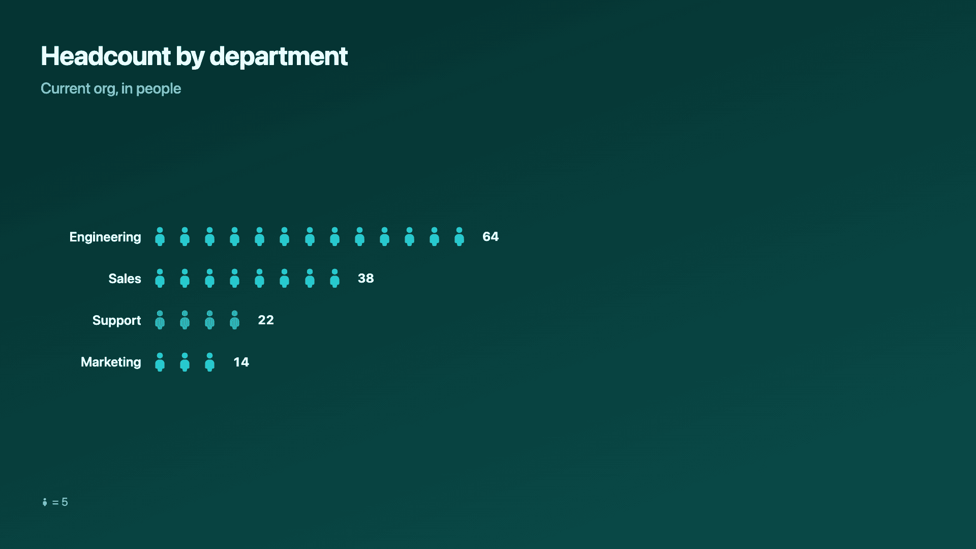
Real charts made in Reochart, each with its own data and theme. They animate automatically as you scroll.
Good fit
When to use a pictogram
- ✓"1 in N" statistics and survey shares
- ✓Audience or population breakdowns
- ✓Any count where the units are people or things
- ✓A single dramatic proportion for a social post
Reach for something else
When not to use a pictogram
- ✕You have more than about 10-15 categories, icon rows get cramped fast; use a bar chart instead.
- ✕Precise comparison matters more than the visceral "count of things" read, a bar or lollipop chart compares lengths more accurately than icons compare counts.
- ✕Your values span a huge range, a handful of tiny counts next to one huge one forces a unit that makes the small rows disappear.
- ✕The audience needs to read exact figures at a glance without waiting for icons to finish popping in, a highlight table states the numbers directly.
Compare
Pictogram vs other charts
Pictogram vs the alternatives, at a glance.
| Chart type | Best for | Avoid when |
|---|---|---|
| Pictogram | "1 in N" counts, audience breakdowns | Precise comparison, more than ~15 categories |
| Bar / column | Comparing values across categories | You want a visceral, human count |
| Lollipop | A minimal ranked comparison | You want icons rather than dots |
| Donut | Parts of one whole as a percentage | The audience wants a literal count, not a share |
Your data
What data you need
One row per category: a label and a count. Reochart picks the icon unit automatically from your largest value; paste straight from Excel or Sheets, or import a CSV. 3 to 6 rows reads best.
| Label | Value |
|---|---|
| Word of mouth | 38 |
| Social posts | 27 |
| Search | 19 |
| Paid ads | 10 |
Step by step
How to make a pictogram
Drop your numbers in, or import a CSV.
Choose the chart, theme and animation speed.
Tune colours, labels and add your brand.
Download MP4, GIF, PNG or SVG.
Best practices
Get it right
- ✓Keep to 3-6 rows so every row's icons stay countable at a glance.
- ✓Let Reochart pick the unit automatically rather than forcing 1-per-icon on large numbers.
- ✓Use it when the story is "how many" or "what share", not when exact comparison matters.
- ✓Keep labels short so they don't compete with the icon rows for space.
- ✕Mix wildly different magnitudes in one chart, a unit that fits the biggest row can make a small one vanish.
- ✕Use more than about 15-20 icons per row, past that it reads as a texture, not a count.
- ✕Rely on icons alone for a decision that needs precision, print the number too (Reochart always does).
- ✕Pick an icon unit and forget to mention it, always show the "= N" legend when it's greater than 1.
Watch out
Common mistakes to avoid
Past 15-20 icons a row stops being countable and just reads as a block of colour. Let the auto unit keep rows short.
If one icon means 5 people, say so. An icon array without its legend quietly misleads.
One category with 5,000 and another with 12 forces a unit that erases the smaller row. Split them into separate charts or use a bar chart instead.
Icons are for a visceral read, not fine-grained ranking. If the audience needs to know which of two close values is bigger, use a bar or lollipop chart.
Why Reochart
Built for sharing, not just charting
- ✓No design skills required
- ✓Animated MP4 and GIF exports
- ✓PNG and scalable SVG too
- ✓Your brand colours and logo (Pro)
- ✓Paste from a sheet or import a CSV
- ✓Presentation and feed ready in minutes
FAQ
Frequently asked questions
What is a pictogram chart?
A pictogram chart, also called a pictograph or an isotype chart, represents a value as a row of repeated icons, where each icon stands for one unit or for a round number of units stated in a key. Counting replaces measuring: instead of reading a bar against an axis, the viewer sees seven figures out of ten shaded and understands the proportion immediately. That directness is why the format is a staple of public-health messaging, survey results and infographics aimed at non-specialist audiences, and it is the natural home of the “1 in 10 people” statistic. The constraint is that icons are discrete. A pictogram handles round numbers and simple ratios well, but a value like 47.3 has to be rounded or shown as a partial icon, so precise figures are better served by a bar chart.
What data do I need?
A label and a value per row. Reochart picks the icon unit automatically and shows it in a small legend when one icon stands for more than 1.
How many rows can a pictogram hold?
It stays readable up to about 8 rows. Beyond that, icon rows compete for vertical space; a bar chart handles a longer list more gracefully.
How does Reochart decide what one icon is worth?
It looks at your largest value and rounds up to a clean unit (1, 2, 5, or a multiple of ten) that keeps the longest row to roughly 15-20 icons. The legend spells out the unit whenever it's more than 1.
Pictogram or bar chart?
Use a pictogram when the story is a human count or a "1 in N" share and some rounding is fine. Use a bar chart when categories need to be compared precisely.
Can I make it animated?
Yes. Icons pop in one by one by default, and you can export the animation as an MP4 or GIF, or grab a static PNG or SVG.
Can I export as SVG?
Yes. Pro exports a crisp, scalable SVG vector, alongside MP4, GIF and PNG. Every export renders at 1080p.
Can I use my own brand colours and logo?
On Pro, yes. Set a brand palette and add a logo that replaces the watermark on every export.
Is Reochart free?
Yes. The free plan lets you make every chart type except the animated bar chart race, and export an animated MP4 with a small watermark, no card needed. Pro adds the bar chart race, removes the watermark, and adds GIF and SVG, your brand colours and logo, longer videos and CSV import.
From the blog
Learn more about charts and data storytelling

11 min read
How to Create an Animated Number Counter
A step-by-step guide to building a number counter that actually lands: picking the number worth this treatment, setting an honest start point, adding the context that makes it mean something, and exporting an animated version for a launch post, a deck, or a milestone update.
Read article →

11 min read
How to Build a QBR Dashboard
A practical guide to building the handful of charts a quarterly business review actually needs: the growth number, the bridge that explains it, the pipeline read, the KPI scorecard, and the roadmap for what's next.
Read article →