Animated Before & After Chart Generator
Show what improved and what declined between two points in time. Export as PNG, SVG, GIF or MP4.
Free to try · No design skills · Ready in about two minutes
Trusted by 1,220 users, including people at
 ByteDance
 Arizona State
 Fox
Fox UT Austin
 Roche
Roche Tulane
 United Airlines
 Clemson
 NHS
NHS Ayming
 Marquette
 Kent State
 Ray White
 UC Riverside
 CBA
CBA Illinois Tech
 Venngage
 Hofstra
 House of Communication
 IIT Madras
 Sotherly Hotels
 Zenus.ai
Overview
What this tool is for
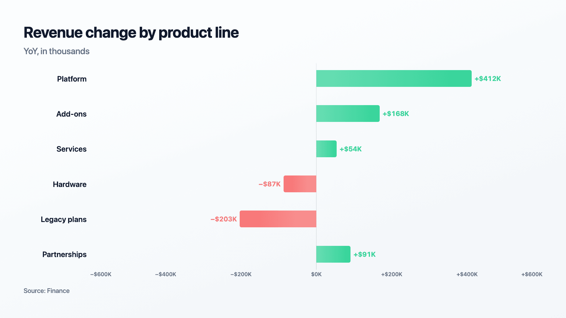
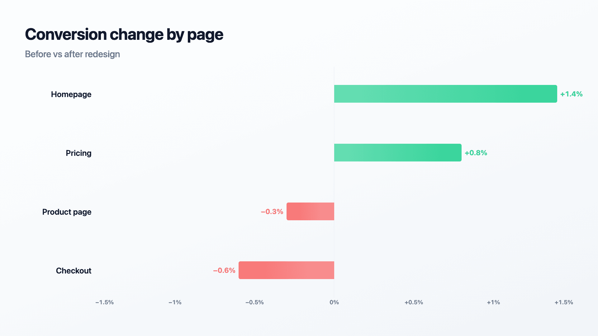
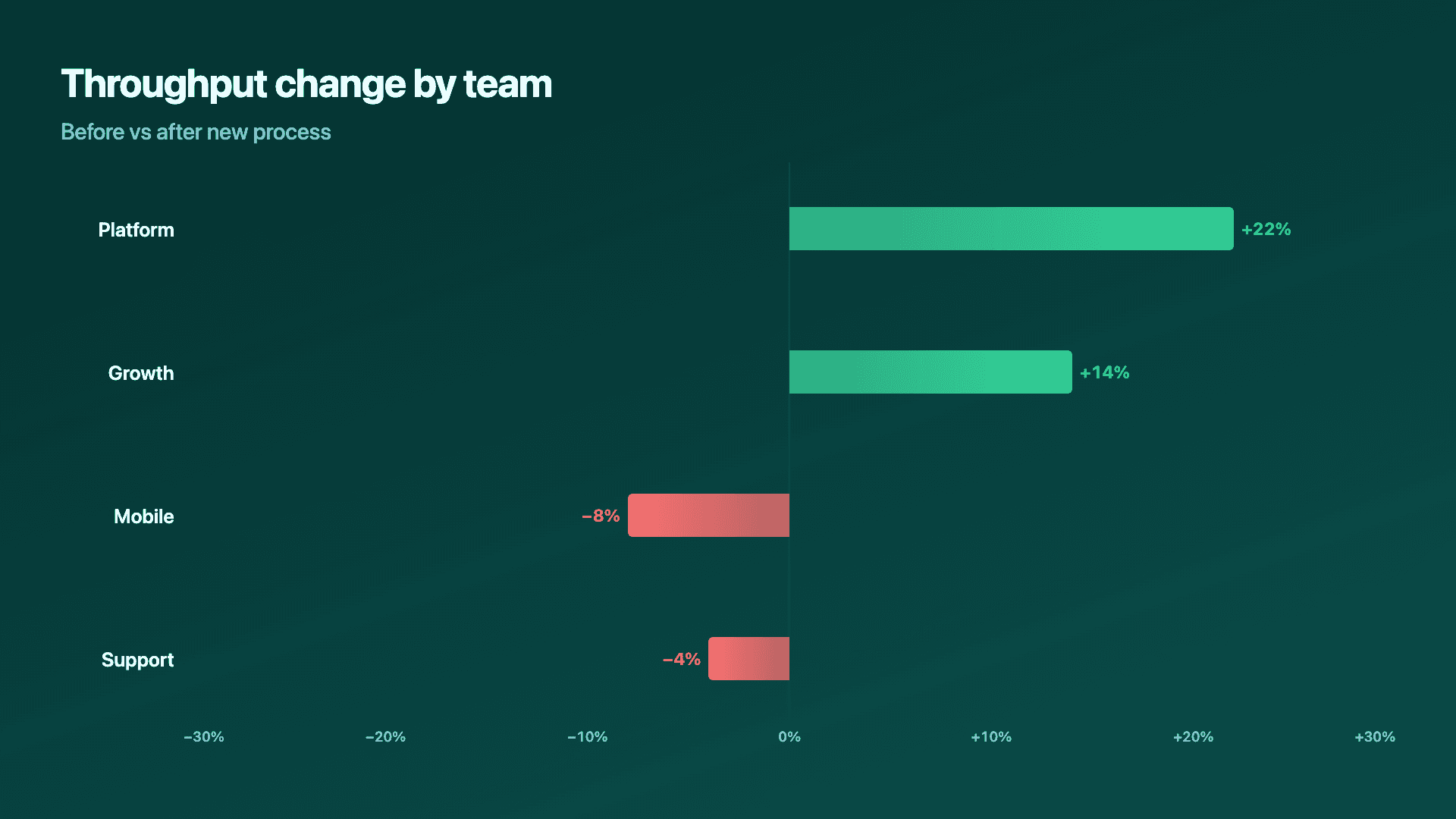
Change rarely moves in one direction across every category at once. A redesign might lift conversion on some pages and drop it on others. A new process might speed up some teams and slow down others while it beds in. Reporting only the average hides that mix, and a reader who needs to know where things got better and where they got worse is better served by seeing every category's change laid out at once, gains extending one way, losses extending the other.
This page builds that specific comparison: a before-and-after view across several categories, showing exactly which ones moved up and which moved down between two points in time.
Reochart animates each bar growing from a shared zero line, gains in one colour and losses in another, so a mixed result reads honestly rather than getting smoothed into an average. Export as MP4, GIF, PNG or SVG, on your brand on Pro.
How it works
How a before and after chart works
List your categories, pages, teams, products, whatever the comparison spans, and enter the before value and the after value for each. The change is calculated as the signed difference and drawn as a bar growing right for an increase and left for a decrease.
Sort categories by size of change, largest improvement to largest decline, so the extremes are easy to find rather than buried in an arbitrary order.
Examples
Example charts
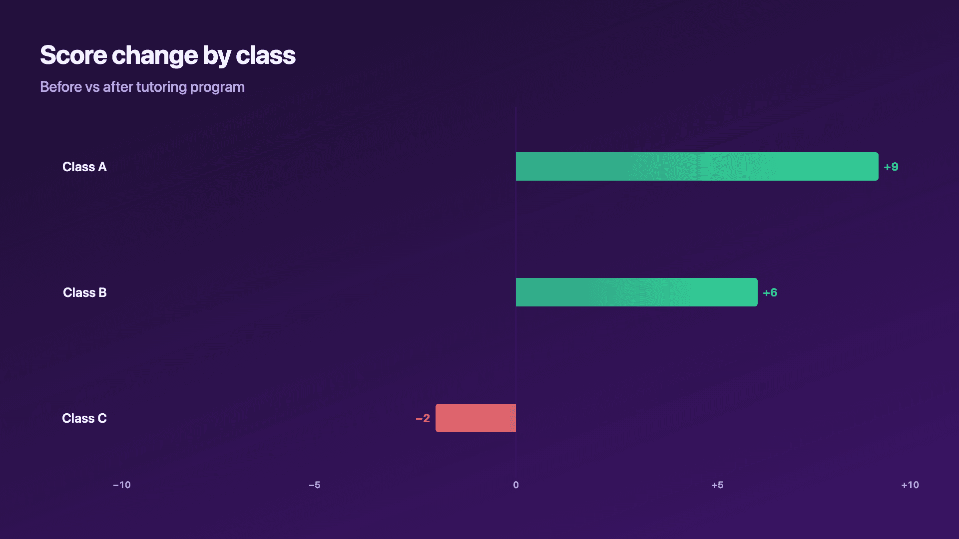
Real charts made in Reochart, each with its own data and theme. They animate automatically as you scroll.
Good fit
When to use it
- ✓Reporting the effect of a redesign, process or policy change
- ✓Results that didn't all move the same direction
- ✓A retrospective on what a change actually did
- ✓Before-and-after results across many categories at once
Reach for something else
When not to use it
- ✕Every value in your comparison is positive, growth across every category with nothing declining, a plain bar chart is simpler.
- ✕You are comparing exactly two named things rather than one thing's change across categories, a comparison bar chart may fit the framing better.
- ✕The point is explaining what moved a single total number, a waterfall chart is built for that instead.
Compare
Which chart to use
Before/after vs the alternatives.
| Chart type | Shows | Best for |
|---|---|---|
| Before/after (diverging) | Signed change across many categories | Mixed results, some up, some down |
| Comparison bar | Two values side by side, per category | A head-to-head with no direction implied |
| Waterfall | A single number's bridge, step by step | Explaining what moved one landed total |
Your data
What data you need
One row per category with a before and after value; Reochart calculates the signed change. Paste from a sheet or import a CSV. Ten to twelve categories reads cleanly.
| Category | Before | After |
|---|---|---|
| Homepage | 2.1 | 3.5 |
| Pricing | 3.0 | 3.8 |
| Checkout | 4.2 | 3.6 |
Step by step
How to make one
Drop your numbers in, or import a CSV.
Choose the chart, theme and animation speed.
Tune colours, labels and add your brand.
Download MP4, GIF, PNG or SVG.
Best practices
Get it right
- ✓Sort categories by size of change, largest improvement to largest decline.
- ✓Show the actual before and after values near the chart, not just the delta.
- ✓Use a consistent, distinct colour for increases versus decreases across everything you publish.
- ✕Hide a category with no change by omitting it, show it at zero instead.
- ✕Show only percentage change with no absolute figures.
- ✕Mix categories measured in different units into one chart.
Watch out
Common mistakes to avoid
Not sorting by size of change lets the biggest movers get lost in an arbitrary or alphabetical order.
Without baseline values shown, a reader can't judge whether a large percentage change actually matters in absolute terms.
Reporting only percentage change without the underlying numbers can make a change on a very small base look larger than it is.
If every category moved the same direction, a plain bar chart of the after values communicates growth more simply.
Why Reochart
Built for sharing, not just charting
- ✓No design skills required
- ✓Animated MP4 and GIF exports
- ✓PNG and scalable SVG too
- ✓Your brand colours and logo (Pro)
- ✓Paste from a sheet or import a CSV
- ✓Presentation and feed ready in minutes
FAQ
Frequently asked questions
What is a before and after chart?
A before and after chart shows what changed between two points in time by plotting the movement for each category rather than the two absolute values, so improvement and decline separate visually. Drawn as a diverging bar chart, gains extend one way from a centre zero line and losses the other, which means the reader sees the split before reading a single number. That framing is the whole advantage. Two columns of before and after figures make a reader do subtraction for every row; a diverging chart does the subtraction for them and ranks the results. It suits any comparison of two periods or two states, a redesign's effect on page metrics, results before and after a policy change, or performance this quarter against last.
What if a category has no change at all?
Show it at zero, a bar with no length in either direction, so the reader can see plainly that it neither improved nor declined.
How is this different from a regular bar chart?
A regular bar chart shows a value. This chart shows a change, a signed difference between a before and an after, with direction carried by which way the bar extends.
Should I show percentage change or absolute change?
Both, where possible. Percentage alone can make a tiny base number look dramatic; absolute alone can undersell a meaningful shift on a small base.
Should the categories be sorted by size of change?
Usually yes. Sorting from the largest improvement to the largest decline makes the extremes easy to find.
Can I make it animated?
Yes. Charts animate by default, and you can export the animation as an MP4 or GIF, or grab a static PNG or SVG if you prefer.
Can I export as SVG?
Yes. Pro exports a crisp, scalable SVG vector, alongside MP4, GIF and PNG. Every export renders at 1080p.
Is Reochart free?
Yes. The free plan lets you make every chart type except the animated bar chart race, and export an animated MP4 with a small watermark, no card needed. Pro adds the bar chart race, removes the watermark, and adds GIF and SVG, your brand colours and logo, longer videos and CSV import.
From the blog
Learn more about charts and data storytelling

11 min read
How to Create an Animated Number Counter
A step-by-step guide to building a number counter that actually lands: picking the number worth this treatment, setting an honest start point, adding the context that makes it mean something, and exporting an animated version for a launch post, a deck, or a milestone update.
Read article →

11 min read
How to Build a QBR Dashboard
A practical guide to building the handful of charts a quarterly business review actually needs: the growth number, the bridge that explains it, the pipeline read, the KPI scorecard, and the roadmap for what's next.
Read article →