Animated Historical Timeline Maker
Plot events, eras and dates on a clean animated timeline. Export as PNG, SVG, GIF or MP4.
Free to try · No design skills · Ready in about two minutes
Trusted by 1,220 users, including people at
 ByteDance
 Arizona State
 Fox
Fox UT Austin
 Roche
Roche Tulane
 United Airlines
 Clemson
 NHS
NHS Ayming
 Marquette
 Kent State
 Ray White
 UC Riverside
 CBA
CBA Illinois Tech
 Venngage
 Hofstra
 House of Communication
 IIT Madras
 Sotherly Hotels
 Zenus.ai
Overview
What this tool is for
A history timeline carries a different kind of weight than a product timeline. It usually spans years, decades or centuries rather than weeks, often needs to show two periods overlapping, a reign running alongside a war, and the dates themselves are settled fact, not a target someone is trying to hit.
This page builds that version: a timeline for plotting historical events, eras and dates, meant for a class assignment, a history blog post, a family history project, or a museum or library display, using the same animated timeline engine as the rest of Reochart, tuned for this use.
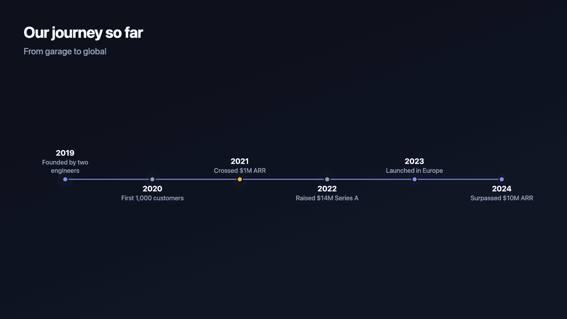
Reochart animates each milestone onto the line in turn, so the narrative unfolds instead of sitting flat. Add a date and a short description per event and export as MP4, GIF, PNG or SVG, on your brand on Pro.
How it works
How a historical timeline works
List your events with their dates, exact days for recent history, just a year or a century for anything older, and choose a scale, decades or centuries for a broad sweep, exact dates for a shorter, detailed stretch.
Label each event briefly and add an era or period band wherever two spans overlap, a reign next to a war, for instance, so overlapping periods sit next to each other without one date crowding out another.
Examples
Example charts
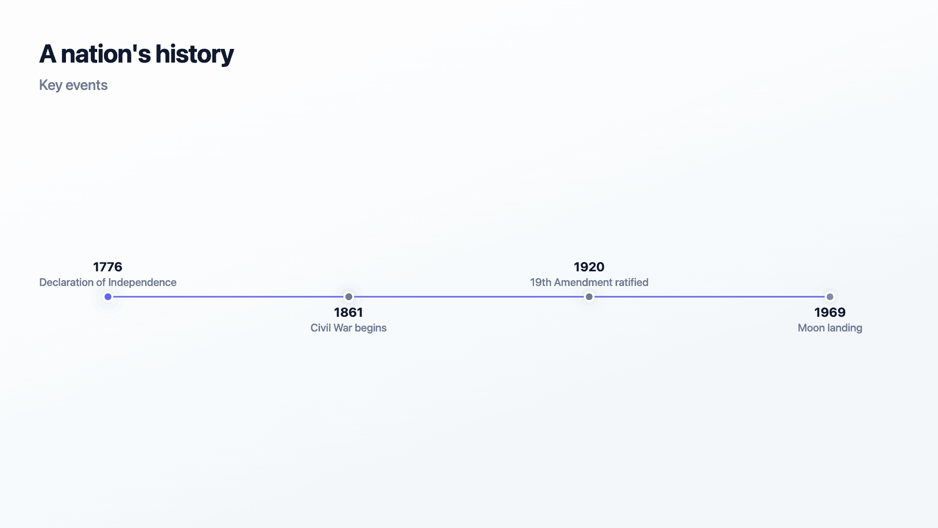
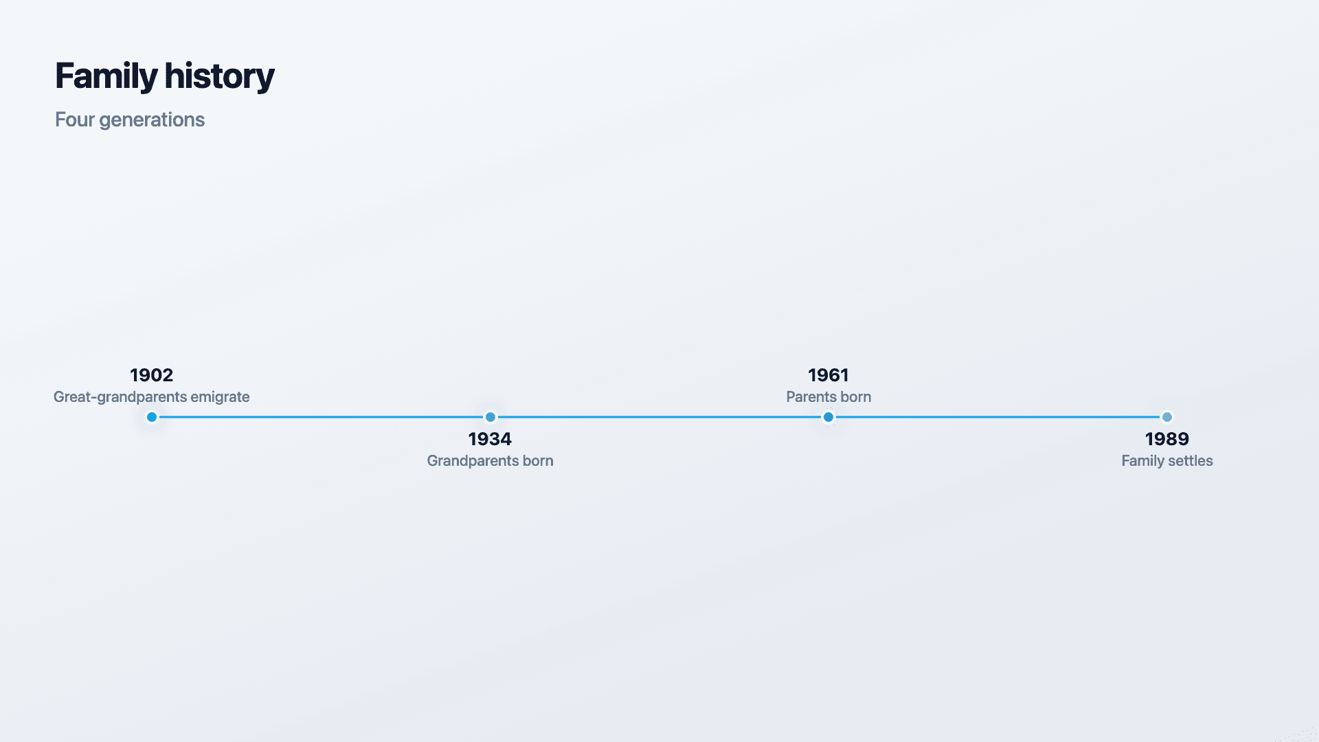
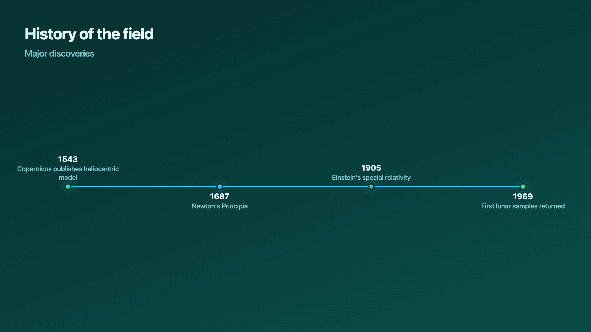
Real charts made in Reochart, each with its own data and theme. They animate automatically as you scroll.
Good fit
When to use it
- ✓A class assignment or history project
- ✓A history blog post or article
- ✓A family history or genealogy project
- ✓A museum or library display
Reach for something else
When not to use it
- ✕The story is a product launch, a migration, or a quarter's plan, the roadmap generator handles now/next/later planning instead.
- ✕The audience is a business team rather than a classroom, library or blog, the general timeline generator covers that case directly.
- ✕You have dozens of events, summarise to the key moments instead.
Compare
Which chart to use
Historical timeline vs roadmap vs general timeline.
| Chart type | Typical span | Best for |
|---|---|---|
| Historical timeline | Years to centuries | A narrative across long stretches of settled history |
| Roadmap | Weeks to a year | Planned, uncertain work grouped into lanes |
| General timeline | Weeks to a few years | A single sequential business process |
Your data
What data you need
One row per event: a year, full date, or range, and a short description. A century or decade works just as well as an exact day. Paste from a sheet or import a CSV. Fifteen to twenty events per view reads best.
| Date | Event |
|---|---|
| 1066 | Battle of Hastings |
| 1776 | Declaration of Independence |
| 1969 | Moon landing |
Step by step
How to make one
Drop your numbers in, or import a CSV.
Choose the chart, theme and animation speed.
Tune colours, labels and add your brand.
Download MP4, GIF, PNG or SVG.
Best practices
Get it right
- ✓Keep date granularity consistent within one timeline.
- ✓Use an era or period band for anything that overlaps another entry.
- ✓Keep labels short, push detail into an optional caption instead.
- ✕Cram more than fifteen to twenty events onto a single view.
- ✕Ignore calendar differences for very old dates.
- ✕Assume a reader knows the century you mean from a two-digit year alone.
Watch out
Common mistakes to avoid
Fitting a century's worth of detail onto a timeline sized for a decade makes every label overlap the next.
Not distinguishing a point event from an era that spans years makes the timeline read as a flat list rather than a shape with duration in it.
Using exact-day precision for events only known to the nearest decade reads as false confidence rather than care.
Leaving out BC/AD or BCE/CE markers on a timeline that spans the boundary is the fastest way to confuse a reader about how much time passed.
Why Reochart
Built for sharing, not just charting
- ✓No design skills required
- ✓Animated MP4 and GIF exports
- ✓PNG and scalable SVG too
- ✓Your brand colours and logo (Pro)
- ✓Paste from a sheet or import a CSV
- ✓Presentation and feed ready in minutes
FAQ
Frequently asked questions
What is a historical timeline?
A historical timeline plots events, eras and dates across a span measured in years, decades or centuries rather than weeks or quarters. Two things distinguish it from a business timeline. The dates are settled record rather than targets someone is trying to hit, so the chart is describing what happened instead of proposing what will; and the spans are long enough that overlap becomes normal, with a reign running alongside a war or one movement beginning before another ends. That means a historical timeline usually needs period bands as well as point events, and it needs honest precision, since much of the historical record is only known to the nearest decade or century. It is the standard format for a class project, a history article, a family genealogy or a museum display.
Can I use BC/BCE dates?
Yes. Ancient history through the present all work the same way, since the scale is something you set rather than a fixed window built around modern dates.
What if I don't know the exact date, only the decade or century?
Use whatever precision you actually have. A vague 'circa 1200s' entry is more honest than inventing a specific year the historical record doesn't support.
Can I show a range of years instead of a single date?
Yes. Many events, a reign, a war, an era, don't have one day attached to them, so entries can be set to a range instead.
Can I show two overlapping periods, like two rulers reigning in different regions at once?
Yes, using an era or period band alongside the point events, so two spans can sit next to each other without one date crowding out the other.
Is this suitable for a school project?
Yes. A student assignment usually needs a clear sequence of dated events with short labels, exportable as an image for a printed report or a video for a presentation.
Can I make it animated?
Yes. Charts animate by default, and you can export the animation as an MP4 or GIF, or grab a static PNG or SVG if you prefer.
Can I export as SVG?
Yes. Pro exports a crisp, scalable SVG vector, alongside MP4, GIF and PNG. Every export renders at 1080p.
Is Reochart free?
Yes. The free plan lets you make every chart type except the animated bar chart race, and export an animated MP4 with a small watermark, no card needed. Pro adds the bar chart race, removes the watermark, and adds GIF and SVG, your brand colours and logo, longer videos and CSV import.
From the blog
Learn more about charts and data storytelling

11 min read
How to Create an Animated Number Counter
A step-by-step guide to building a number counter that actually lands: picking the number worth this treatment, setting an honest start point, adding the context that makes it mean something, and exporting an animated version for a launch post, a deck, or a milestone update.
Read article →

11 min read
How to Build a QBR Dashboard
A practical guide to building the handful of charts a quarterly business review actually needs: the growth number, the bridge that explains it, the pipeline read, the KPI scorecard, and the roadmap for what's next.
Read article →