Animated Ranked Bar Chart Generator
Turn a leaderboard or top-N list into bars that sort themselves by rank. Export as PNG, SVG, GIF or MP4.
Free to try · No design skills · Ready in about two minutes
Trusted by 1,220 users, including people at
 ByteDance
 Arizona State
 Fox
Fox UT Austin
 Roche
Roche Tulane
 United Airlines
 Clemson
 NHS
NHS Ayming
 Marquette
 Kent State
 Ray White
 UC Riverside
 CBA
CBA Illinois Tech
 Venngage
 Hofstra
 House of Communication
 IIT Madras
 Sotherly Hotels
 Zenus.ai
Overview
What this tool is for
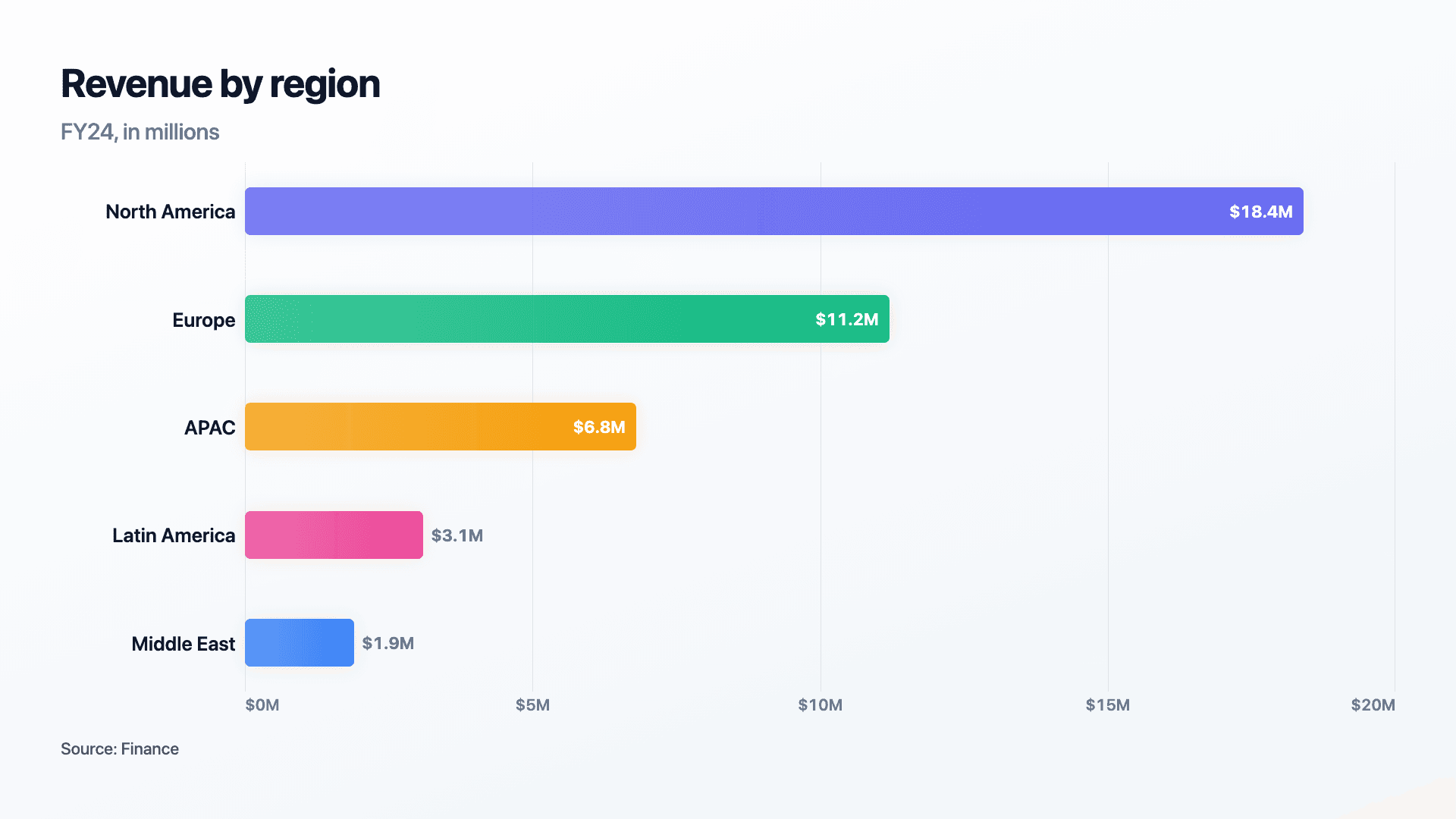
A ranked list is a different kind of chart than a plain comparison. In a plain bar chart, the order of the categories is arbitrary or alphabetical. In a ranked chart, the order is the entire point: first place, second, third, and so on, with the length of each bar confirming the rank rather than the other way around.
A leaderboard, a top-10 list, or survey results sorted by share all need the chart to do that sorting automatically and keep it obvious at a glance, without a reader hunting for the order in a legend.
Reochart sorts your items high to low and animates the bars sliding into rank order, so a leaderboard or top-N list lands instantly. Export as MP4, GIF, PNG or SVG, on your brand on Pro.
How it works
How a ranked bar chart works
Enter your items and values in any order, Reochart sorts them from highest to lowest so first place sits at the top, where a reader expects it. Bar length is proportional to value from a shared zero baseline.
Keep the list to around ten to fifteen items so every bar and label stays readable. Beyond that, show only the top group and summarise the rest.
Examples
Example charts
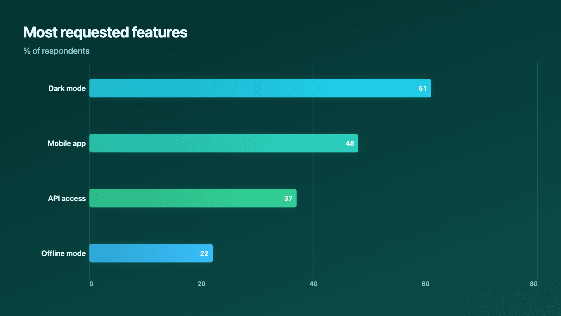
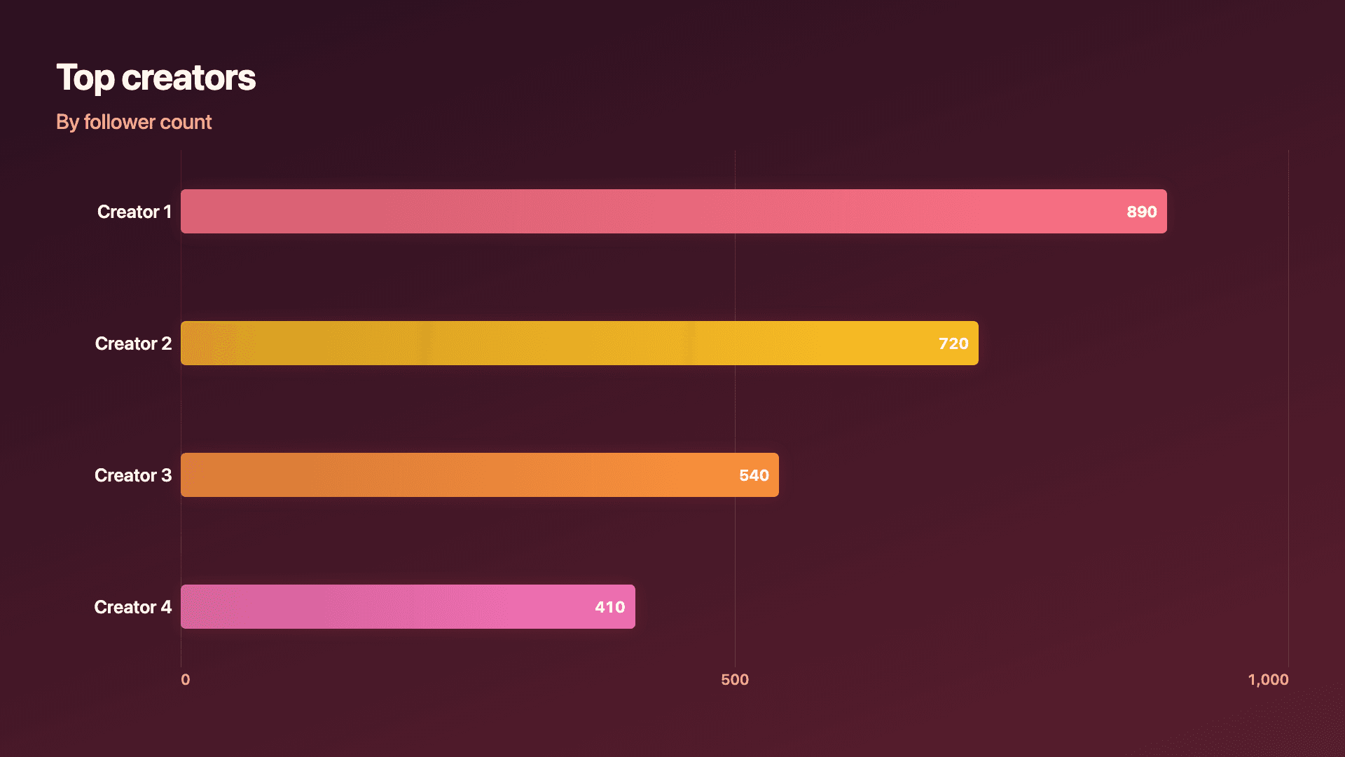
Real charts made in Reochart, each with its own data and theme. They animate automatically as you scroll.
Good fit
When to use it
- ✓A leaderboard or top-N list
- ✓Survey or poll results ordered by share
- ✓Most popular or highest-performing content
- ✓Any ranking where the order itself is the story
Reach for something else
When not to use it
- ✕You are comparing a fixed, unordered set of categories, a plain horizontal or vertical bar chart fits better.
- ✕The ranking changes across several time periods and the movement itself is the story, a bar chart race shows that directly.
- ✕You have more than about fifteen items, group the tail into an 'others' bar or split into two views.
Compare
Which chart to use
Ranked bar vs the alternatives.
| Chart type | Best for | Avoid when |
|---|---|---|
| Ranked bar chart | A leaderboard or top-N list, today | No inherent order to the categories |
| Bar chart race | Watching rank shift over months or years | A single snapshot in time |
| Horizontal bar chart | Any ordered or unordered category comparison | Rank itself needs to be the headline |
Your data
What data you need
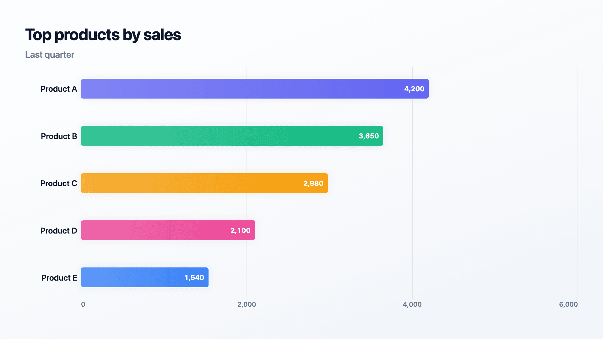
One row per item: a label and the value you're ranking by, revenue, votes, downloads. Reochart sorts high to low automatically. Paste from a sheet or import a CSV.
| Item | Value |
|---|---|
| Product A | 4200 |
| Product B | 3650 |
| Product C | 2980 |
Step by step
How to make one
Drop your numbers in, or import a CSV.
Choose the chart, theme and animation speed.
Tune colours, labels and add your brand.
Download MP4, GIF, PNG or SVG.
Best practices
Get it right
- ✓Label the exact value next to each bar, not just its length.
- ✓Sort descending unless there is a specific reason to reverse it.
- ✓Note the date or period the ranking reflects.
- ✕Truncate the axis to exaggerate the gap between ranks.
- ✕Rank more than about fifteen items in one view.
- ✕Bury how a tie was broken.
Watch out
Common mistakes to avoid
Starting the axis above zero makes small gaps in the data look like large gaps in the chart.
Ranking too many at once makes the bottom half unreadable and adds nothing actionable.
Leaving out the source or date for survey data makes a legitimate ranking read like an unsupported claim.
Comparing revenue figures against percentage growth as if they were the same kind of number undermines the ranking.
Why Reochart
Built for sharing, not just charting
- ✓No design skills required
- ✓Animated MP4 and GIF exports
- ✓PNG and scalable SVG too
- ✓Your brand colours and logo (Pro)
- ✓Paste from a sheet or import a CSV
- ✓Presentation and feed ready in minutes
FAQ
Frequently asked questions
What is a ranked bar chart?
A ranked bar chart is a horizontal bar chart whose defining property is its order: bars are sorted by value, largest to smallest, so position on the page is itself information. That sounds like a small detail and is not. In an unsorted bar chart the reader has to compare lengths to work out what came first; in a ranked one the answer is simply the top bar, and second place is the one below it. Sorting also produces a clean descending silhouette that shows the shape of the distribution at a glance, whether a couple of items dominate everything else or the field is evenly matched. It is the right format for leaderboards, top-ten lists, survey responses, product or region performance and any question phrased as which of these is biggest.
How is this different from a regular horizontal bar chart?
A regular horizontal bar chart can be ordered any way you like. This one is built around automatic ranking, sorting your items by value and keeping that order the focus.
What's the difference between a ranked bar chart, a ranked horizontal bar chart, and a top N chart?
Nothing — they're the same tool. Whether you're searching for a ranked bar chart, a ranked horizontal bar chart, or a top N chart generator, this builds the same thing: bars that sort themselves by value and settle into rank order, animated and exportable as MP4, GIF, PNG, or SVG.
Should the axis start at zero?
Yes, in almost every case. Starting anywhere else exaggerates the visual gap between ranks relative to the real numbers.
Can I highlight the top 3?
Yes, the top few positions can be given a distinct colour or accent so the podium stands out from the rest of the field.
Can I animate items swapping rank between two periods?
A single ranked bar chart shows one snapshot. For rank changing over time, a bar chart race is built for that movement directly.
Can I make it animated?
Yes. Charts animate by default, and you can export the animation as an MP4 or GIF, or grab a static PNG or SVG if you prefer.
Can I export as SVG?
Yes. Pro exports a crisp, scalable SVG vector, alongside MP4, GIF and PNG. Every export renders at 1080p.
Is Reochart free?
Yes. The free plan lets you make every chart type except the animated bar chart race, and export an animated MP4 with a small watermark, no card needed. Pro adds the bar chart race, removes the watermark, and adds GIF and SVG, your brand colours and logo, longer videos and CSV import.
From the blog
Learn more about charts and data storytelling

11 min read
How to Create an Animated Number Counter
A step-by-step guide to building a number counter that actually lands: picking the number worth this treatment, setting an honest start point, adding the context that makes it mean something, and exporting an animated version for a launch post, a deck, or a milestone update.
Read article →

11 min read
How to Build a QBR Dashboard
A practical guide to building the handful of charts a quarterly business review actually needs: the growth number, the bridge that explains it, the pipeline read, the KPI scorecard, and the roadmap for what's next.
Read article →