Zoho Analytics alternative for shareable charts
Not every chart needs a dashboard.
Some just need to move.
Last updated: August 2026
Zoho Analytics is built for ongoing BI: connect a data source, build a dashboard, let a team query it over time. Reochart is built for a different moment — one number or trend that needs to leave the dashboard as a polished, animated chart. Paste your data, pick from 30 chart types, export an MP4, GIF, PNG or SVG in under two minutes.
The short answer
Reochart isn't a BI replacement — it's what you reach for after the analysis is done. Zoho Analytics is genuinely good at connecting data and building dashboards a team queries over time. Reochart is for the moment one result from that work needs to become a single, polished, animated chart for a post, a slide, or an investor update — without spinning up a workspace for it.
Default spreadsheet chart — static
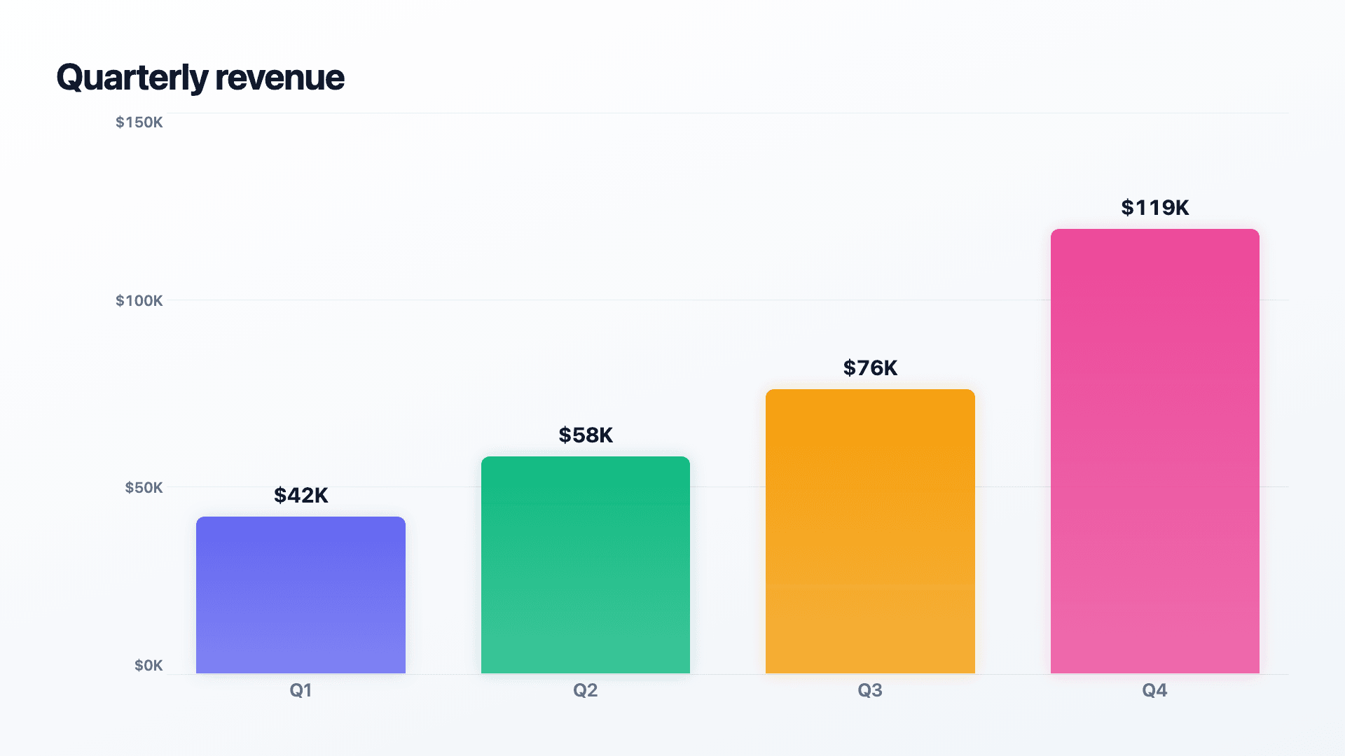
Same data, made in Reochart — animated
Same numbers. Left: a static dashboard report. Right: the same data in Reochart, animating.
Two different jobs, not one tool doing it better.
This isn't a straight "which is better" comparison — Zoho Analytics and Reochart aren't built for the same task. Here's the honest split.
Zoho Analytics: ongoing analysis.
Connect a live data source, build a workspace, model the report, and let a team drill into it over time. It's infrastructure, not a one-off chart.
Reochart: one shareable moment.
Paste the numbers you already have, pick a chart type, and export something animated and finished in under two minutes. No workspace, no data model.
Where they differ.
When Zoho Analytics is the right choice.
Keep using it, full stop, in these situations:
- ✓
You need to connect live, ongoing data sources. Databases, apps, warehouses — Zoho Analytics is built to keep a report current automatically. Reochart works from data you paste or import once.
- ✓
Your team needs to query and drill into the data themselves. Interactive filtering, pivoting and ad hoc analysis is Zoho Analytics' core job. Reochart makes one finished chart, not an explorable dataset.
- ✓
The dashboard is the deliverable. If the goal is a living internal dashboard people check regularly, that's exactly what Zoho Analytics is for.
When to reach for Reochart instead.
Four signals that what you actually need is a chart, not a dashboard:
- 1
You have a handful of numbers already — from a report, a spreadsheet, anywhere — and just need one polished chart from them.
- 2
The chart is going somewhere outside the dashboard: a LinkedIn post, a slide, an investor update, a client email.
- 3
You want the chart to animate: a number counting up, a bar chart race, or a revenue bridge building step by step.
- 4
Setting up a workspace and data connector for one chart would take longer than making the chart itself.
Other tools people compare Zoho Analytics against.
If you're evaluating Zoho Analytics for BI specifically, these are its real competitors. None of them animate a chart for sharing either — that's the gap Reochart fills alongside any of them.
Presentation formats a BI dashboard isn't built for.
These are narrative, single-moment visuals — built for Reochart, not part of a BI platform's standard toolkit:
Questions answered.
Is Reochart a replacement for Zoho Analytics?
No, and it's worth being upfront about that: they solve different problems. Zoho Analytics is a business intelligence platform for connecting to live data sources and building dashboards a team queries over time. Reochart makes one polished, animated chart from data you already have, for sharing outside that dashboard. If you need ongoing analysis, keep Zoho Analytics. If you need one chart that looks good and moves, Reochart is faster and purpose-built for exactly that.
What's the best Zoho Analytics alternative for a quick shareable chart?
Reochart. Zoho Analytics is built around workspaces, data connectors and dashboards — real infrastructure for ongoing BI, which is overhead you don't want for a single chart you need to post or drop into a deck today. Reochart skips all of that: paste your numbers, pick a chart type, export an animated MP4, GIF, PNG or SVG in under two minutes.
Does Zoho Analytics export animated charts?
No. Zoho Analytics exports reports and dashboards as static PDFs, images, or the underlying data (CSV/XLSX). It's built for analysis and internal reporting, not for producing a shareable animated video. Reochart's charts animate automatically on every MP4/GIF export.
Can Zoho Analytics make a funnel, waterfall or bar chart race?
Zoho Analytics covers standard BI visuals well: bar, line, pie, pivot tables, KPI widgets and geo maps, and funnel charts for conversion analysis. Narrative, presentation-style formats built for a single shareable moment — a roadmap, a bar chart race, a pictogram, a fundraising thermometer — aren't part of a BI dashboard's toolkit the way they're built into Reochart.
Is Reochart free like Zoho Analytics' free tier?
Yes. Reochart's free plan makes every chart type and exports an animated MP4 with a small watermark, no card required, no row or viewer limits to run into. Pro ($8/mo) removes the watermark and adds GIF/SVG export, your brand colors and logo.
Should I use Reochart AND Zoho Analytics?
That's genuinely the common case. Keep Zoho Analytics for the ongoing dashboard your team actually queries. When one number or trend from that dashboard needs to go into a LinkedIn post, an investor update or a slide, pull it into Reochart for a chart that's built to be looked at once and shared, not drilled into.
Take one result from your dashboard and make it move.
Free forever to start. Pro is $8/mo when you want your brand on it.