Pitch Deck Chart Maker
Make investor-grade charts that carry your story, not clutter the slide. Export as PNG, SVG, GIF or MP4.
Free to try · No design skills · Ready in about two minutes
Trusted by 1,198 users, including people at
 ByteDance
 Arizona State
 Fox
Fox UT Austin
 Roche
Roche Tulane
 United Airlines
 Clemson
 NHS
NHS Ayming
 Marquette
 Kent State
 Ray White
 UC Riverside
 CBA
CBA Illinois Tech
 Venngage
 Hofstra
 House of Communication
 IIT Madras
 Sotherly Hotels
 Zenus.ai
Overview
What this tool is for
Investors skim decks in minutes, and the charts are what they stop on. A traction slide with a clean growth line does more than three bullet points ever will, and a market slide with one honest comparison beats a wall of stats. The problem is that most founders paste a spreadsheet screenshot or a default Excel chart, and it reads as exactly that — rushed.
A pitch-deck chart has one job: make a single point land in the two seconds an investor gives the slide. That means one idea per chart, a headline that states the takeaway, and a style that looks designed rather than dumped. The traction curve, the market size, the unit economics, the use-of-funds split — each maps to a chart that says it clearly.
Reochart turns your numbers into polished, on-brand charts sized for a slide, animated if you want the growth to actually move when you present. Build the traction line, the revenue bars and the funnel once, export PNG for the deck or MP4 for a demo-day recap, and the deck looks like a team, not a template, made it.
How it works
How to make pitch-deck charts
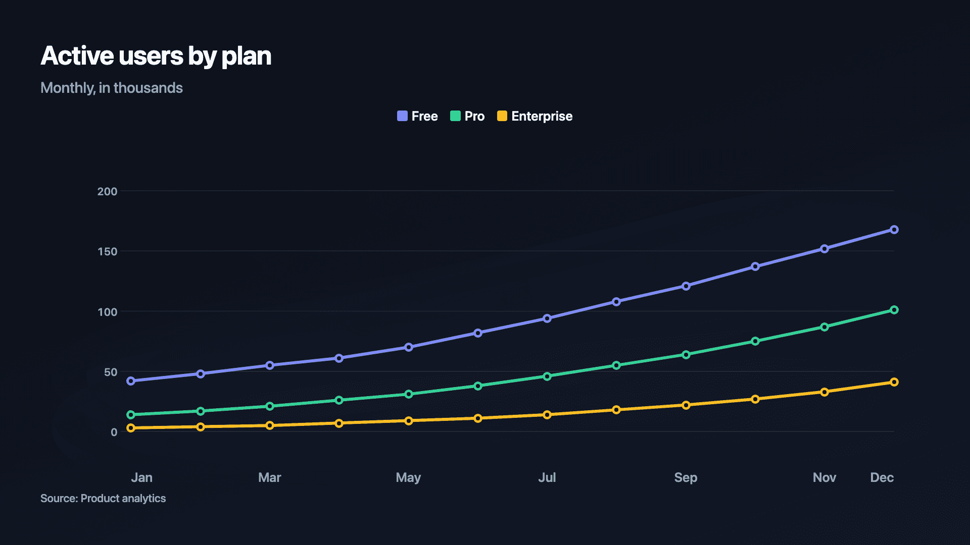
Pick the point each slide has to make and choose the chart that states it: a line or area for traction over time, bars for revenue by quarter, a counter for a headline metric, a funnel for the go-to-market. Paste the numbers, write a takeaway title, and set your brand colours.
Keep every chart to one idea and start axes at zero so the growth is honest. Export a crisp PNG or SVG for the slide, or an MP4 when you want the curve to draw on live as you talk.
Examples
Example charts
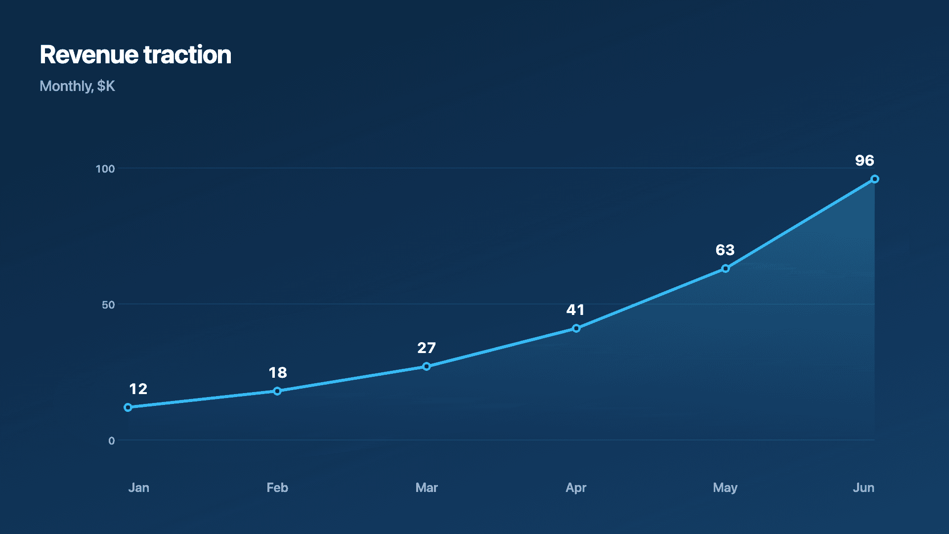
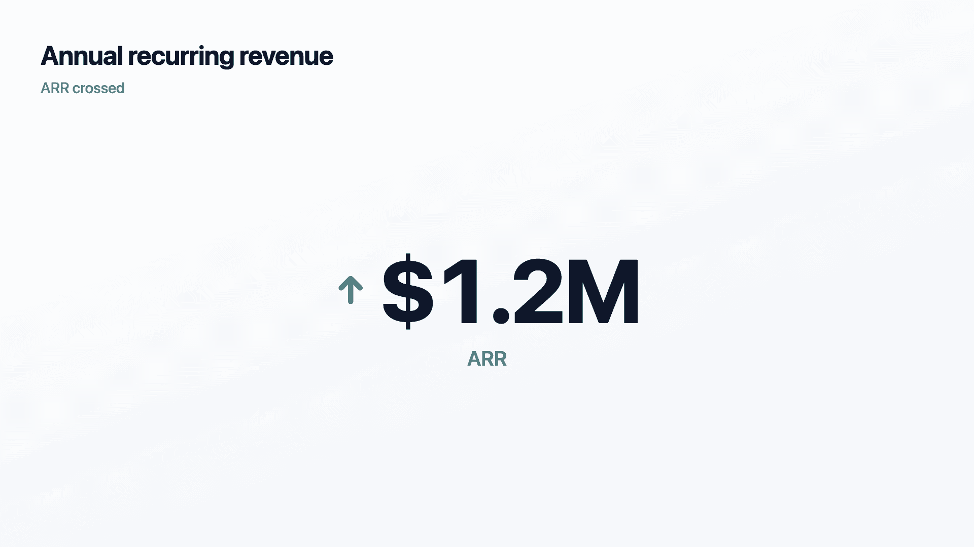
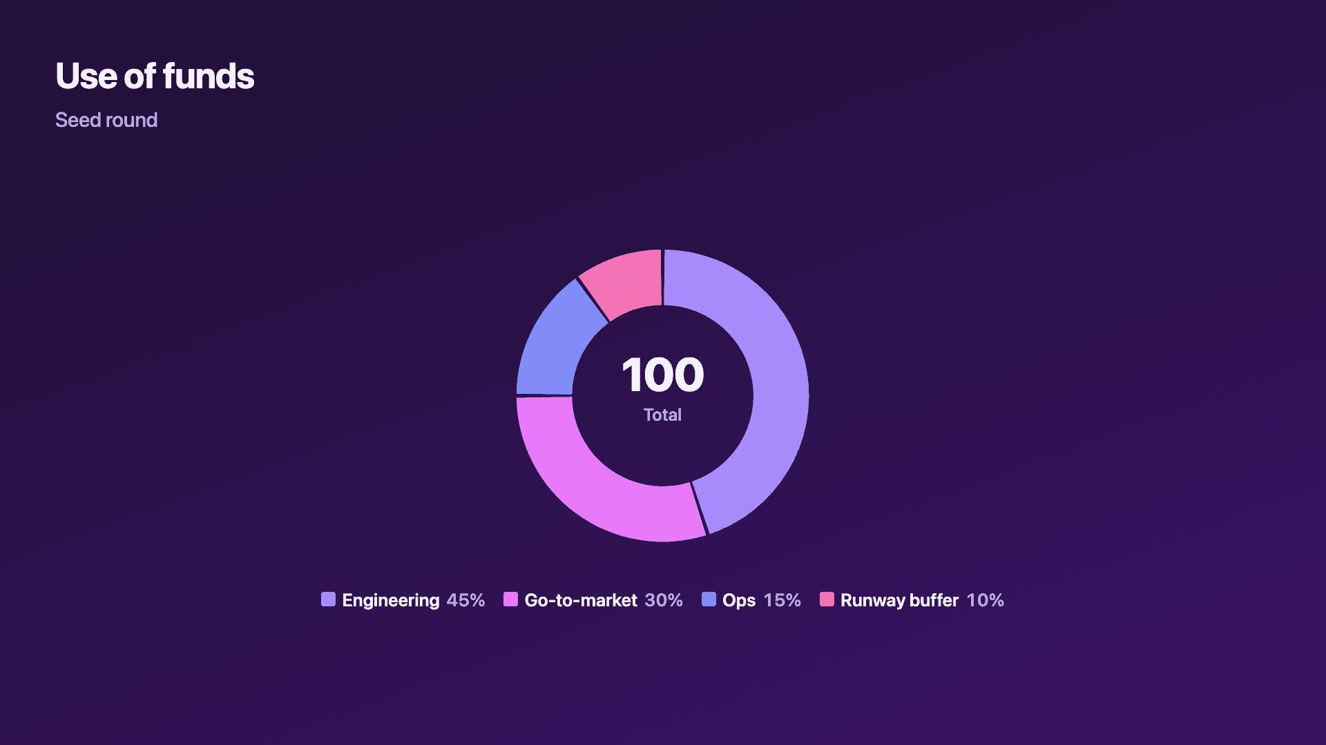
Real charts made in Reochart, each with its own data and theme. They animate automatically as you scroll.
Good fit
When to use it
- ✓Traction and growth slides
- ✓Revenue and unit-economics slides
- ✓Market-size comparisons
- ✓Use-of-funds breakdowns
- ✓Demo-day recap videos
Reach for something else
When not to use it
- ✕You need pages of detail, that belongs in the data room, not a slide.
- ✕The trend is flat or down, a chart will only draw the eye to it.
- ✕You have three data points, a sentence is often stronger.
- ✕The number needs heavy caveats, a chart implies confidence you may not have.
Compare
Which chart to use
Which chart for which slide.
| Slide | Best chart | Why |
|---|---|---|
| Traction | Line or area | Growth over time, at a glance |
| Revenue by period | Bar | Clean period comparison |
| One headline number | Counter | Maximum impact, zero clutter |
| Use of funds | Donut | Parts of a whole |
Your data
What data you need
Most deck charts are label-and-value rows (period, metric). A counter takes one number. Paste from a sheet or import a CSV.
| Period | Value |
|---|---|
| Jan | 12 |
| Feb | 18 |
| Mar | 27 |
Step by step
How to make one
Drop your numbers in, or import a CSV.
Choose the chart, theme and animation speed.
Tune colours, labels and add your brand.
Download MP4, GIF, PNG or SVG.
Best practices
Get it right
- ✓State the takeaway in the chart title.
- ✓One idea per chart, one chart per point.
- ✓Start axes at zero so growth is honest.
- ✓Match your deck's brand colours.
- ✕Paste a spreadsheet screenshot onto a slide.
- ✕Cram several metrics into one chart.
- ✕Truncate the axis to exaggerate a trend.
- ✕Label the chart with the metric name instead of the point.
Watch out
Common mistakes to avoid
A pasted Excel or dashboard screenshot reads as rushed and undercuts the story. Rebuild it clean and on-brand.
"Revenue by month" wastes the headline. Say the point: "Revenue tripled in six months."
Investors give a slide seconds. Three charts fighting for attention means none of them lands.
Truncating the y-axis to make growth look steeper is spotted instantly by anyone who reads decks, and it costs trust.
Why Reochart
Built for sharing, not just charting
- ✓No design skills required
- ✓Animated MP4 and GIF exports
- ✓PNG and scalable SVG too
- ✓Your brand colours and logo (Pro)
- ✓Paste from a sheet or import a CSV
- ✓Presentation and feed ready in minutes
FAQ
Frequently asked questions
What makes a good pitch deck chart?
A pitch deck chart has a harder job than a report chart, because it gets roughly two seconds of an investor's attention and has to land one specific point in that time. That constraint drives everything. One idea per chart, never three; a headline that states the takeaway rather than describing the axes, so the slide argues rather than presents; and enough visual polish that the chart reads as considered rather than pasted from a spreadsheet, since a sloppy chart quietly suggests sloppy numbers behind it. The charts themselves map to the standard deck sections: a traction line or area for growth, bars for revenue by period, a counter for the headline metric, a funnel for conversion, and a simple split for market size or use of funds.
What charts belong in a pitch deck?
A traction line or area for growth, bars for revenue by period, a counter for a headline number like ARR, a funnel for go-to-market, and a donut for use of funds.
Should pitch-deck charts be animated?
For a live or demo-day presentation, yes, an MP4 where the curve draws on as you talk is memorable. For a deck you send, export a static PNG or SVG.
How do I make charts look investor-grade?
One idea per chart, a takeaway title, zero-based axes, and your own brand colours. Reochart handles the styling so it looks designed, not defaulted.
Can I match my deck's brand?
Yes. On Pro you can set brand colours and add your logo so every chart matches the rest of the deck.
Can I make it animated?
Yes. Charts animate by default, and you can export the animation as an MP4 or GIF, or grab a static PNG or SVG if you prefer.
Is Reochart free?
Yes. The free plan lets you make every chart type except the animated bar chart race, and export an animated MP4 with a small watermark, no card needed. Pro adds the bar chart race, removes the watermark, and adds GIF and SVG, your brand colours and logo, longer videos and CSV import.
Keep exploring
Related generators
From the blog
Learn more about charts and data storytelling

11 min read
How to Create an Animated Number Counter
A step-by-step guide to building a number counter that actually lands: picking the number worth this treatment, setting an honest start point, adding the context that makes it mean something, and exporting an animated version for a launch post, a deck, or a milestone update.
Read article →

11 min read
How to Build a QBR Dashboard
A practical guide to building the handful of charts a quarterly business review actually needs: the growth number, the bridge that explains it, the pipeline read, the KPI scorecard, and the roadmap for what's next.
Read article →