Animated Sales Pipeline Chart Generator
Visualise your pipeline stage by stage, lead to closed-won. Export as PNG, SVG, GIF or MP4.
Free to try · No design skills · Ready in about two minutes
Trusted by 1,223 users, including people at
 ByteDance
 Arizona State
 Fox
Fox UT Austin
 Roche
Roche Tulane
 United Airlines
 Clemson
 NHS
NHS Ayming
 Marquette
 Kent State
 Ray White
 UC Riverside
 CBA
CBA Illinois Tech
 Venngage
 Hofstra
 House of Communication
 IIT Madras
 Sotherly Hotels
 Zenus.ai
Overview
What this tool is for
A sales pipeline is a funnel, but it carries a different kind of weight than a marketing conversion funnel. A marketing funnel usually tracks a count of people moving through awareness to signup. A sales pipeline tracks deals, and each stage often carries a dollar value, not just a count, since the question a sales team is actually asking is how much revenue sits at each stage and how much of it is likely to close.
This page builds that version: a funnel-shaped chart meant for a pipeline review, a forecast call, or a quarterly business review, where the stages are lead, qualified, proposal, negotiation and closed-won.
Reochart animates each stage narrowing into the next, so a pipeline review builds step by step in front of the room. Export as MP4, GIF, PNG or SVG, on your brand on Pro.
How it works
How a sales pipeline chart works
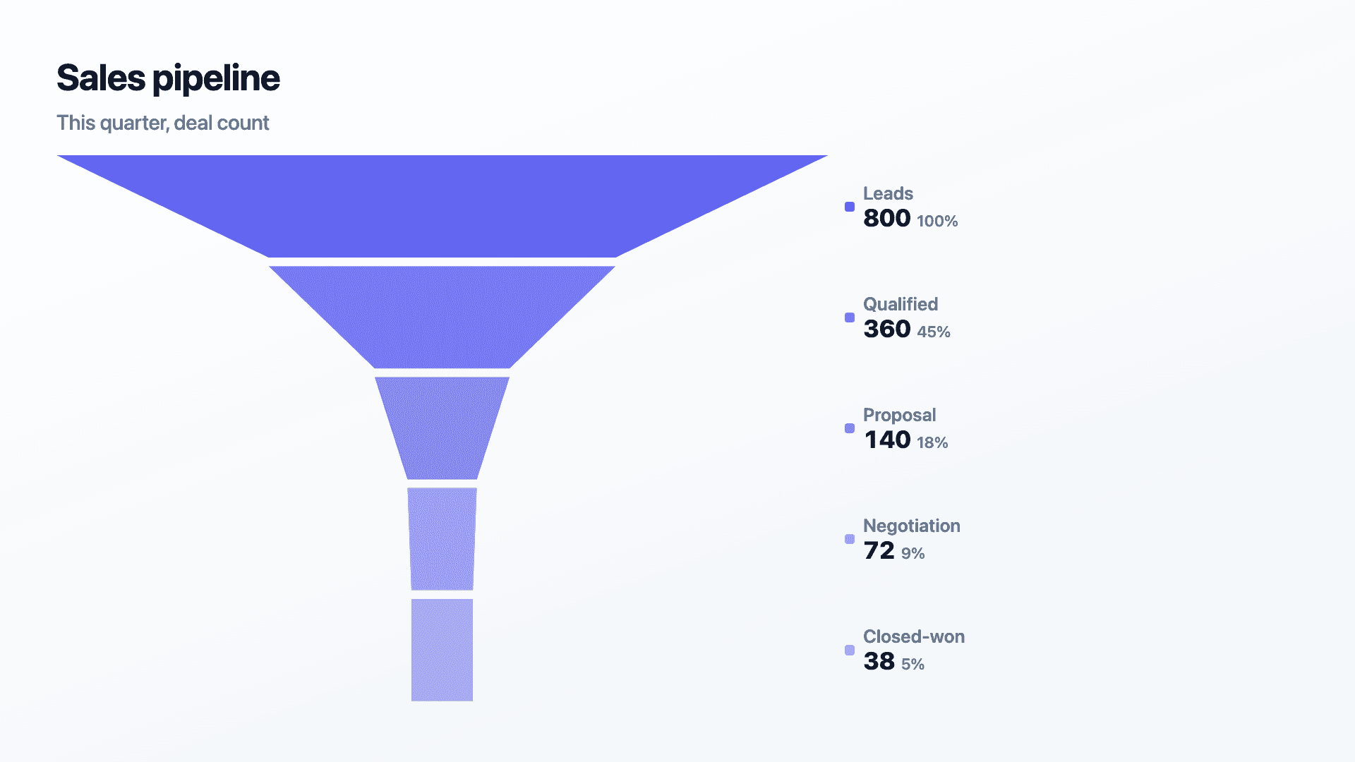
List your stages in order, lead through closed-won, and enter either a deal count or a total value at each one, whichever number the room cares about. Each band narrows in proportion to its value, so drop-off between stages is impossible to miss.
Order matters: each stage should be a subset of the one before it. If your stages don't feed into each other that way, a bar chart is the more honest choice.
Examples
Example charts
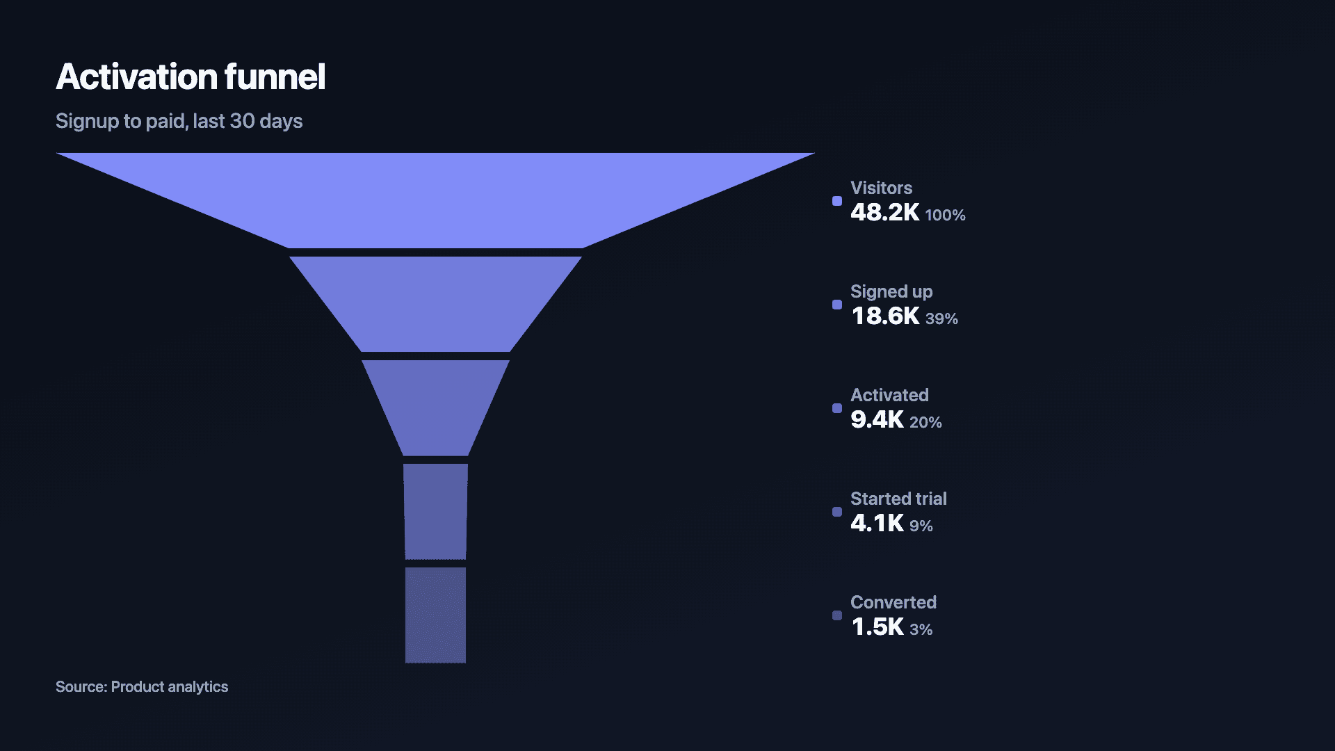
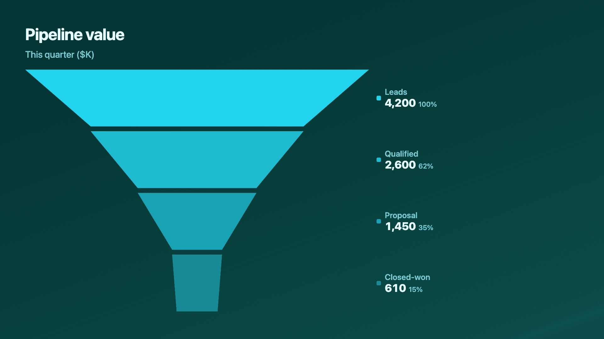
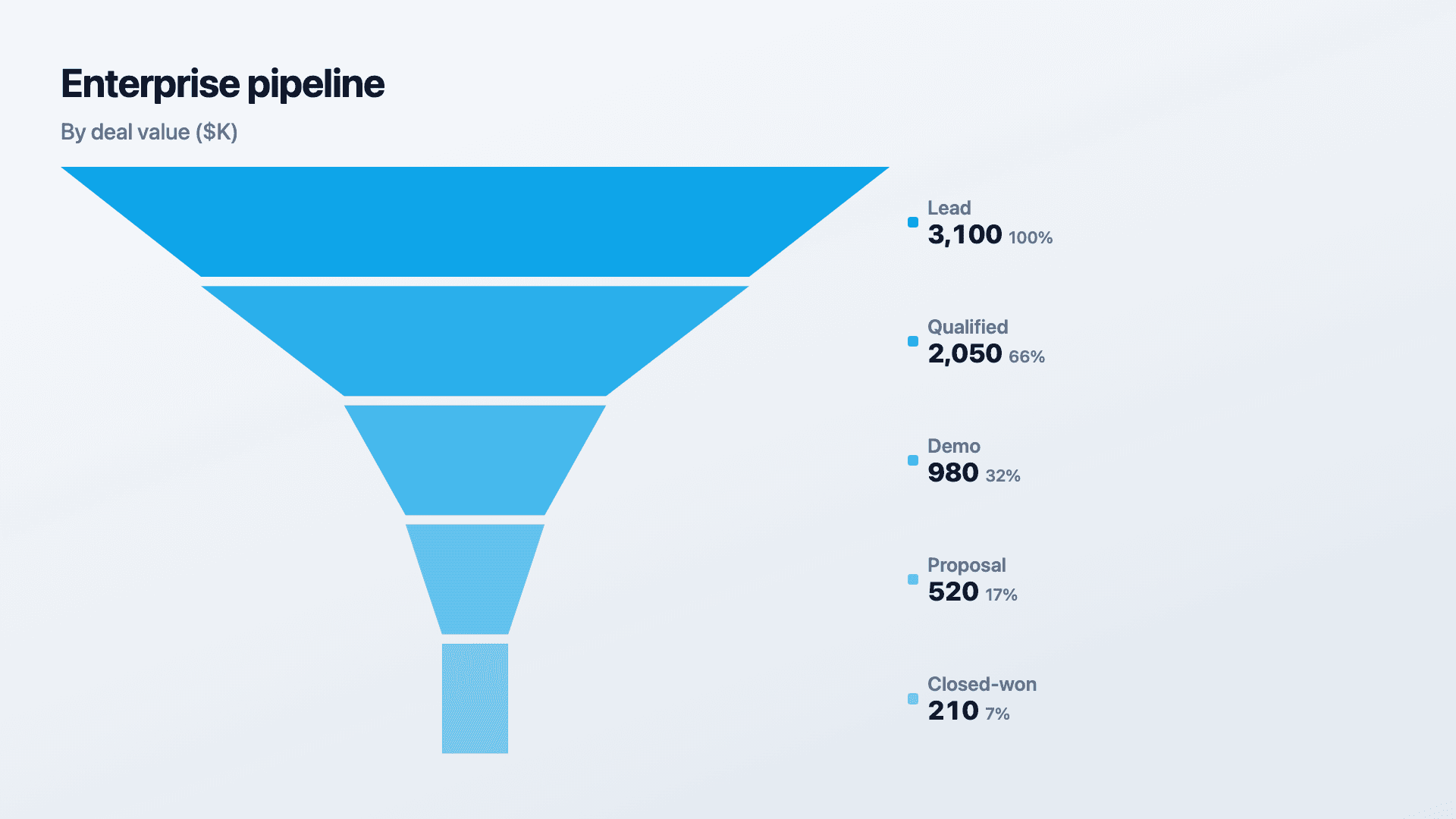
Real charts made in Reochart, each with its own data and theme. They animate automatically as you scroll.
Good fit
When to use it
- ✓A pipeline review or forecast call
- ✓A quarterly business review pipeline slide
- ✓Tracking deal count or value stage by stage
- ✓Spotting where deals are getting stuck
Reach for something else
When not to use it
- ✕Your stages are a marketing conversion funnel with no deal value attached, the general funnel chart generator fits that directly.
- ✕You need to explain what already moved a landed revenue number rather than where deals sit today, a waterfall chart is built for that.
- ✕You have more than six or seven stages, beyond that the funnel stops reading as a shape.
Compare
Which chart to use
Sales pipeline vs the alternatives.
| Chart type | Tracks | Avoid when |
|---|---|---|
| Sales pipeline | Deals moving toward close, count or value | No dollar or deal-count story |
| Funnel chart | A general conversion flow | Forecasting revenue specifically |
| Waterfall chart | What already moved a landed number | Showing where deals sit today |
Your data
What data you need
One row per stage, ordered widest to narrowest. Use deal count or dollar value, whichever the room needs. Paste from a sheet or import a CSV.
| Stage | Count or value |
|---|---|
| Leads | 800 |
| Qualified | 360 |
| Proposal | 140 |
| Closed-won | 38 |
Step by step
How to make one
Drop your numbers in, or import a CSV.
Choose the chart, theme and animation speed.
Tune colours, labels and add your brand.
Download MP4, GIF, PNG or SVG.
Best practices
Get it right
- ✓Show value alongside count wherever forecasting is the point of the meeting.
- ✓Label the conversion rate between adjacent stages, not just the raw drop-off.
- ✓Compare a pipeline against its own historical baseline rather than an assumed benchmark.
- ✕Hide a near-empty stage, a sparse stage is itself the finding.
- ✕Blend two very different pipelines into a single funnel without labelling the segments.
- ✕Use more than six or seven stages.
Watch out
Common mistakes to avoid
Showing deal count when the room needs value, or the reverse, answers a different question than the one being asked.
Without a stage-to-stage percentage, the room has to do that arithmetic mid-meeting.
Beyond six or seven, no single narrowing point stands out as the one worth discussing.
Combining enterprise and self-serve pipelines into one funnel hides which segment is actually driving the numbers.
Why Reochart
Built for sharing, not just charting
- ✓No design skills required
- ✓Animated MP4 and GIF exports
- ✓PNG and scalable SVG too
- ✓Your brand colours and logo (Pro)
- ✓Paste from a sheet or import a CSV
- ✓Presentation and feed ready in minutes
FAQ
Frequently asked questions
What is a sales pipeline chart?
A sales pipeline chart shows how many deals, or how much value, sits at each stage of a sales process, from lead through qualified and proposal to closed. It is normally drawn as a funnel, because a pipeline narrows: not every lead becomes an opportunity and not every proposal is won, so each stage is smaller than the one feeding it. Reading it is mostly about the gaps. A stage that loses most of what enters it is where the process is actually failing, and that is usually more useful than the headline conversion rate. Sales and RevOps teams use it in forecast reviews and board updates because it makes coverage visible: whether there is enough in early stages to hit next quarter's number, not just this one.
Can I show deal value instead of deal count at each stage?
Yes. Either number works, and value is usually the more useful one for a forecast conversation.
Should I use count or value for the top of the funnel?
Count is often more useful there, since a fresh lead rarely has a confirmed deal value yet; value becomes more meaningful in the middle and late stages.
How do I show a stage where deals are getting stuck?
Widen the gap to the next stage and label it with the percentage or value lost there.
Is this the same as a sales funnel template in a CRM?
It produces the visual, not the underlying tracking. Your CRM stays the system of record; this chart presents a snapshot of it.
Can I make it animated?
Yes. Charts animate by default, and you can export the animation as an MP4 or GIF, or grab a static PNG or SVG if you prefer.
Can I export as SVG?
Yes. Pro exports a crisp, scalable SVG vector, alongside MP4, GIF and PNG. Every export renders at 1080p.
Is Reochart free?
Yes. The free plan lets you make every chart type except the animated bar chart race, and export an animated MP4 with a small watermark, no card needed. Pro adds the bar chart race, removes the watermark, and adds GIF and SVG, your brand colours and logo, longer videos and CSV import.
Keep exploring
Related generators
From the blog
Learn more about charts and data storytelling

11 min read
How to Create an Animated Number Counter
A step-by-step guide to building a number counter that actually lands: picking the number worth this treatment, setting an honest start point, adding the context that makes it mean something, and exporting an animated version for a launch post, a deck, or a milestone update.
Read article →

11 min read
How to Build a QBR Dashboard
A practical guide to building the handful of charts a quarterly business review actually needs: the growth number, the bridge that explains it, the pipeline read, the KPI scorecard, and the roadmap for what's next.
Read article →