Animated Headcount Chart Generator
Show how your team's headcount changed, hires, departures, transfers. Export as PNG, SVG, GIF or MP4.
Free to try · No design skills · Ready in about two minutes
Trusted by 1,220 users, including people at
 ByteDance
 Arizona State
 Fox
Fox UT Austin
 Roche
Roche Tulane
 United Airlines
 Clemson
 NHS
NHS Ayming
 Marquette
 Kent State
 Ray White
 UC Riverside
 CBA
CBA Illinois Tech
 Venngage
 Hofstra
 House of Communication
 IIT Madras
 Sotherly Hotels
 Zenus.ai
Overview
What this tool is for
A team's size rarely changes for one reason. Hires add to it, departures take from it, and transfers move people between teams without changing the company's total at all. Reporting a single number, 'we grew from 40 to 52', hides all of that, and a listener has no way to tell whether the growth was mostly hiring or mostly a smaller team absorbing people transferred in from elsewhere.
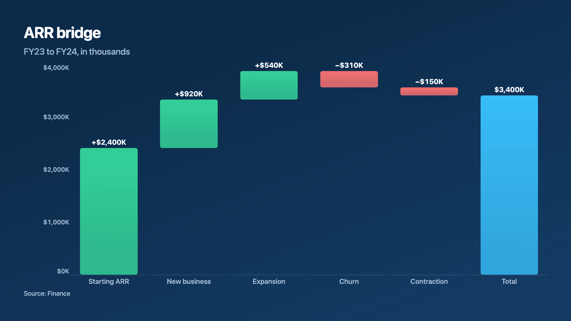
This page builds a bridge chart specifically for that story: opening headcount, stepping through hires, departures and transfers, to a closing headcount, the same mechanic finance uses for a revenue bridge, built here for people ops, planning meetings and all-hands updates instead.
Reochart animates each step rising or dropping into place, so a headcount review builds in front of the viewer rather than landing all at once. Export as MP4, GIF, PNG or SVG, on your brand on Pro.
How it works
How a headcount chart works
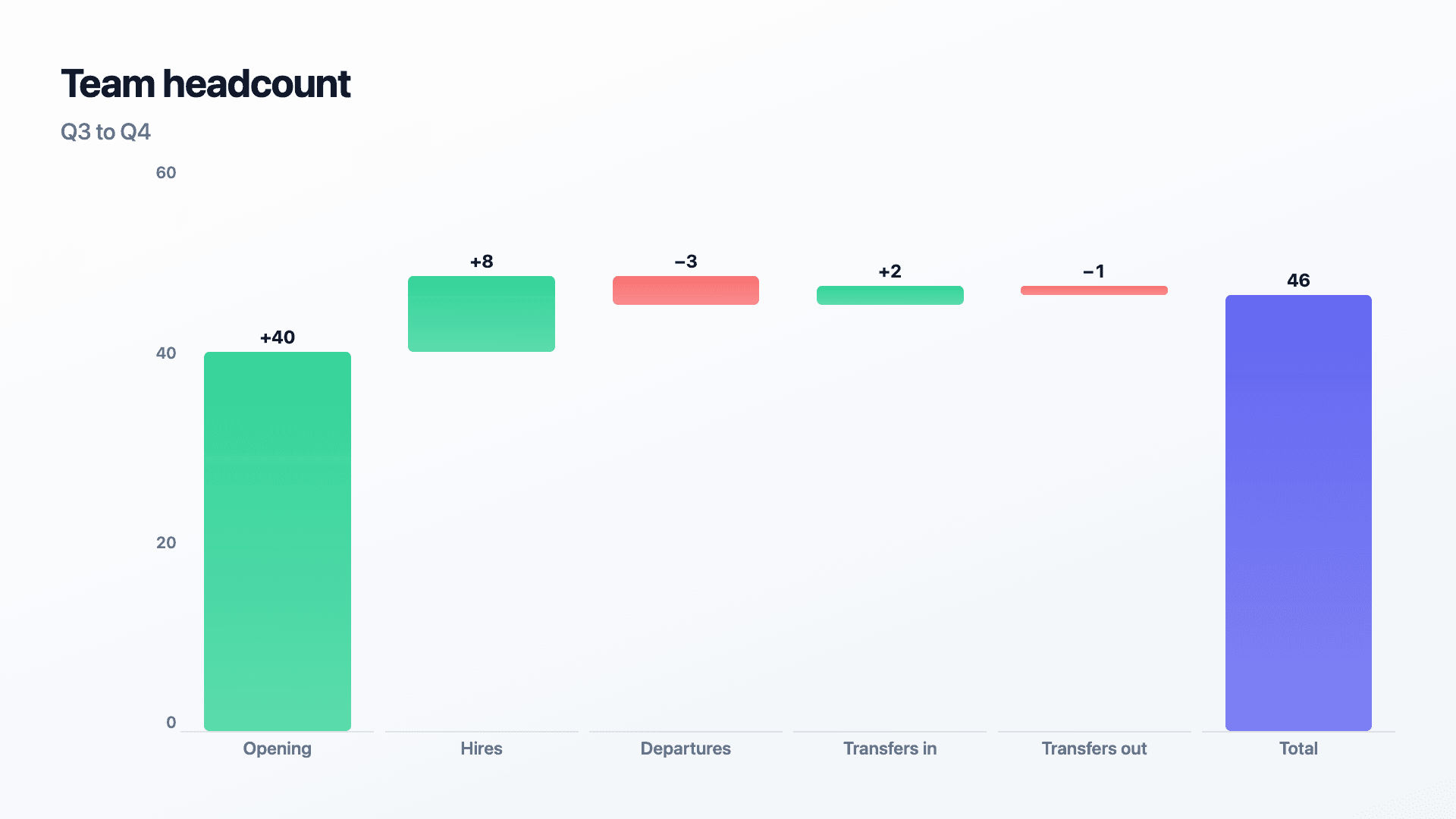
Set the opening headcount as the first bar, then add each step, hires, departures, transfers out, transfers in, as a floating bar with its own value and direction. The closing bar returns to the baseline as the final count.
Enter hires and transfers-in as positive numbers and departures and transfers-out as negatives. Opening plus every step should equal the closing number exactly.
Examples
Example charts
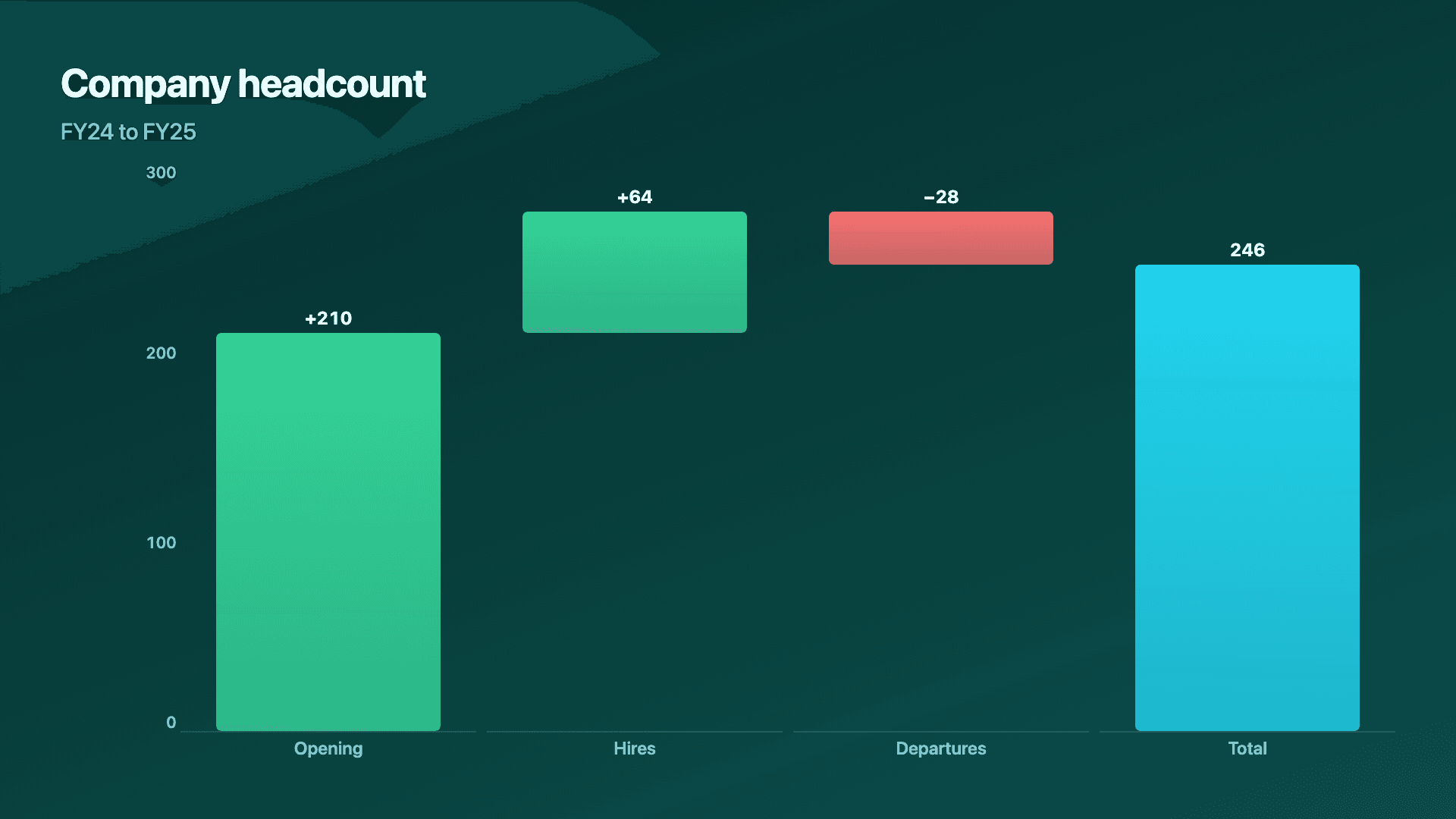
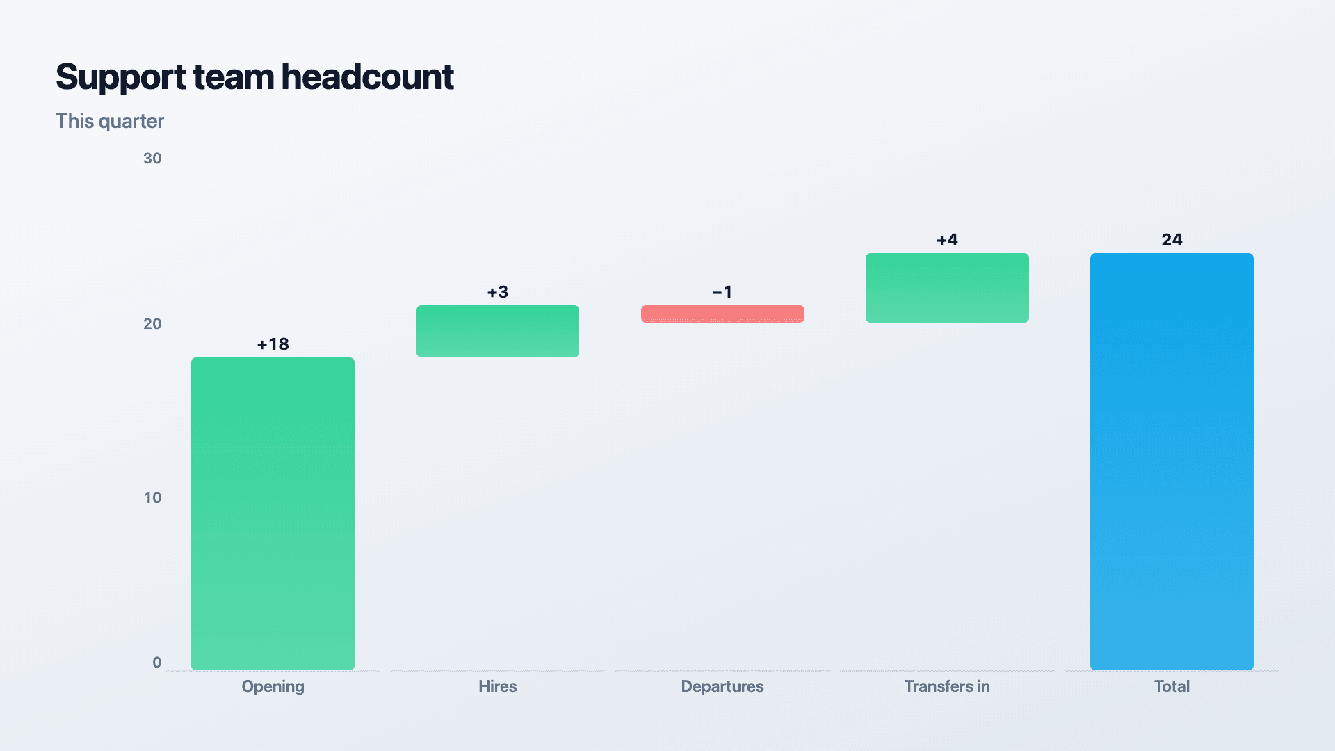
Real charts made in Reochart, each with its own data and theme. They animate automatically as you scroll.
Good fit
When to use it
- ✓A quarterly or annual headcount review
- ✓A people-ops slide in a wider update
- ✓Attrition and hiring plan reviews
- ✓Any count that needs a bridge explanation, seats, licenses, subscribers
Reach for something else
When not to use it
- ✕The number moving is revenue rather than people, the waterfall chart generator is written for that case directly.
- ✕You need an org chart showing reporting lines rather than a count changing over time.
- ✕You need a trend across several quarters rather than one period's change, a line chart tracking total headcount fits better.
Compare
Which chart to use
Headcount bridge vs the alternatives.
| Chart type | Shows | Avoid when |
|---|---|---|
| Headcount bridge | How a team's size changed, one period | A trend across many periods |
| Waterfall chart | How a revenue number changed | The moving number is people, not dollars |
| Line chart | Total headcount trending over several quarters | Explaining what drove one period's change |
Your data
What data you need
First row is the opening headcount; each next row is a signed change. Reochart floats the steps and colours gains and losses. Paste or import a CSV.
| Step | Change |
|---|---|
| Opening | 40 |
| Hires | 8 |
| Departures | -3 |
| Transfers in | 2 |
Step by step
How to make one
Drop your numbers in, or import a CSV.
Choose the chart, theme and animation speed.
Tune colours, labels and add your brand.
Download MP4, GIF, PNG or SVG.
Best practices
Get it right
- ✓Reconcile the arithmetic: opening plus every step should land exactly on the closing number.
- ✓Group many small hiring or departure events into one step per category.
- ✓Label whether departures were voluntary or involuntary when that distinction matters.
- ✕Mix contractors and full-time employees in one count without labelling which is which.
- ✕Omit transfers between teams, skipping them creates a false picture at the team level.
- ✕Present a bridge that doesn't reconcile.
Watch out
Common mistakes to avoid
A bridge where the steps don't add to the closing number, usually from an omitted transfer or a double-counted hire, loses credibility fast.
When that distinction matters to the story, a single combined 'departures' step hides it.
Skipping transfers between teams misrepresents growth or shrinkage at the team level even when the company total is unaffected.
Ignoring seasonal contractor swings makes a temporary spike or dip read as a permanent change.
Why Reochart
Built for sharing, not just charting
- ✓No design skills required
- ✓Animated MP4 and GIF exports
- ✓PNG and scalable SVG too
- ✓Your brand colours and logo (Pro)
- ✓Paste from a sheet or import a CSV
- ✓Presentation and feed ready in minutes
FAQ
Frequently asked questions
What is a headcount chart?
A headcount chart shows how a team's size changed over a period by breaking the net movement into its parts: the starting figure, hires added, departures and transfers removed, and the ending figure. Drawn as a bridge or waterfall, each component floats from the running total, so the arithmetic is visible rather than implied. That matters because a net number conceals the story. Growing from 48 to 52 people looks like steady expansion, but if it took 14 hires to offset 10 departures, the real finding is attrition, not growth. People ops and finance teams use it in planning reviews and board packs for exactly that reason, since a hiring plan and a retention problem call for completely different responses even though they produce the same net figure.
Does this show who reports to whom?
No. This chart shows how a headcount total changed over a period, not reporting structure. An org chart is a different kind of diagram entirely.
How do I handle transfers between teams so the company total stays right?
Show transfers out of one team and transfers into another as separate steps; the company-wide total should net to zero across all teams' transfer steps.
Can I use this for a single team rather than the whole company?
Yes, the same structure works at any level, as long as the steps reconcile to that group's own opening and closing counts.
Can this show a trend across several quarters?
A single bridge covers one period's change. For a trend across quarters, a line chart tracking total headcount usually communicates the arc better.
Can I make it animated?
Yes. Charts animate by default, and you can export the animation as an MP4 or GIF, or grab a static PNG or SVG if you prefer.
Can I export as SVG?
Yes. Pro exports a crisp, scalable SVG vector, alongside MP4, GIF and PNG. Every export renders at 1080p.
Is Reochart free?
Yes. The free plan lets you make every chart type except the animated bar chart race, and export an animated MP4 with a small watermark, no card needed. Pro adds the bar chart race, removes the watermark, and adds GIF and SVG, your brand colours and logo, longer videos and CSV import.
Keep exploring
Related generators
From the blog
Learn more about charts and data storytelling

11 min read
How to Create an Animated Number Counter
A step-by-step guide to building a number counter that actually lands: picking the number worth this treatment, setting an honest start point, adding the context that makes it mean something, and exporting an animated version for a launch post, a deck, or a milestone update.
Read article →

11 min read
How to Build a QBR Dashboard
A practical guide to building the handful of charts a quarterly business review actually needs: the growth number, the bridge that explains it, the pipeline read, the KPI scorecard, and the roadmap for what's next.
Read article →