Newsletter Chart Maker
Make charts that render crisp in any inbox and stop the scroll. Export as PNG, GIF, SVG or MP4.
Free to try · No design skills · Ready in about two minutes
Trusted by 1,198 users, including people at
 ByteDance
 Arizona State
 Fox
Fox UT Austin
 Roche
Roche Tulane
 United Airlines
 Clemson
 NHS
NHS Ayming
 Marquette
 Kent State
 Ray White
 UC Riverside
 CBA
CBA Illinois Tech
 Venngage
 Hofstra
 House of Communication
 IIT Madras
 Sotherly Hotels
 Zenus.ai
Overview
What this tool is for
Newsletters are read fast, on phones, in a cramped inbox column, and often with images half-loaded. A chart that looks fine on your screen can turn into an unreadable smudge in that context. Yet a single clear visual is often the most-remembered thing in an issue, the data point people screenshot and share.
A newsletter chart has to survive the medium: big enough labels to read on a phone, a single clear message, and a format that renders everywhere. Static images (PNG) work in every email client; an animated GIF loops in most and catches the eye in a busy inbox. The trick is legibility first, polish second.
Reochart makes charts sized and styled for email, on your brand, exported as a crisp PNG for universal support or a looping GIF for a bit of motion. Build the one chart your issue is built around, drop it in, and it reads cleanly whether someone opens it on a laptop or a phone on the train.
How it works
How to make newsletter charts
Pick the one number or trend the issue is about and choose a simple chart: bars for a comparison, a line for a trend, a counter for a single figure. Enter the data, keep labels short, and use large, high-contrast text so it reads on a small screen.
Export a PNG for maximum email-client support, or a GIF if you want subtle motion. Avoid MP4 for email — most inbox clients won't autoplay it — and always include descriptive alt text when you embed.
Examples
Example charts
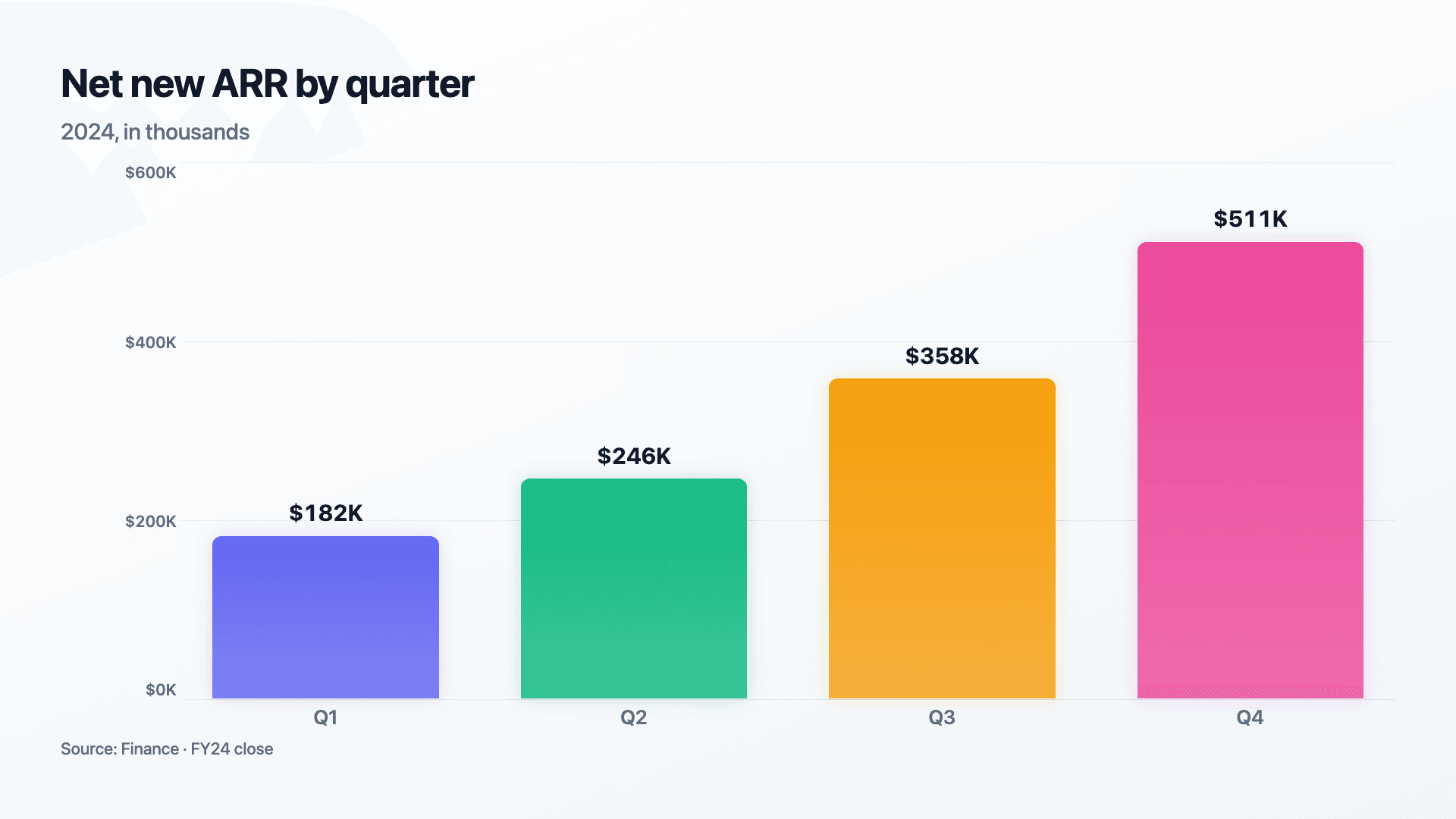
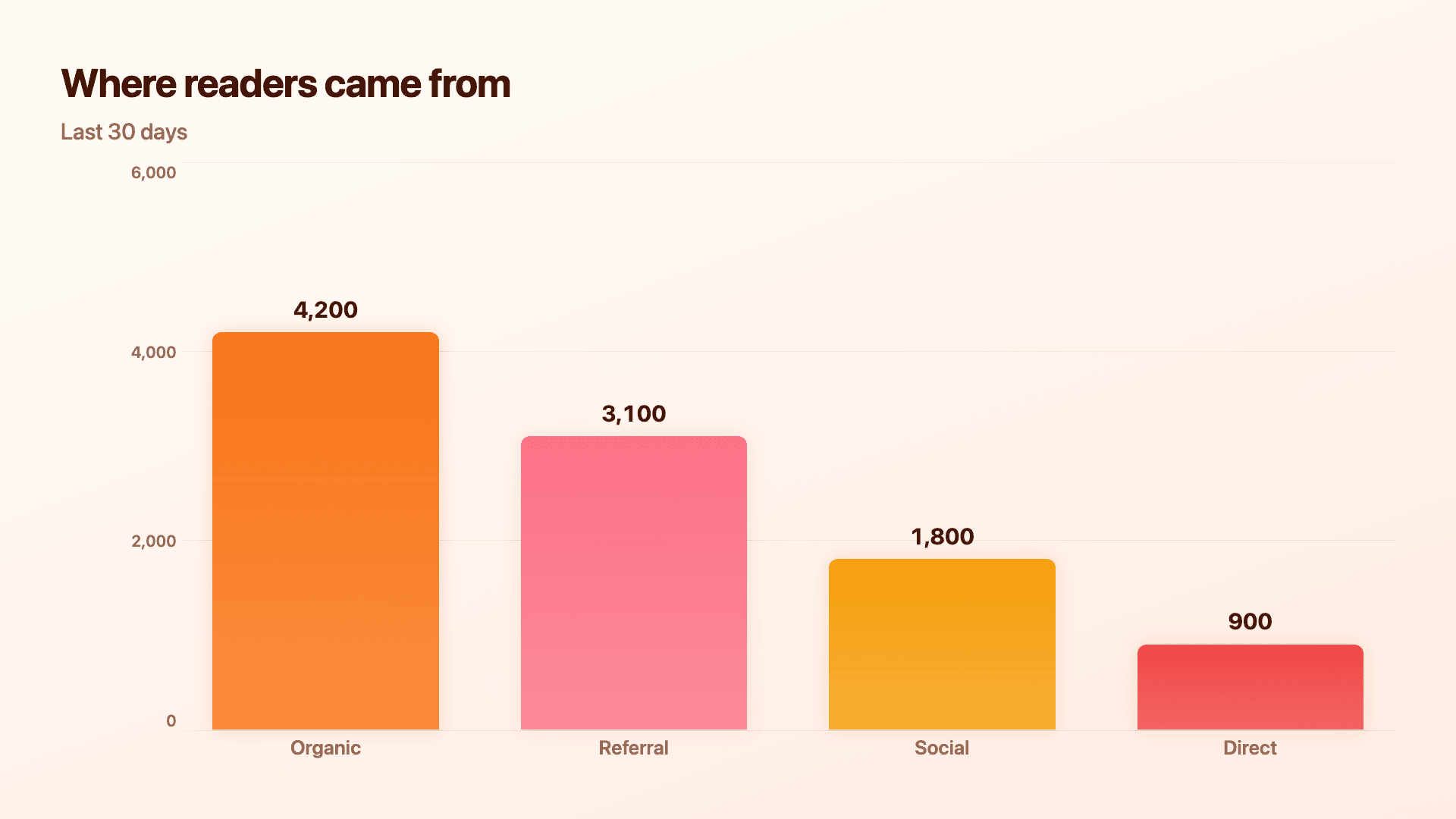
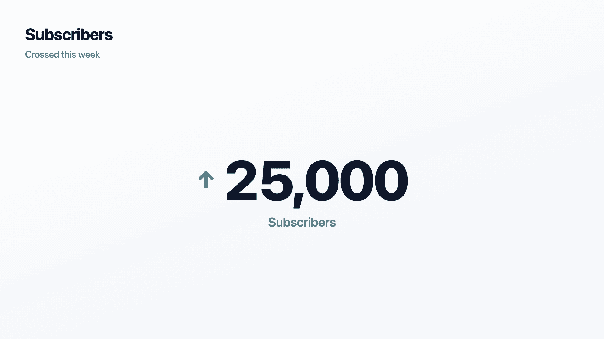
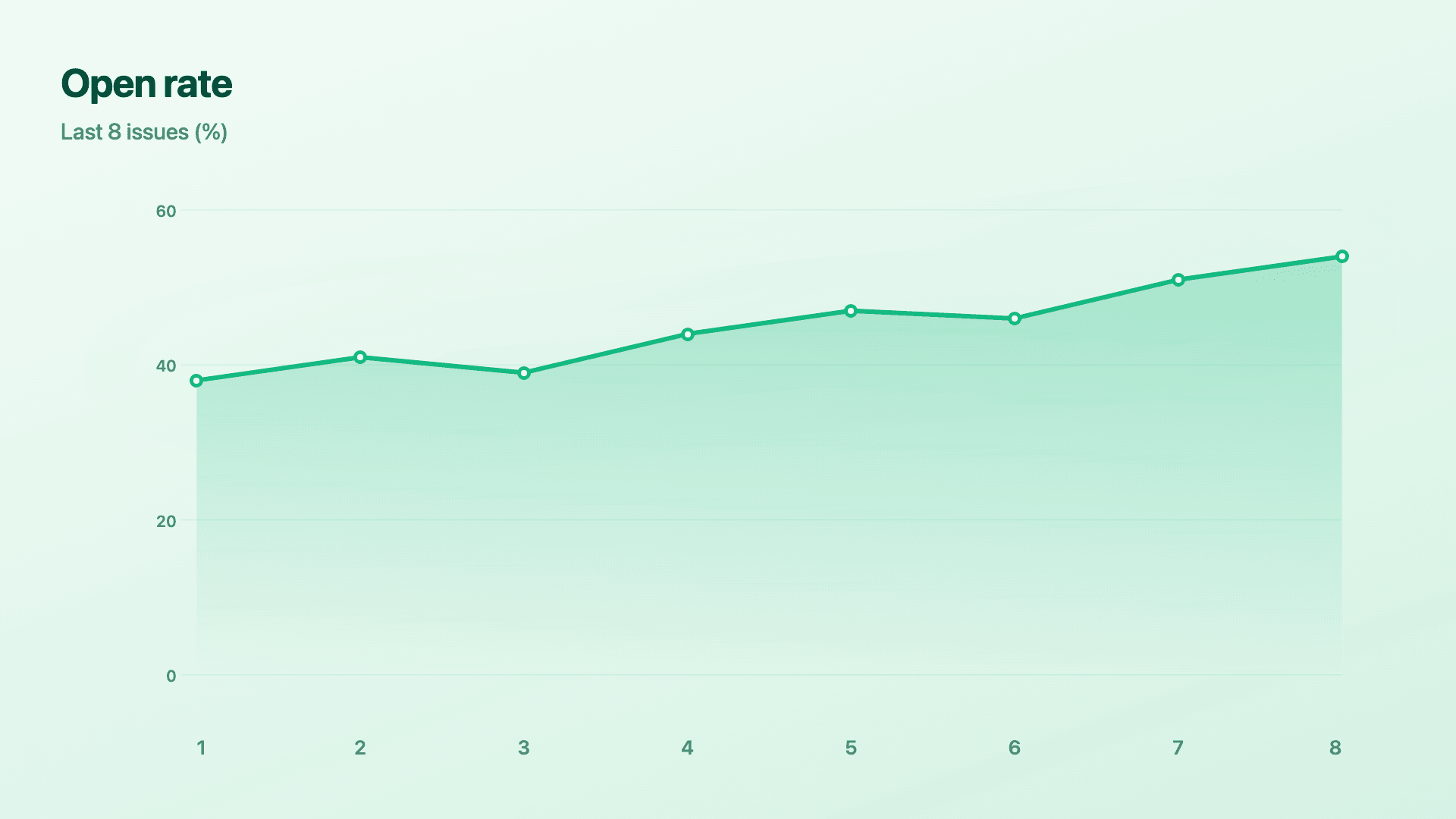
Real charts made in Reochart, each with its own data and theme. They animate automatically as you scroll.
Good fit
When to use it
- ✓The one visual an issue is built around
- ✓A metric update to your list
- ✓A data point worth screenshotting
- ✓Recurring "numbers this week" sections
- ✓Report and roundup emails
Reach for something else
When not to use it
- ✕The email is text-only by design, a chart may feel bolted on.
- ✕You have many charts, link to a web version instead of stuffing the email.
- ✕The point is one sentence, write the sentence.
- ✕Images are commonly blocked for your audience, lead with text and use alt.
Compare
Which chart to use
Which chart for a newsletter.
| Goal | Best chart | Why |
|---|---|---|
| Compare a few things | Bar | Reads instantly on a phone |
| Show a trend | Line or area | Direction at a glance |
| One headline number | Counter | Maximum impact, minimum space |
| Parts of a whole | Donut | Simple split, few slices |
Your data
What data you need
Newsletter charts are usually simple label-and-value rows. A counter needs one number. Paste from a sheet or import a CSV.
| Label | Value |
|---|---|
| Organic | 4200 |
| Referral | 3100 |
| Social | 1800 |
Step by step
How to make one
Drop your numbers in, or import a CSV.
Choose the chart, theme and animation speed.
Tune colours, labels and add your brand.
Download MP4, GIF, PNG or SVG.
Best practices
Get it right
- ✓Use large, high-contrast labels for small screens.
- ✓Export PNG for universal email support.
- ✓Keep it to one message per chart.
- ✓Add descriptive alt text when you embed.
- ✕Rely on MP4 — most inbox clients won't autoplay.
- ✕Pack a dense multi-series chart into an email.
- ✕Use tiny axis labels that vanish on mobile.
- ✕Assume images always load; caption the takeaway.
Watch out
Common mistakes to avoid
Most opens are on phones. Small labels and busy charts turn to mush. Size type up and simplify.
Most email clients won't autoplay video. Use a PNG, or a GIF if you want motion.
Images get blocked. Without alt text, a blocked chart is a blank hole where your point should be.
An inbox column is narrow and attention is short. One strong chart beats five cramped ones.
Why Reochart
Built for sharing, not just charting
- ✓No design skills required
- ✓Animated MP4 and GIF exports
- ✓PNG and scalable SVG too
- ✓Your brand colours and logo (Pro)
- ✓Paste from a sheet or import a CSV
- ✓Presentation and feed ready in minutes
FAQ
Frequently asked questions
What makes a chart work in a newsletter?
A chart in an email faces constraints no other medium imposes. Email clients strip or block much of what a web page takes for granted, so an embedded interactive chart is not an option and the chart has to travel as an image. Many clients also block images by default until a reader opts in, which makes alt text genuinely load-bearing rather than an accessibility afterthought. Most newsletters are read on a phone in a narrow column, so a chart designed at presentation width arrives illegible and needs larger type and fewer data points than a slide would carry. PNG is the safest format because it renders everywhere; a GIF adds motion and works in most clients, though Outlook shows only its first frame, which is why that frame needs to make sense alone.
Which image format works in email?
PNG is the safest — it renders in every email client. GIF works in most and adds subtle motion. Avoid MP4; most inbox clients won't autoplay it.
Will an animated chart play in the inbox?
A GIF loops in most clients. Video (MP4) generally won't autoplay in email, so export a GIF or a static PNG for newsletters.
How do I make charts readable on mobile?
Most newsletter opens are on phones, so use large high-contrast labels, one message per chart, and avoid dense multi-series charts.
Should I add alt text?
Yes. Email clients often block images by default, so descriptive alt text ensures your point survives even when the chart doesn't load.
Can I make it animated?
Yes. Charts animate by default, and you can export the animation as an MP4 or GIF, or grab a static PNG or SVG if you prefer.
Is Reochart free?
Yes. The free plan lets you make every chart type except the animated bar chart race, and export an animated MP4 with a small watermark, no card needed. Pro adds the bar chart race, removes the watermark, and adds GIF and SVG, your brand colours and logo, longer videos and CSV import.
Keep exploring
Related generators
From the blog
Learn more about charts and data storytelling

11 min read
How to Create an Animated Number Counter
A step-by-step guide to building a number counter that actually lands: picking the number worth this treatment, setting an honest start point, adding the context that makes it mean something, and exporting an animated version for a launch post, a deck, or a milestone update.
Read article →

11 min read
How to Build a QBR Dashboard
A practical guide to building the handful of charts a quarterly business review actually needs: the growth number, the bridge that explains it, the pipeline read, the KPI scorecard, and the roadmap for what's next.
Read article →